The post The History of Blackletter Calligraphy appeared first on Jake Rainis.
]]>When the average western layperson thinks of calligraphy, there is no doubt many visuals come to mind. For most, it’s likely to be that elegant style of cursive we all know and love. Copperplate and Spencerian scripts, as we refer to them today, derived from the Roundhand style of calligraphy in the late 16th century. Sure, that was over 400 years ago, but in the grand timeline of calligraphy, it wasn’t actually that long ago. So what led up to that? And what about “Blackletter”?
“Blackletter”, “Gothic”, “Old English”, etc. You’ve probably heard these terms at some point and perhaps mental images of newspaper headlines come to mind. After all, those fonts are based off of classic “Blackletter” scripts, which is the word we use to describe these styles of scripts developed during Medieval times.
The history of Blackletter calligraphy is long and fascinating. Its roots date back to before 1200BC. That’s almost 3,000 years ago! Suddenly, several centuries doesn’t actually seem like so long of a time, does it?
Despite its long and rich history, exhaustive historic documentation of Blackletter calligraphy is fragmented and difficult to find. It is quite ironic how one can easily find a book spanning hundreds of pages that details just about any point in history. Yet, one cannot find a book detailing the history of the written language that built the foundation upon which we write.
With that said, this is a difficult topic to write about comprehensively. This article is carefully pieced together from many different sources and referential material. Any dates mentioned herein are approximate and span across over 2.5 millenniums. However, I’m confident that the timeline is accurate and that the details within will be more than sufficient in understanding and appreciating how Blackletter calligraphy has come to be what it is today.
We’ve established that “Blackletter” is the term we use to describe calligraphic type developed during Medieval times. What about “Gothic” or “Old English”? Though they have become synonymous with Blackletter script, these terms are actually somewhat inaccurate at their core. Let’s take a quick moment to clear up any confusion.
“Old English” was actually the language of the Anglo-Saxons until the mid 1100s and they had nothing to do with Blackletter. Centuries after Blackletter’s initial emergence, “Old English Text” was the name of a font by Monotype that mimicked 11th century Textura.
The “Goths”, as you’ll read about shortly, were actually Germanic tribes. However, the term “Gothic” was also used during medieval times in reference to the “Gothic” architecture, which was an architectural style found in many churches and cathedrals built during the Medieval era. And this architecture is important, as it was a major influence for inspiring blackletter calligraphy in the 11th century.
Though these styles can be used interchangeably, we’ll refer to it exclusively as “Blackletter” hereafter in the interest of establishing a common vocabulary.
Before jumping in, let’s address one of the most commonly-asked questions about Fraktur (and subsequently, every other style of Blackletter calligraphy).
Blackletter is comprised of four styles; Textura, Rotunda, Bastarda, and Fraktur. Other styles were hybridized developments from one or more of these core styles. These styles developed between the 11th and 18th centuries. Over hundreds of years, their generational evolution was the result of regionality, education (or lack thereof), available materials of the time, religion, and politics.
With that said, there are no singular “textbook” forms when it comes to these styles of Blackletter. This makes establishing a holistic understanding of these styles and their nuances difficult and often unapproachable for novice scribes. But there are definitive distinctions that can be made between each style.
Consider a serif typeface. We all know that there is no one foundational serif. On the contrary, there are countless variations that fall into this broad category. Still, understanding the qualities this category of type is comprised of gives one the ability to distinguish whether or not a typeface is a serif typeface.
Think of a Blackletter script in the same way. Once you understand the aesthetic qualities of the four aforementioned styles, telling them apart them becomes easy. Bottom line — don’t worry about their differences. Instead, do your best to understand each one as an individual at its core.
Now that we’re all on the same page, let’s go back in time and see where Blackletter, and subsequently, how all of the letters we use in the Western World today came from.
Calligraphy is a term that refers to the written execution of alphabetic letterforms with a writing instrument such as a brush or pen. Cultures all over the world have developed their own unique forms of calligraphy in a variety of alphabets, each with their own unique history.
In western culture, we communicate with words formed with the letters of the Latin (also referred to as “Roman”) alphabet, which is the most commonly used alphabet in the world. It is this specific style of calligraphy that we’ll be focusing on in depth, as Blackletter calligraphy is written using characters exclusively from the Latin alphabet.
But where does the Latin alphabet come from and what makes an alphabet in the first place?
The first known alphabet was the Phonecian alphabet (also known as the Proto-Canaanite alphabet for the oldest of inscriptions). The individual glyphs in this alphabet were derived from early Egyptian hieroglyphs and each one represented a consonant. Alphabets with no vowels are referred to as an “abjad”, which is a writing system in which vowels are implied or determined by the reader based on the adjacent consonants.
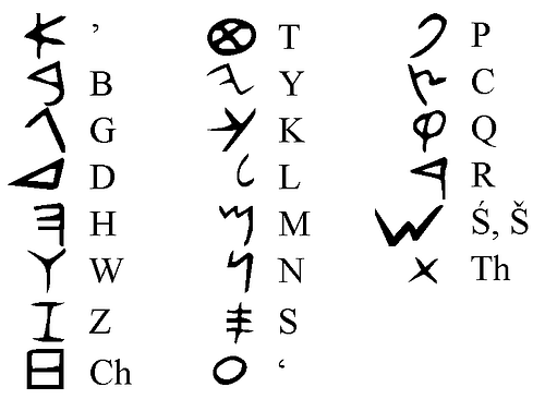
The Phonecian alphabet was used between 1200BC and 150BC throughout the Mediterranean, where it was adopted by many other cultures. These cultures continuously evolved it into other, more localized alphabets. One of those alphabets became what we know today as the Greek alphabet, which happens to be the first alphabet to have distinct vowel letterforms. Comprised of all capital letters, it was written in rows between 2 horizontal guidelines as a loose organizational layout method. However, reading from left to right was not an established rule at this time. The alphabet was often written in a “boustrophedon” format, where the lines alternate between right to left and then back from left to right.
The Greek alphabet dates back to 800BC and can still be found present in the modern day. Its glyphs are often used as technical symbols in domains such as mathematics, science, and technology.
The Greek alphabet is the ancestor of many other alphabets and writing systems, including the Latin alphabet, which set the foundation for the earliest traces of western calligraphy!
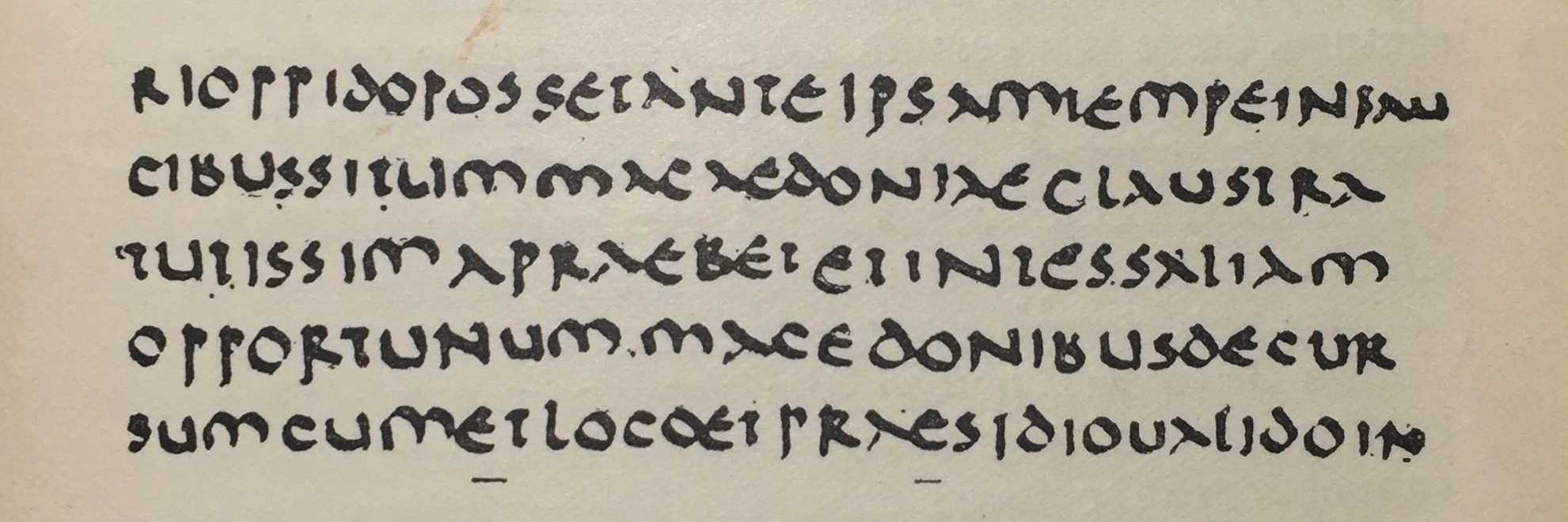
Old Roman Cursive, also referred to as “majuscule cursive” and “capitalis cursive”, was the writing standard in ancient Rome for several centuries. The exact dates are unknown, but based on historic documents that were discovered from that time, and events that those documents referenced therein, its origins are speculated to go back to 2nd century BC.
Letterforms of Old Roman Cursive are comprised of characters from the Latin alphabet. The penmanship which was taught to children in schools and used most notably by business merchants and emperors as methods of communication and the recording of important documents.
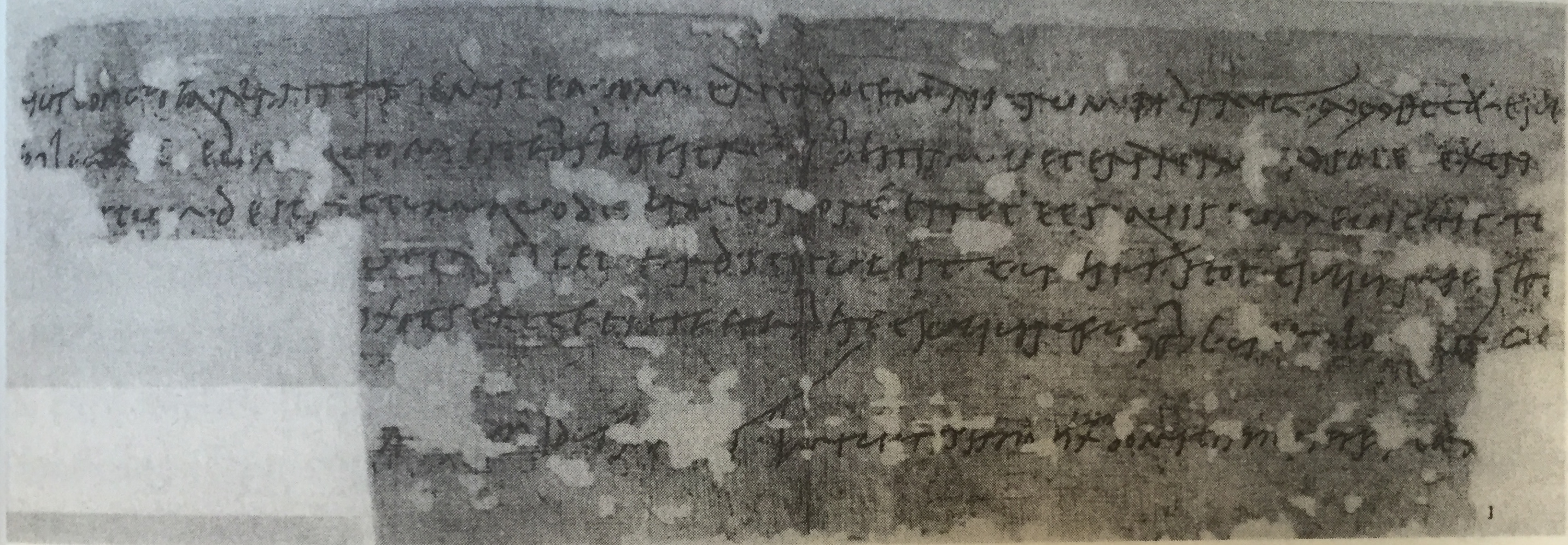
Recovered artifacts from that time reveal comedians mocking the script for its illegibility. Old Roman Cursive writing was often packed with ligatures as a shorthand mechanism which made it quite difficult to read. The proportion of individual letters and where they sat on their baseline lacked consistency.
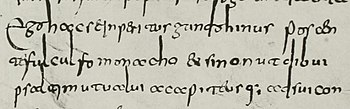
Also referred to as “minuscule cursive” (and later, just “Roman Cursive) New Roman Cursive evolved from Old Roman Cursive. This evolution was likely a response to the older style’s illegibility. The characters in New Roman Cursive are more distinctly recognizable by modern standards. Additionally, their proportions are more rhythmic and follow a consistent baseline.
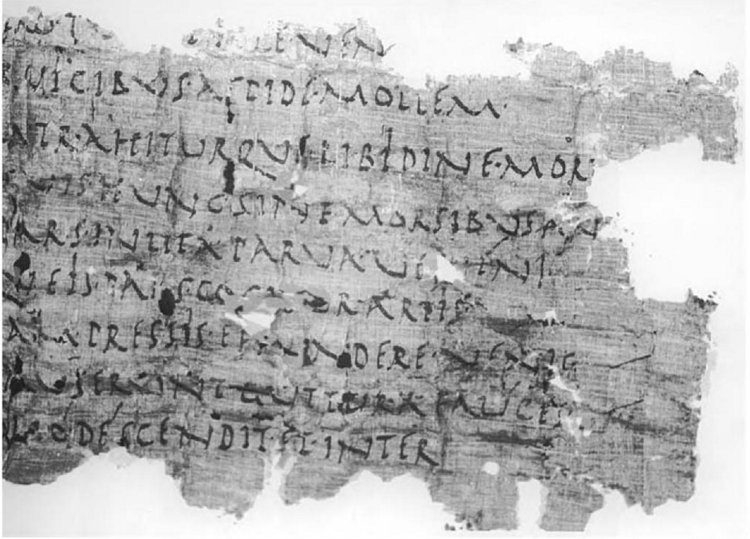
New Roman Cursive marks the birth of the earliest alphabet that even an untrained eye would likely recognize.
Letterforms at any given point in western history heavily influenced the evolution of the many different styles we know today. However, Roman Cursive is probably the most pivotal foundation of those styles. Its roots influenced and cemented the anatomy of the letters we have been writing for centuries and eventually gave birth to countless serifs and sans-serif fonts we use in our word processors. In a sense, Roman Cursive is the great (great, great, etc.) grandfather of today’s many styles of western calligraphy.
The earliest traces of Uncial script were discovered to be from the late 1st century and early 2nd century, but its era of popularity and common usage was between 4th and 8th century. Uncial script likely developed from Roman Cursive. However, there are several distinct features that really set this style of script apart. The broad edge used to create the strokes of these letterforms is the first in Western history and the correlations between them and the letterforms we know today in modern styles of Blackletter is visibly apparent.
Unlike Roman Cursive, Uncial’s broad strokes are also rounded. Interestingly enough, it is speculated that this new treatment was made possible by the development of parchment and vellum. These materials were much smoother and allowed for such manipulation of the writing instrument, as opposed to rougher surfaces like papyrus.
This approach to writing also enabled the scribe to write faster and more fluidly. Speed is a major aspect of writing calligraphy that helped influence many developments in different styles calligraphy. This particular instance is perhaps one of the earlier examples, but it is a trend we’ll continue to see in later centuries.
The origin of the name isn’t definitive. The earliest reference to the style comes from the St. Jerome’s preface of Book of Job. Within the preface, he writes:
Habeant qui volunt veteres libros, vel in membranis purpureis auro argentoque descriptos, vel uncialibus ut vulgo aiunt litteris onera magis exarata quam codices.
Which translates to:
“Let those who so desire have old books, or books written in gold and silver on purple parchment, or burdens {rather than books} written in uncial letters, as they are popularly called.”
Many believe the name is based upon the Latin word “uncialis”, which can translate to mean “inch high”. This would make sense as early Uncial scripts were generally written between 2 horizontal baselines that were about an inch apart from each other.
Classic Uncial script is a majuscule alphabet, so all of its letterforms are written as what we know to be uppercase.
The Uncial style of script was one that slowly developed over centuries and eventually gave way (around 6th century) to what we now refer to as either Half Uncial or Semi Uncial. Half/Semi Uncial introduced lowercase versions of its predecessor’s majuscules along with ascenders and descenders. And as the years went on, scribes began to introduce ligatures, as well as embellishments and flourishes. The broad nib was twisted to add different characteristics to the core strokes of the letterform.
The use of Half/Semi Uncial script began to taper off as it evolved into other unique and more regionalized hands. However, it was still used by the Christian church until ~10th century as the primary hand for biblical transcription.
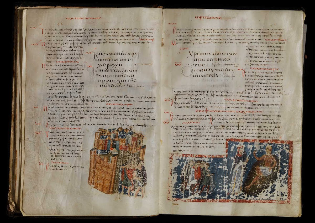
It is important to recognize the influence that Uncial script had across the western world. During the Middle Ages, Western Europe’s overall deterioration resulted in many instances of regional division, migration, and displacement. This division promoted the unique interpretations, treatments, and techniques of Uncial writing.
While many of these styles of writings may be relatively unknown and short-lived in common use, the roots they established are still recognizable today in the cultures of their respective modern regions.
Also known as “Gallo-Roman” script, Merovingian script was central to the Merovingian dynasty, a dynasty in the region where France is today. The Merovingian dynasty lasted several centuries until the 8th century when it became the Carolingian monarchy. As a result, the writing in the region eventually adopted Carolingian scripts.
Merovingian script was primarily used in monasteries and interestingly enough, it is known to have 4 distinct variants; each unique to its respective monastery. The 4 monasteries were: Luxeuil, Laon, Corbie, and Chelles. The script is distinct In appearance due to its narrow and sharp letterforms. The ascenders and descenders of its minuscules are often long and exaggerated.
This medieval script was written in Ireland under the influence of Irish Christianity around the same time as Merovingian script. The appearance of Insular script should be distinguishable to those familiar with “traditional” Irish and Gaelic scripts, as those scripts were directly influenced by Insular script.
The differentiations within Insular script varied based on usage scenario. The most formalized examples of the script are found in important documents and sacred texts. This style was perhaps the most tedious due to the time required to produce the letterforms. Casual variations were used in less formal documents and notes in favor of letterforms that were quicker to write.
Meanwhile, down south on the Iberian Peninsula (which is now modern Spain and Portugal), were the Visigoths.
Finally a mention of “Gothic” — perhaps one of the more common and generic terms used to describe modern Blackletter calligraphy. However it’s not entirely accurate in this context. Gothic is actually a language spoken by the Goths, an Eastern-Germanic people (comprised of the Ostrogoths and the Visigoths). These tribes played a key role in the fall of the Western Roman Empire in the late 4th century.
Visigothic script was used from the 7th century through the 13th century, but its heyday was 9th-11th century. It declined gradually thereafter. The script is comprised of elements that stay true to its Uncial roots, but similarities to Merovingian can be seen in its long, slender letterforms.
The Beneventan script was used originated in the Duchy of Benevento (a duchy is a territory ruled by a duke or duchess), an area of Southern Italy. It existed around the same time as Visigothic script (specifically 8th century to 13th century), and was primarily used in the monasteries of Bari and Monte Cassino.
Visually, Beneventan is very distinct, particularly when compared to other scripts that were heavily influenced by the Uncial writing of previous centuries. Perhaps the most distinguishing feature of Beneventan script is the rythmic connectivity of its letterforms. Words are grouped together with the prominent use of ligatures and other connecting strokes.
As far as a writing system, Beneventan script was also unique in that it would omit or abbreviate letters, often with a preceding macron (a mark above a letter to denote a long or stressed vowel) as an indicator. This was a concept we saw in earlier Roman Cursive, but unlike Roman Cursive, standard punctuation and word spacing is used in Benevantan script. In fact, one particular piece of punctuation was for interrogative clauses — one of the earliest forms of a question mark that we’ve found in Western writing.
The Carolingian Empire, ruled by the Carolingian Dynasty during the 8th century was a large empire in Central Europe that gave way to the Carolingian Renaissance — one of the major renaissances during medieval times. This period of growth gave way to an increase and advancement of many cultural aspects. Of those aspects, writing and literature were major components.
It was speculated that Emperor Charlemagne (emperor of the Carolingian Dynasty) was not particularly literate in his own right, but still pursued learning. In fact, a Frankish scholar named Einhard, who was known for writing a biography of Charlemagne, wrote:
Temptabat et scribere tabulasque et codicellos ad hoc in lecto sub cervicalibus circumferre solebat, ut, cum vacuum tempus esset, manum litteris effigiendis adsuesceret, sed parum successit labor praeposterus ac sero inchoatus.
Which translates to:
He also tried to write, and used to keep tablets and blanks in bed under his pillow, that at leisure hours he might accustom his hand to form the letters; however, as he did not begin his efforts in due season, but late in life, they met with ill success.
Despite his lack of success in this area, Charlemagne still recognized the importance of cultural literacy. He sent for Alcuin of York, an English scholar from Northumbria (modern Northern England/south-east Scotland) and had him establish a palace school and scriptorium. Scriptoriums were rooms or centers dedicated to writing, particularly in monasteries where manuscripts and religious texts were copied. During this time, the production of literature increased and linguistics of the time were standardized in the interest of unifying communication throughout the large and continually expanding empire. As a result of these efforts, Carolingian minuscule (also known as Caroline minuscule) emerged as the calligraphic standard throughout the large European empire.
The development of Carolingian script was primarily influenced by English and Irish monasteries using Roman Half/Semi Uncial and Insular scripts, respectively. The letterforms are comprised of rounded strokes that make up clearly individualized glyphs. Sentences used punctuation and began with a capital letter. The words within were separated with spaces and ligatures were used sparingly to promote legibility.
Over the course of the next couple centuries, Carolingian scripts matured into a writing system not far from system we’re familiar with today. Letterforms with descenders began to slant in a natural direction, as opposed to their uncial predecessors. Modern version of certain glyphs began to appear, like the s, which up until this time was traditionally written in a longer vertical stroke (similar to that of an f). The letter v became distinctively different than u. And for the first time, the letter w began to appear. Carolingian minuscule was also the first hand that featured a dotted i.
Carolingian minuscule’s influence rippled throughout Europe, particularly where Carolingian influence was commonly present, but also throughout other parts. For example, the script is present in the Freising manuscripts, which contains the first Roman-script record of the Slavic language. Its influence can also be seen in areas such as Switzerland, Austria, Germany, and Italy, among others.
Carolingian scripts were eventually superseded by Blackletter in the mid 11th century.
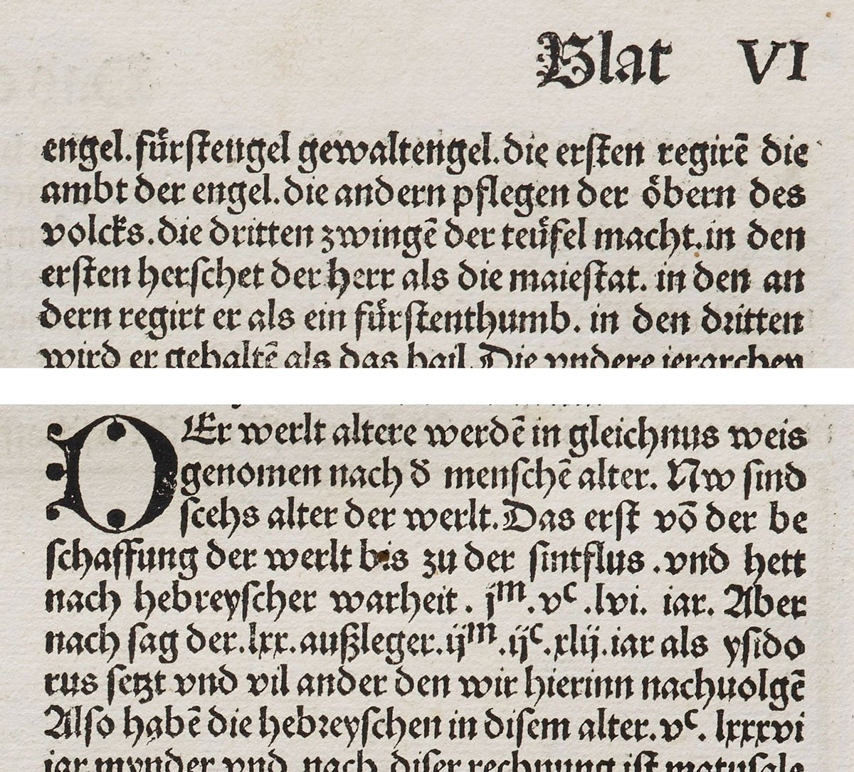
The 11th and 12th centuries saw a notable increase of literacy throughout Europe. Beyond bibles and religious manuscripts, books of varied subjects such as business, law, grammar, and history were produced as a result of newly established universities.
The demand for these books was high. Keep in mind this was a couple hundred years before the invention of the printing press! Each book was written by hand and they needed to be produced quickly.
Despite Carolingian minuscule’s legibility, the large letterforms took a while to produce and also occupied a considerable amount of manuscript space. Writing materials were costly at this time, so there was no doubt that Blackletter was birthed for economic reasons.
The Blackletter styles that transformed from Carolingian minuscule in Northern Europe during the 11th and 12th century are referred to as textualis hands (also known as “Textura”, or “Gothic Bookhand”) and is considered to be the foundational form of Blackletter that eventually evolved into other styles of Blackletter in later centuries.
This style of script is the one that is most synonymous with the term “Gothic”, compared to it’s Southern European counterpart Rotunda. It was most commonly used in England, France, and Germany, but even within close regional proximity of each other, these countries all celebrated nuanced interpretations of the script.
English forms came in many varieties, according to Wikipedia:
English Blackletter developed from the form of Caroline minuscule used there after the Norman Conquest, sometimes called “Romanesque minuscule”. Textualis forms developed after 1190 and were used most often until approximately 1300, afterward being used mainly for de luxe manuscripts. English forms of Blackletter have been studied extensively and may be divided into many categories. Textualis formata (“Old English” or “BlackLetter”), textualis prescissa (or textualis sine pedibus, as it generally lacks feet on its minims), textualis quadrata (or psalterialis) and semi-quadrata, and textualis rotunda are various forms of high-grade formata styles of Blackletter.
Texturalis Blackletter generally suffers in legibility compared to its Carolingian predecessor. Instead of wider rounded letterforms, it is comprised of straight and narrow letterforms, each of which are evenly spaced with vertical downstrokes that create a uniform rhythm across the page. This calculated uniformity is evocative of the gothic architecture of the time. Consider how cathedral windows are spaced with strong verticals. It could be speculated that this style of writing was also a nod to the church.
Johnannes Gutenberg introduced the movable type printing press (known as the Gutenberg Press) in the 14th century and hand-carved textualis letterforms to print the Gutenberg bible. This was the first ever mass-produced book printed with movable type and the limited copies remaining today are considered to be one of the most valuable books in the world.
The 14th century also saw the introduction of paper, which was much easier to write on than parchment. This helped to influence the development of what we now refer to as “cursiva”. Cursiva is a broad term used to simplified Blackletter scripts. These versions are typically less rigid and broken apart than traditional textualis variations, which features strong sharp lines.
While not one specific style of script, cursiva interpretations of early Blackletter script played a large role in their eventual evolution in later centuries, particularly in Germany.
Rotunda originated in Italy and is considered to be the textualis sibling of Southern Europe. It’s direct influence of Carolingian minuscule is more obvious than textualis.
The name itself is derived from the Latin word rotundus, which refers to a building that has a round, circular floorplan. While Rotunda letterforms share many of the same structural qualities as textualis letterforms, they contain more rounded strokes. This adds a considerable amount of variety to the alphabet and makes the style far more legible, even when written narrowly.
In later centuries, Blackletter became less popular in Southern Europe as chancery, Antiqua script and other modern cursive and italic hands became more widespread for practical reasons.
Bastarda (also known as “hybrida”) is an evolved variety of textualis for,s that surfaced in Northern Europe in the late 14th century. True to their name, bastarda scripts can be characterized as bastardized treatments of textualis since the style itself is defined as a hybrid mix of traditional textualis and the simplified cursiva styles that came about thereafter.
Bastarda scripts were quicker to write as their letterforms involved less reorientation of the pen. The deliberation of formality and consistency ranged contextually. Some manuscripts were carefully written while other forms of correspondence were loose and more informal. Because of this spectrum of application, as well as the regional varieties and nuanced treatments of the letterforms, bastard fonts are difficult to categorize holistically.
One particular bastard style worth noting is Schwabacher. Schwabacher script was primarily used in Germany in the 14th and 15th centuries, but could also be found in Switzerland during the same time. From the late 14th century to the early 15th century, it was the predominant typeface used in print throughout Germany.
The combination of rounded forms blended with the formal textualis strokes suggest the script’s hybrid nature draws from the influence of earlier rotunda scripts. In later centuries, Schwabacher was largely replaced Fraktur.
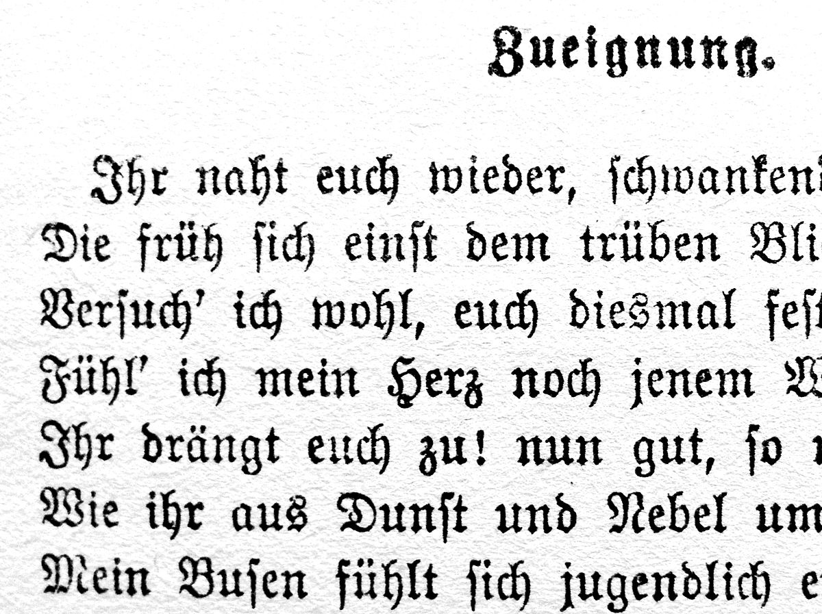
At the turn of the 16th century, a German emperor named Maximillian laid out plans to open an exquisite library. Fed up with the difficult-to-read textualis hands, he had his chancery Leonhard Wagner work with Hieronymus Andreae (a renowned woodblock cutter of the time) to develop a new typeface. This typeface became known as Fraktur.
The word Fraktur is derived from the Latin word “fractus”, which means “broken”. This word translates to English as “fracture” and the meaning is actually quite accurate as Fraktur letterforms are broken apart into fractured strokes laid out at many angles. This variety of angles is a major aspect of what makes Fraktur more legible, particularly when compared to classic forms of textualis hands, which were vertically rigid and narrow.
Fraktur quickly rose in popularity as it was printed and distributed throughout the country. Interestingly enough, for a time it marked a distinction between catholic and protestant texts. Protestants printed in German using Fraktur while catholics printed in Latin using various types of Antiqua.
With the technological breakthrough of print, the mass-production of text kicked into full swing during 15th century Europe and the most commonly used typeface in these productions was Antiqua. Antiqua was not a calligraphic script, but it was designed to look like one. And while it’s not considered a Blackletter face, gothic influence can be found in its letterforms.
With the exception of Germany, use of Antiqua eclipsed the use of Blackletter scripts throughout Europe after its rise in popularity in the 15th and 16th centuries. However, German Fraktur coexisted with Antiqua until the early 20th century. Throughout the centuries in which both were prominent, there was great debate on which was the “correct” typeface to use.
Fraktur didn’t fall out of popularity until the WW2 era with the rise of the Third Reich. Much of the Nazi propaganda was printed using this hand and the style eventually (and unfortunately) became synonymous with the Nazi Regime. Coincidentally, Hitler actually ordered to terminate the use of Fraktur in favor of Antiqua because it wasn’t widely recognized outside of Germany. However, this order was never effectively carried out.
Because Fraktur influence never really reached beyond German borders, it was always considered to be “German” in essence during its heyday. Any Blackletter script produced in Germany during these golden years is considered Fraktur, despite nuanced differences and localized treatments. With that said, it is worth noting that there is no single “official” version of Fraktur.
Blackletter calligraphy (and Blackletter typefaces) fell out of use in the 16th century due to the emergence of Antiqua. Germany was the sole exception, as we saw, with Fraktur calligraphy holding its ground until the end of World War II. Blackletter slipped into the past after this time and never saw a resurgence until nearly a century later.
Today, we celebrate Blackletter calligraphy, hand lettering, and modern Blackletter typography as a form of art that is no longer confined to its utilitarian roots — and hopefully no longer widely associated with its dark historic past (I’m looking at you, Fraktur).
A major aspect of what makes this form of art so amazing is just how old these varieties of visual language really are. The work we know, love, and create today is the product of thousands of years of development.
Thanks to this time of celebration, we’re also witnessing a new chapter of language take place before our very eyes.
With the emergence of graffiti and street art in the past 40 years, typography has become a common form of artistic expression. Original styles are being developed without any formal training in typography. Graffiti has exploded into a brand new culture. This urban aesthetic has influenced and encouraged new kinds of lettering artists. While graffiti might not be a direct form of Blackletter calligraphy in and of itself, it has given way to a new form of calligraphy — one I’m confident will continue to grow over the course decades and write new chapters to an already-long story of visual language and typographic expression.
By definition, calligraffiti combines calligraphy, typography, and graffiti. And in a time where technological communication is no longer limited to print, calligraffiti has exploded around the world.
Like all modern grassroots art movements, there aren’t many formalities or official authorities on the subject. While the origin of the term is unclear, it was popularized by Dutch artist Neils Meulman, a graffiti writer who identifies by the alias “Shoe”, when he held his solo exhibition “Calligraffiti”. Shoe describes calligraffiti as “traditional handwriting with a metropolitan attitude” and a “way of translating the art of the street to the interior of museums, galleries and apartments.”
Due to its expressive nature, loose definition, and lack of rules (some might even argue that like graffiti, rules are paradoxical in nature in the context of calligraffiti), it is a broad style, leaving an often abstract subject matter up to personal interpretation. And while the movement originated in western culture, calligraffiti is by no means confined to the west. It can be found everywhere.
Calligraffiti is also very young. As a result, there is a limited history to report on. And while there is no doubt that is is a large departure from classic calligraphy, its continuation of a long history of written language and visual expression cannot be denied.
If you’ve read this far, you must love history as much as I do. Hopefully this deep-dive was comprehensive enough to give you a robust understanding of what Blackletter history is comprised of.
Whether you’re yet to pick up a pen or you’ve already started learning to write Blackletter, this knowledge will serve you along your journey.
At this point in time, you might be wondering where to go next. No worries — I have you covered. This site is packed with free resources to help you in your creative endeavors. Now that you have a solid background, consider diving into some introductory lessons to learn one of the four core styles of Blackletter.
If you’re already convinced and committed to taking your learning to the next level, I’ve created a series of premium books to guide you in a linear path to mastery. Each of these four books covers one of the four styles of Blackletter calligraphy in extensive detail (Textura, Rotunda, Bastarda, and Fraktur).
These books are available digitally on my website (and can be printed just like these free worksheets).
The post The History of Blackletter Calligraphy appeared first on Jake Rainis.
]]>The post Understanding and Creating Blackletter Calligraphy Guides appeared first on Jake Rainis.
]]>Whether you’re just practicing Blackletter calligraphy or you’re about to lay the foundation for a large piece, you’ll probably want to lay out guidelines to help ensure your work follows a consistent typographic system. I’m not talking about lesson-based tutorials or books, I’m talking about templates with drawn lines in which your work will sit atop of. These guidelines will aid you in maintaining uniformity throughout your entire composition.
This might be seem arbitrary or unnecessary… but try writing a sentence on a blank piece of paper. Chances are, your line begins to slant or become wavy as you progress. Perhaps each word or letter is vertically offset ever-so-slightly from the previous. Are the descenders and ascenders the same size? Probably not.
With careful focus, you might be able to mitigate some of these common side-effects of writing without guidelines, but this will inevitably draw attention away from your actual work. Calligraphy guidelines remove this tedium, which makes the process more enjoyable. And if you follow the template you’ve laid out, consistency is guaranteed.
Definitely not.
Perhaps you’ve seen some of the “experts” on Instagram or YouTube write freehand without guides. And with enough practice, you can do this too. However, it doesn’t make the work any more authentic and I can assure you they did not start that way.
Can you draw a perfect circle freehand? Most people can’t. I sure as hell can’t, and even if I could, I’d still trace a circle or use a compass because it’s easier and requires less eyeballing and guesswork.
Don’t make life harder than it has to be. Draw guides!
Before we dive in to the nitty gritty, let’s touch on tools briefly.
You don’t need anything fancy… just a pencil and a ruler will do. And of course, an eraser to carefully erase the guidelines out of your finished piece when you’re done.
However, if you’re looking to streamline the process, there are two items I’d recommend adding to your tool belt.
A 30″ Aluminum Graduated T-Square helps ensure your lines are parallel to eachother (assuming you align and anchor it accordingly). Aluminum is recommended because it is a resilient material and will last forever. Plastic tools tend to split and snap easily and can be more difficult to clean if there is dried ink or paint stuck on them.
Rolling Rulers take a little practice to get the hang of, but they make creating guidelines a breeze. Essentially, it’s a straight-edge ruler with a built-in… inner ruler. You draw a line, and without lifting the roller, glide it along the page to the desired space (which is indicated by markings on the inner ruler), and draw your next line. Very handy.
A single baseline on which your letters sit can suffice in some cases, but robust a blackletter calligraphy guide generally consist of more than just a baseline. If you’re familiar with basic typographic principles, this should look familiar. But if you’re not, it’s quite simple. Consider the following diagram:
The structural body of all letters sit on the baseline. And if it’s a minuscule (lowercase), it will generally reach up as far as the “x-height” (this can also be referred to as the “m-height”). This rule hold true for letters like “a”, “c”, “m”, or “x”, among others.
There are two exceptions to this rule; letters with “ascenders” and letters with “descenders”.
An ascender is present when one of a letter’s stems (vertical strokes) reaches above the x-height, all the way to the ascender guideline. For example, “b”, “d”, “f”, and “l” are all letters that have ascenders, since they contain a stem that reaches above the x-height.
Likewise, a descender is present when one of a letter’s stems reaches below the x-height, all the way down to the descender guideline. Letters “j”, “h”, “p”, and “q” are all letters that have descenders, since they contain a stem that reaches below the x-height.
When it comes to majuscule (uppercase) letters, they also sit on the baseline and depending on the alphabet style, some might have descenders. But unlike their minuscule counterparts, all majuscules occupy the entirety of space between the ascender guideline and the baseline.
Now that you understand how blackletter calligraphy guides are constructed, you should be able to understand how different letters of the alphabet will exist on those guidelines. Yet, you might be wondering just how much space exists between the baseline and the x-height, or just how tall an ascender is.
The space between these individual lines is just as important as the lines themselves, particularly when it comes to any sort of flat-pen calligraphy, such as blackletter.
This vertical spacing is measured in units, and with proportions of those units representing the space between two lines. How big is a unit? One unit represents one nib-width of your pen. For example, if you’re writing with a 6MM wide nib, then your spacing unit is 6MM.
Pilot Parallels, which are common (and highly recommended!) fountain pens for writing flat-pen calligraphy come in four different sizes, measured in MM. Likewise, these width measurements would represent a spacing unit.
Note: This approach applies exclusively to flat-pen calligraphy. When it comes to pointed-pen calligraphy such as Copperplate or Spencerian scripts, you can still use ratios (although the ratios will differ drastically), but they are measured in metric units such as centimeters.
Taking the spacing unit size into account, you’ll want to apply these to a ratio which defines how many spacing units exist between each guideline. One of the most common ratios for blackletter calligraphy guides is 2:4:2.
A 2:4:2 ratio means:
While a 2:4:2 ratio is common, other ratios can be used as well! For example, any of the following ratios could work:
Typically, the ascenders and descenders should occupy the same vertical space for best visual results, but there are no hard and fast rules when it comes to working with ratios. Experiment and see what ratios look appealing to you.
You’ll just want to consider how it impact a line of script aesthetically. For example, a 3:4:3 Ratio would make your ascenders and descenders quite tall, resulting in an elongated letter whereas a 2:5:2 ratio would make the body of the letter that exists between the baseline and x-height significantly larger than the descenders, which would look stumpy in context to each other.
Depending on how far you want to experiment, you might also consider working in ratios with half spacing units.
Now let’s say you’re working on a multi-line composition… How far should the lines be spaced? Should we use units?
You certainly can, but you don’t have to.
The spacing between lines can depend on many factors and it’s ultimately up to you to determine what looks appropriate for style and legibility. What’s most important is that if you have more than two lines, the spacing between each of them should be consistent so the overall composition looks uniform.
Here are some factors to consider when deciding how much space to add between your lines:
With that said, don’t overthink it too much. Deciding upon linespacing will become second nature once you do it a handful of times.
You might want to consider adding vertical guidelines in addition to horizontal guidelines.
90º vertical guidelines can be incredibly helpful for ensuring all of your vertical stems are truly vertical and perpendicular to the baseline.
Most calligraphy artists naturally write with their surface slightly rotated to one side to ease the strain on their wrists. This is generally the result of habits developed throughout their lifetime from an early age of practicing basic penmanship. While this might be more comfortable, it can make executing a perfectly perpendicular stroke throughout and entire composition more challenging.
In addition to alleviating this problem, vertical guidelines can also be used to help maintain consistency in the space within letters, between letters, and between words. To do this, space each vertical guideline one nib width apart. Having these guidelines close in proximity and consistently spaced will remove any guessing as you work through your piece.
At this point, you know everything there is to know about drawing calligraphy guidelines for your work. But drawing calligraphy guidelines can be cumbersome and time-consuming. And quite honestly, boring. So before you get started, here are some tips that you might find convenient.
If you’re just looking to practice, the template that I’ve created are perfect for printing, photocopying, or tracing.
The template is built in the common 2:4:2 ratio and sized for a 3.8MM nib. This is the size of the green medium-large Pilot Parallel, but you can also get away with relatively similar sized nib too.
Alternatively, you can make your own custom template and duplicate it as needed.
If you’re going beyond practice and want to create finished piece without printed guidelines, consider a tabletop light box. These are thin adjustable lights designed for tracing. The light they cast is powerful enough to go through paper and “project” the guides beneath the page you’re writing on. This way, you can create a guide once, reuse it, and you won’t even have to erase drawn guidelines on your finished work.
Note: Effectiveness with a light box will vary depending on the paper thicknesses you’re working with.
Once you get into the swing of working with calligraphy guidelines, you might feel comfortable abandoning exact measurements in favor of loosely eyeballing your ratios. If you’re familiar with how a line ratio fits into the width of your T-square, you can bang out lines quickly with the following steps.
If you followed correctly, you’ve just drawn two entire lines of guides. Here’s what it should look like.
You can repeat this exercise all the way down the page and have an entire page of calligraphy guidelines in no time at all!
Don’t go crazy trying to measure perfect units. Once you get comfortable, the unit size won’t matter much. What is more important is that the ratios of each line are consistent with the next line.
That’s all there is to it. Now you have a great foundational understanding of typographic systems and how you can easily apply that system to your own practices to guarantee consistency throughout your work.
I hope this was helpful. If you have an questions, please don’t hesitate to shoot me an email!
The post Understanding and Creating Blackletter Calligraphy Guides appeared first on Jake Rainis.
]]>The post Learning Blackletter Alphabets (Free Downloadable Guides) appeared first on Jake Rainis.
]]>Years back, I posted a series of posts that dove into learning Blackletter (specifically in Textura and Fraktur styles). Since then, I’ve written many posts on blackletter technique. I’ve also published a series of workbooks dedicated to learning each style of the four styles of blackletter. Upon revisiting those posts, I realized the content was lacking in regards to what I’m now able to offer instructionally. As a result, I decided to compile all of those posts into this single big one. And that’s what you’re reading right now.
First off, let’s get our vocabulary straight. You’ve probably heard the terms “Old English” or “gothic” in reference to blackletter. All of this terminology is interchangeable and over centuries, has become common slang to describe the style.
The style itself originated in Northern Europe during the 11th century. It evolved as it spread throughout Europe until the early 1900s. Interestingly enough, the rigid vertical structure was written to mimic the architecture of gothic cathedrals (hence the name “gothic”). This style of architecture is not meant to be confused with the actual Gothic tribes from or the Gothic alphabet. This particular alphabet was used by bishops and missionaries in bible translation many centuries earlier.
In regards to the “Old English”, it was believed the Old English language was written in blackletter style. It was later disproved, but the name stuck, at least in our modern era. This was arguably due to a blackletter font called “Old English Text”, which is often found in newspaper headline text.
I could go on about the history and evolution of blackletter, but it’s well beyond the scope of this article.
Blackletter is simply a reference to a variety, or school, of gothic calligraphy styles. But to distill things down for the sake of simplicity, you accurately categorize the main classic varieties of blackletter into to the following four styles:
This tends to confuse or overwhelm people when they first attempt to learn blackletter because it becomes tough to understand the differences and why there are so many variations of each of these four core styles. Why? Well, simply because it evolved over time, across lands under different rule, through the instruction of people that were all trained differently, and with access to different tools and materials.
But don’t overthink it. Here’s a simple and roughly loose way of explaining:
Textura, a rigid and vertically structured form of blackletter started in the 11th century in Northern Europe. Shortly thereafter, Rotunda emerged in Southern Europe. Rotunda is inspired by Textura, but features many round forms. Over the centuries when it became more common for the everyday person to learn to write, Bastarda. Hence the name, it’s truly a bastardized version of Textura and Rotunda, often written quickly (which results in more flow of gesture and expression). In the 1800 and 1900s, German blackletter evolved into Fraktur (from a hand called Schwabacher), a more formalized and rhythmic rendition of Bastarda hands. This was the font used by Hitler and the Third Reich. Those assholes inevitably tarnished the hand’s reputation.
Once again, it’s hard to sum up centuries of history in just a couple of paragraphs, but hopefully this gives you a high-level understanding of blackletter’s origins and it’s four core styles. Let’s get to the fun part.
In this day and age, writing blackletter is much easier than it used to be. There are many tools at our disposal and what works best for one person might not work best for the next. You could use brushes, pens, markers, or even classic quills. However, the key factor is that your writing utensil is “broad edged”. Also referred to as a “flat”, this style of edge is simply one which can produce thick and thin lines, depending on the direction it is moved.
I have an entire post on broad edge calligraphy resources. If you want to dive deep, it contains everything you need to know.
However, if you’re just getting your feet wet or experimenting and are unsure of where to start, look no further than the Pilot Parallel. This pen comes in four sizes (I recommend the 3.8MM). It is incredibly versatile, easy to maintain, and inexpensive. With just a little care, it will last you for many years.
What about paper? Don’t go crazy with paper when you’re just starting out. If you’re using basic ink, almost anything will do. If you notice some bleeding, use a thicker paper (bristol or any kind of mixed media marker pad will work just fine).
Working with a guide is not cheating. For most, it’s a crucial aspect of enabling the execution of consistent letterforms. Without going too far into details and the philosophies behind guide creation, just know there are no hard and fast rules.
When it comes to broad edged calligraphy, guides are measured in “units”, where one unit represents the width of your writing utensil. For blackletter calligraphy, a 2:4:2 ratio guide is appropriate, particularly for what we’re doing. A 2:4:2 ratio means your x-height is 4 units while your ascender and descender heights are 2 units. Your letters will sit on the baseline.
Lowercase (minuscule) letters will be as tall as the x-height, unless they have an ascender, in which case the letterform will reach the ascender line. Likewise, if they have a descender, that descender will reach the descender line. Uppercase (majuscule) letters sit on the baseline and extend all the way up to the ascender.
You can certainly make these guides yourself and even experiment with different ratios of your choosing, but I’ve also created a 2:4:2 guide sheet that you can print out to save time. This guide sheet is based on a 3.8MM unit, which is the width of the second largest in the Pilot Parallel pen series. This is the tool that I recommended in the previous section.
You’re primed and prepped to get started. This is where most people experience paralysis. What style of blackletter are you supposed to learn first? Should you copy an alphabet? How do you know if you’re practicing the best technique? These are all questions I asked when I first started. And after many years of practice, the best answer is simply to just start.
To give you a good understanding of how to approach every style or variation you come across, we’re going to build towards learning two drastically different alphabets. This might seem like a lot — and it is! You’re going to be learning the extent of what your pen is capable of when it comes to composing strokes. However, this is the fastest way to develop your pen skills and gain an understanding and appreciation of the nuanced differences that make each rendition of a blackletter alphabet unique.
Before we jump in, just remember: calligraphy is hard. It is essential that you remind yourself of this when you get frustrated or fatigued. You can learn the basics in a matter of hours. However, mastering the execution and developing the muscles takes countless hours of practice. There’s no silver bullet. Just a whole lot of practice. Practice, practice, practice.
Hold your pen (or the blackletter tool of your choice), at an angle of 40º to 50º. With a few exceptions, this is the angle at which you will create most of your letters from. Holding the pen in this manner allows you to achieve different line widths depending on the direction in which you move your pen.
So simple, yet so important! You’ll find a quad (a diamond shape) of some sort in many letterforms, so make sure you get comfortable, as it is also the basic for many horizontal stroke variations. There are two varieties of diamonds; regular and elongated.
These diamond shapes are simple, but they take a little bit of practice. The key to making a perfect diamonds is to ensure that the left and right points are horizontally aligned. To create one, place your pen on the paper while making note of where the left edge of your nib is touching the paper.
Picture a line that goes horizontally across your paper right through that point. Now slowly pull down and to the right (at the same angle your pen is tilted) until the right edge of your nib is at that imaginary line.
Elongated diamonds follow the exact same technique, but when you pull down, you do so at an angle that is less than that of your tilted pen. In other words, move it further to the right than you are moving it down.
As a general rule of thumb, downstrokes are always thick. A large majority of the Textura style is made up by different combinations of these strokes, particularly the lowercase alphabet.
To achieve these strokes, firmly hold your pen and pull in the appropriate direction (very rarely will you push a stroke in blackletter). Be sure not to twist your pen. Maintaining a consistent angle is the most important part of a down stroke.
Once you’re comfortable with a basic downstroke, try mixing diamonds into them.
To begin with a diamond, follow the diamond technique, but when you finish with the diamond, don’t lift your pen. Instead, pull straight downwards.
To end with a diamond, pull your stroke down, but don’t pull it all the way to the baseline. Instead, stop about a diamond’s height shorter and pull your diamond out to the right.
Now let’s try some more advanced downstrokes. At first glance, these look pretty easy (and maybe the will be for you), but up until this point, the strokes you’ve practiced have been rigidly straight. Those straight strokes are common Textura, but in later iterations of blackletter (like Fraktur), the strokes bend much more.
These vertical strokes are all achieved by moving your pen down straight (or at a slight bend like the 2nd, 3rd, and 4th example in the above image).
The last stroke in the above image is by far the hardest. Notice how it tapers off to a point as it gets towards the bottom? This technique requires hours of practice before it becomes natural. It can be achieved by applying more pressure on the left of the nib and less pressure on the right side of the nib as you finish off the stroke. It can also be done by gradually rotating your pen counter-clockwise as the stroke progresses, ending in a vertical point.
Horizontal strokes in Textura are relatively easy. To perform a basic horizontal stroke, place your pen and pull it horizontally in a straight line. As always, make sure you’re holding your pen at a consistent angle.
To make a curved horizontal stroke, adjust the direction you’re pulling ever so slightly so that you can achieve the curve.
When it comes to giving strokes more of an expressive and sharp Fraktur-style edge, you’ll need to finesse the pen a little more. In the following diagram, the first stroke move the is similar to the straight horizontal Textura stroke, but nib is moved upward at the beginning and end of the stroke to give it those sharp points.
The second stroke in the image above is executed much in the same way as the first, it’s just more of a fluid motion. As soon as you begin the stroke, move the pen up, over, down, then back up, finishing with a sharp point at the same angle in which the stroke began.
The third stroke (labelled “fill”) is something I refer to as a “flare”. These flares can be achieved in a single pen stroke if you flick the nib at the right angle while flexing it with the right amount of pressure. Again, this takes a a great deal of practice. Even after years of writing blackletter, it’s still a skill I’m personally refining. But you can always fake your flares by drawing them in with the edge of your nib. Don’t worry, it’s not cheating!
If you’ve made it this far, give yourself a pat on the back. Learning basic strokes individually is not a particularly enjoyable or rewarding process, but it’s crucial to being able to develop letterforms. The good news is you’ve learned all of the strokes you need to create a variety of different styles of styles of blackletter. And to put your hard work to use, let’s do so right now.
Throughout these exercises, we spoke of Textura and Fraktur alphabets. The earlier exercises of each stroke category (strokes with more rigidness) are more pertinent to the Textura alphabet, whereas the the more expressive strokes are geared towards Fraktur.
I’ve created guide sheets for both of these alphabets that you can download and print out to aid in your practice. These guides are also based on a 3.8MM unit, so if you’re using the green Pilot Parallel, these should match up exactly with your pen nib. But if you’re using something else, these guides can still be a a helpful reference.
Here’s an example of what one of the guide pages look like:
Note: I created each of these alphabet guides at two different points in time, so the guide structure might look a little different at first glance, but the mechanics are identical.
Download the Textura minuscule guides as well as the Fraktur minuscule guide. Or download blank blackletter guides.
Yes, there are 26 letters here, but once you know a couple of them, you know all of them. Nearly every letter is a combination of downstrokes and diagonal strokes. You’ll notice many of the letters in the textura minuscule (lowercase) alphabet follow the exact same pattern. For example, a, c, e, g, o, and q all start with the same vertical stroke and their second stroke is the short horizontal “diamond” that meets the top of the stroke at its edge. These repetitive patterns are extremely helpful in learning the alphabet quickly.
Here’s how I would recommend practicing:
Don’t be afraid to trace — it’s not cheating, okay? This is how you learned to write when you were a child. There’s no quicker way to get comfortable with these letters.
I’ve set the guide sheet up in a way that allows you to start by tracing. Like the minuscule guide, each line slowly gradates from black to completely transparent. Begin by tracing and as you start to familiarize yourself with the feel of each letterform, you can rely on the guides less and less.
Download the Textura minuscule guides as well as the Fraktur minuscule guide. Or download blank blackletter guides.
When you feel comfortable enough to draw the letters without tracing them, get a fresh practice sheet and use it to draw your own letters. But keep the other guide sheet in front of you. Reference those letters as your draw yours.
You’ll need to draw each letter many times before you’re able to memorize them. Then you’ll need to draw them each many more times to get them perfect.
When you’ve engrained each letter into memory, print more practice sheets and put the reference guide away. Draw the entire alphabet and then go back and check the guide to see how accurate you were.
At this point, you can start introducing minuscules and writing words and sentences. Here’s a couple sentences that utilize all of the different letters of the alphabet:
Majuscule alphabets are substantially more complex. While they share similar repetition (here and there) to their minuscule counterparts, there are considerably more variations. As a result, they’re much harder to learn and master. However, if you’ve spent some quality time with with the minuscule alphabets and are feeling ready to advance on to the majuscules, let’s do it. If not, don’t worry. This section isn’t going anywhere!
These strokes should be pretty straightforward, given your practice. The tapered strokes here, which you’ll see often in the Textura majuscules are actually quite similar to the vertical strokes in the minuscule Fraktur alphabet.
The tapered stroke begins and ends in a point. To perform this stroke, begin slightly off to the right of where you want the body of your down stroke to be. As always, be sure to maintain a consistent angle. Starting with a point, pull inwards towards the body of your stroke, and then down. As you reach the end of the stroke, end in a point by pulling out and to the left.
Downward “strokes” with serifs are actually multi-stroke pieces of a letter… and you already know how to do them! They’re just combinations of vertical and horizontal strokes from the previous lesson. Start with the top chiseled horizontal. Release. Perform the downstroke. Release. Finally, perform the bottom chiseled horizontal.
Here are some common contexts in which you’ll see these strokes:
Diagonals follow a similar form to basic downward strokes, except they’re done at an angle. If you’ve been practicing, you shouldn’t have any trouble recreating these. However, getting the angle just right will require some trial and error.
Some common contexts in which you’ll see these strokes:
It’s important to get a feel for creating varying line-widths with a single pull stroke. Crescents are a great way to master that feeling. You got a little taste of this with some of the horizontal strokes.
Hold the pen firmly, and starting from the top, pull out to the left towards the bottom of the stroke while maintaining a consistent angle. As you round the thick part of the stroke, pull towards the end of the crescent. If you did everything right, you should have a sliver with two tapered ends and a thick middle.
The full circle is done in two strokes. The strokes are actually identical if you were to flip the second stroke upside down. To create the second stroke, start at the top with your nib touching where the first stroke begins. Pull downward and to the right, rounding out the stroke and pulling into the left where the first stroke ends.
Again, here are some common contexts in which you’ll see these strokes:
In the previous image, you can see these strokes in the context of Textura letterforms, but they’re also just as common Fraktur letterforms:
Abstracting majuscule alphabets is a little more difficult than with the minuscules. The fact is many of the majuscule letterforms are comprised of their own unique strokes. Or, even if they reuse a stroke from another letterform, it might appear in a different placement or at a different size.
The good news is you’ve really gotten solid look into what your pen can do, so anything else you see should be relatively easy to figure out for yourself. But here are a couple more common stroke exercises to help get you warmed up even more.
Hairlines often appear as little decorations or filigrees, but are occasionally used as structural lines in letters such as “N” or “X” in the Textura alphabet. They’re also quite frequent in the Fraktur majuscules and while they might not be structurally integral, the letters wouldn’t be the same without them.
The best way to achieve hair lines is to tilt your pen nib on its side, drawing with one of the two corners.
And finally, a couple of odd, yet common stroke combinations that you’ll find in the Fraktur majuscules.
Start from the left of the below image. The first stroke looks a bit odd on it’s own, but you’ll see how it comes together in several different letter shortly. Start with the long vertical (labelled “1”). Position your pen’s nib at a 40º slightly below the ascender line. Move upwards and to the right briefly, but then quickly loop around and bring it down a single unit about the baseline.
The second stroke begins directly to the left (about 1.5 units) of where the first stroke ends. It’s one of those “squiggle” strokes, so move the pen slightly upward at 40º and loop back down, continuing down through where the top of this stroke meets the previous stroke until the bottom of this stroke meets the baseline. Then finish it off with that upward curl at 40º.
The second exercise from the left should look familiar to you. It’s comprised of two of the basic strokes from the minuscule alphabet. You’ll also find this series of strokes throughout the majuscule alphabet as well.
The third and fourth exercises are pretty self explanatory. Begin with a hairline stroke moving straight upwards until you get towards the ascender line. Finish off the stroke with the respective horizontal (third exercise) or diagonal (fourth exercise).
The diamond is optional, but it certainly adds to the visual complexity of your letter.
Here are some examples of letters using these miscellaneous strokes. That unique combination are pretty prevalent, right?
You must be pretty sick of practicing strokes. If so, I don’t blame you. But you’ve made it to the fun part. Now it’s time to put it all together.
Just like the minuscules, Ive also prepared majuscule guides for a Textura alphabet and Fraktur alphabet.
Download the Textura majuscule guides as well as the Fraktur majuscule guide. Or download blank blackletter guides.
Begin by printing out the guide sheets. As you go through, focus diligently on the angles of the strokes as well as the negative space. Maintaining consistency with the negative space will help your letters look uniform when you begin putting them together.
Just as you did before, trace the guides carefully, and as they fade out, reference them visually until you’re comfortable creating each letterform from memory.
Practice. I really can’t express this enough. It takes an incredibly long time (10,000 hours?) to master something. But it should also be fun.
Look for opportunities to practice regularly. Your brain and hands will grow quicker if you develop a routine rather than picking up the pen a couple of times a month when it feels convenient.
But after considerable practice, you’ll be looking for ways to take your work to the next level. And there are so many opportunities to do so. Different letter variations, stroke techniques, compositions, etc. Check out the Resources section for all of this content and more. I’ve spent years writing this stuff and it’s helped thousands of aspiring calligraphers.
Finally, if you’re taking this seriously and are really looking to fast-track your learning, consider checking out my printable e-books. There are a total of four (one for each style of Blackletter; Textura, Rotunda, Bastarda, and Fraktur). They go much further into depth than this tutorial and even though you’ve learned a basic Textura and Fraktur alphabet in this article, the Textura and Fraktur alphabets in these books are considerably different and far more advanced. Those two in particular are great next steps.
I hope you’re not as frustrated as I was when I started blackletter calligraphy. Unfortunately, I did it all by eye without guides. It was for this reason I decided to create my own, so hopefully they’re helping you out. If you have any hangups or suggestions, I’m all ears. Shoot me an email yo@jakerainis.com and let me know how they’re working for you. Keep up the good work!
The post Learning Blackletter Alphabets (Free Downloadable Guides) appeared first on Jake Rainis.
]]>The post The Ultimate Blackletter Calligraphy Resource Guide appeared first on Jake Rainis.
]]>Whether you’re looking to learn Blackletter or other flat-pen calligraphy styles and don’t know where to get started, or you have plenty of experience and you’re just curious, this article will serve you as a comprehensive list of tools and learning resources. I’m talking about writing instruments, paper, canvas, inks, paint, and even instructional materials.
One would have to be a millionaire to buy every tool out there. With that said, I haven’t tried every ink on the market or every type of brush or canvas. However, I have reached a point after years upon years of experience where I’m now extremely satisfied with my toolset and knowledge of materials. And I’m confident that you’ll be more than equipped to conquer any sort of project throughout your own journey with the tools on this list.
A quick disclaimer before we jump in… don’t go and buy all of these tools at once. Your toolset will enable you to do you very best work but a tool will never make you a better artist. Bottom line; all you need to start is one pen and a pad of paper.
Okay, let’s dive in.
With so many choices, but which one’s are the best? First, decide what interests you most. Fountain pen? Dip pen? Brush? Marker? Each have their pros and cons, and each have their own nuanced learning curves. If you’re just starting, I’d recommend a fountain-pen or a marker simply because of their convenience and ease of use. But don’t let that stop you if you’re eager to try something else!
First things first… if there is ONE tool you should own, it’s a Pilot Parallel.
The Pilot Parallel is a versatile fountain-pen that comes in four different-sized nibs (Red: 1.5MM, Orange: 2.4MM, Green: 3.8MM, and Blue: 6mm). The colors just denote the size of the nib which is convenient if you multiple pens. The tip is comprised of two parallel slabs of metal that feed the ink from a standard cartridge into ink reservoir.
These pens are extremely precise, robust, and easy to maintain. They come with some maintenance tools as well as a couple of cartridges. Additional cartridges can be purchased and while the ink is of good quality, you can easily refill them manually with the ink of your choice for variety and to save money. Alternatively (or additionally), you can dip the pen into an inkwell and it will behave like a dip pen, which makes working with different colors on-the-fly a synch.
Furthermore, the Parallel can be modified and hacked in a number of ways. If you’re interested in pushing the boundaries of this tool, check out my comprehensive Parallel owner’s guide post:
I can’t recommend the Pilot Parallel enough when it comes to fountain-pens. They top anything on the market when it comes to both cost and quality. However, if you’re interested in exploring further, here are two other pens worth checking out.
The Lamy brand is a higher-end pen manufacturer and their Joy fountain pen is fantastic for smaller-scale work. The nib is 1.9MM, which makes it small enough to practice other styles of scripts such as italic or Copperplate. This makes it a particularly good choice if you practice a variety of styles. It’s also quite small, so it fits right in your pocket.
Rotring’s ArtPen line offers a 2.3MM nib, which is slightly bigger than the Lamy. But its nibs are also interchangeable in case you want to go smaller. So if you practice other styles of scripts, this is also a good choice.
Automatic pens are extremely simple, but also incredible versatile. Basically, it’s just a stick with two metal slabs. The slabs are spaced and angled diagonally to meet together at the tip. The space between the nib acts as a reservoir to hold your ink. Even though they require a quick clean after each use, a great aspect about automatic pens is you can a wider variety of pigments than a fountain-pen since it has no internals (some pigments can dry inside of fountain-pen reservoirs).
Automatic pens also come in a variety of sizes ranging from tips smaller than a Pilot Parallel all the way to large poster-sized tips. You can also find automatic pens with splits in the nib that will allow you to create multi-line scroll effects.
Be aware that for what they are, they do tend to be a little expensive. So before you go buying a set of every size, try buying one or two to see how you like working with them.
When you first start working with an automatic pen, here are a couple quick tips worth noting:
Just like pointed pen nibs, you can also buy flat-pen nibs to stick in a standard calligraphy pen holder (I’d advise against using oblique holders).
Dip nibs do come with a steeper learning curve, so consider holding off if you’re just starting. They don’t work particularly well with standard inks either, so you’ll need to mix your own. Gouache and water is the best way to go, but this too does require some trial and error to get the appropriate consistency.
These classic Brause calligraphy nibs are unbeatable when it comes to dipping. They’re inexpensive and come in a variety of sizes from .5MM all the way up to 5MM (which is just in between the two larger Pilot Parallel sizes for reference).
Speedball’s standard set of flat-pen nibs (C0—C5) is another great option.
Trying to write with just the nib would be a bit of a pain, wouldn’t it? If you decide to go the nib-route, you’ll also want to grab a nib holder.
All these do is hold your nib, so you don’t need to go crazy picking one out. In fact, I’d recommend just getting the cheapest one you can find (less than $10 USD). Just be aware that they generally come in a small size and a large size. You’ll want the larger one. The smaller holders are meant for smaller, compact pointed nibs.
You should also be aware that some holders are “oblique” style holders:
These are great for pointed pen calligraphy (Copperplate, Spencerian, and other pointed scripts). However, using this style of holder with broad nibs is a pain and is not recommended.
Like dip nibs, brushes also require a degree of learning, but the effort is totally worthwhile! Unlike any other writing tool, brushes offer a variety of truly unique characteristics. For example, they have the ability to flex. This give you the ability to add gesture and expression to your work in a way that a pen would never allow for. You can also create unique textures depending on how you mix the consistency of your pigment.
With the endless variety of brushes on the market, it is difficult to give definitive advice on which brushes are the best for creating flat-pen calligraphy. The primary reason for this is because everybody has their own style and preferences when it comes to a brush’s bristle length, material, and stiffness.
If you’re more heavy-handed, you might consider trying a stiffer brush with shorter bristles. This will give you more control over your strokes. On the other hand, if you have worked with brushes in the past and feel confident in your abilities to control a more flexible brush, you might prefer this approach. Flexible brushes are particularly great at capturing gesture and expression within a stroke.
You may also find that your preferences reflect your mood. If you’re feeling stressed or anxious, you’ll likely apply more pressure to your strokes. Try starting with a stiffer brush and then move to a more flexible brush once you’re feeling more relaxed. Bottom line, there’s no silver bullet. Experiment to find what works best for you.
With that said, here are the brushes I use. If you have no idea where to start, you certainly won’t be disappointed with these.
Princeton’s Umbria 6250 line offers a reliable set of brushes in a variety of sizes. The synthetic bristles flex nicely under pressure and retain their shape, even after extended use. Their short bristle length allows for precise stroke control, which is perfect when it comes to blackletter calligraphy.
The Blick Studio Synthetics by DickBlick are a less expensive brush option, but still of wonderful quality. Their stiff bristles are capable of providing crisp, sharp strokes, while still allowing for a degree of flexibility.
Looking to go bigger? Liquitex makes a line of larger-scale flat brushes in their Freestyle product line. These brushes are equipped to handle harsher materials which is important if you’re considering outdoor murals. Even if you’re only looking for something bigger, this line is a great place to start.
Let’s break this down into two categories. First, you have small calligraphy markers. These are generally made from a felt tip and can be found in any stationary stores and come in one of three different styles:
These smaller markers are great to learn with (I learned with them myself), but I have found myself moving away from them ever since I started working with Pilot Parallels, automatic pens, and brushes simply because their nibs wear out fast. Even before they run out of ink, the dull nibs quickly reduce the desired sharpness of your strokes.
Then there’s have paint markers. Arguably, these are better suited for a different application than writing on paper (e.g. canvas, glass, or other hard surfaces). Paint markers tend to be larger in scale with thicker nibs capable of holding harsher, more permanent pigment. Traditionally these are marketed as “graffiti” or “street art” markers, so you’ll probably find these near the spray-paint section of your local art store.
Now that we have that out of the way, here are my marker recommendations.
The widest tip (3MM) of the Elegant Writer marker line by Speedball is a good everyday blackletter utensil. Even though the tips tend to dull quickly with heavy use, they are inexpensive and widely available at most arts and crafts stores. They can be ordered in bulk online and also come in smaller sizes.
The Zig calligraphy dual-tip marker is the best everyday calligraphy marker on the market. It comes with a 2mm and a 6mm felt tip, which allows you to vary your letter sizes. The 6mm nib is nice if you’d like to work at a larger scale than the 3mm Elegant Writer.
As mentioned, these larger, heavy-duty markers are generally marketed towards graffiti/street artists. Generally, they’re all constructed the same. You’ll find brands such as OTR, Grog, Krink, Molotow, and Montana.
The only differences I’ve found between each tend to be the opacity of the pigment. In my opinion, Molotow is the best, followed by Montana. I haven’t been as impressed with anything else. However, you can usually buy empty markers and fill them with whatever liquid acrylic you like. If your local art store sells liquid Molotow paint, I’d highly recommend that.
If you visit your local art store, you’ll find an overwhelming selection of paper to choose from. The good news is that most of it will work just fine, so here’s the one area in which I’d recommend not being too choosey if you don’t know exactly what you’re after. In fact, knowing the types of paper to avoid is probably more important than knowing which paper is best for your needs.
Writing surfaces comes in many materials and qualities, but two most important aspects for calligraphy artists is weight and texture.
Paper weight is rated in poundage or grams (GSM or g/m which denotes grams per square meter). Basically, the higher the number, the heavier the paper. Plain copy/printing paper sits at around 20lb. (or ~75g/m), so use that as a baseline. Anything below this is thinner and probably won’t hold your pigment (the paper will bleed and/or warp). Even plain every day paper might not be suitable for your needs. Card stock is generally twice as thick and that weight, or anything above it will work just fine. Just keep in mind, the thicker the paper, the more you’ll pay.
Texture represents the actual textural makeup of the surface. For example, plain mixed-media paper will have less texture than watercolor paper. Texture isn’t necessarily a bad thing — it will depend on the result you’re after. However, more fibrous (and often, handmade) will likely give you some trouble, causing your nib to get caught and pull up fibers that mess with your work.
So the general rule of thumb is to stay away from newsprint or any other thin, low-weight paper as it will likely bleed and warp. And stay away from anything fibrous as it will likely catch your pen. Beyond that, experiment with any other paper within your price-range for optimal results.
When a paper is toted as “Mixed-Media”, it denotes that it can handle both dry and wet mediums. Since ink is wet, it should work just fine. Brands don’t really matter much here, but spring for Strathmore and Canson if you can. Both brands are reputable, mainstream paper manufacturers well-known for their quality.
Another great go-to is Bristol. You can typically find these in both “Vellum” or “Smooth” surfaces, the difference is quite negligible when it comes flat-pen calligraphy. A bristol piece of paper is comprised of two, three, or four multi-ply sheets glued together under pressure, which means it’s quite thick and less flexible than other drawing or mixed-media paper (think plywood vs. cardboard). Because of this, it’s generally sold at lower quantities and at a higher cost, but the quality is excellent.
Pro tip: If you can, opt for paper that is labeled “acid-free” or “archival”. This just means that it isn’t treated with chemicals that will cause it to age and discolor over time. This is ideal for work you might end up selling or displaying down the line.
Watercolor paper tends to be of the thicker papers you can buy since it’s meant to hold water. This makes is great for any other sort of wet media, especially calligraphy ink!
You’ll also find that watercolor paper is available in a spectrum of different textures. All of them work great for calligraphy, but keep in mind that the more texture you have, the more “spotty” and weathered your work will look. To some, this might be a desired effect.
Canson’s Watercolor paper is my personal go-to, particularly when working with automatic pens. It’s a whopping 140lb (300g/m), so it can really hold a considerable amount of pigment and it comes in a variety of different sizes.
Note: Due, to its thickness, watercolor can often be confused for pastel paper. Be weary of pastel paper. Despite its weight, it is commonly fibrous. And we don’t want that!
Charcoal paper is also pretty good for flat-pen calligraphy practice.
I almost left it off this list, but I find myself buying it over and over again, so I felt it was worth touching upon. It’s relatively inexpensive, and while it might not be as desirable as bristol, mixed-media, or watercolor, you might consider it more expendable for practice purposes.
Strathmore’s Charcoal paper has a nice texture and it can bring out some nice character to your work. However, you’ll want to make sure your pigment isn’t too strong or else it will bleed and warp.
Black artist paper is a relatively new new. Sure, you’ve seen black construction paper (stay away — too many fibers), but black artist paper is different in that it behaves very similar to mixed-media paper. This is ideal if you’re working with opaque colors, especially white. Inverting the color your work can bring about entirely new qualities and characteristics.
The trick to working with black paper is finding the right pigment. If it’s too thin, it will disappear into the page in be ghosted or invisible by the time it dries. I’ll touch more on this in the upcoming ink section.
There aren’t nearly as many options out there, but here are two that I swear by.
OOLY is a brand that used to be called International Arrivals. OOLY’s DIY Black Notebook is fantastic. They come in a small (5″x7.5″) and large (8″x11″) size and both contain 75 sheets.
The sheets are somewhat thin, which is a double-edged sword. They don’t actually bleed like other thin paper which is great, but they do warp and bend a little. On the other hand, their thin nature gives the ink less space to seep into so the ink ends up being more vibrant.
I enjoy working in white so I keep some OOLYs on hand for practice.
Canson recently released its Colorline Black Drawing Notebook, which is excellent! At 92lb (150g/m), the 9″x12″ paper warps far less than the OOLY which makes it perfect for finished pieces for sale or display.
Just be sure not to use an overly-diluted pigment, otherwise it will be tough to get fully opaque lines. Even if you can’t, the textured strokes still make for a nice effect!
The idea of working on canvas might seem a little intimidating at first, particularly since most canvases are bigger than any paper you’ve worked on. Canvas also behaves differently than paper since it’s made from a different material that has its own unique texture. But the best thing about canvas is that you can paint over it and start over as many times as you like until you’re satisfied with end result.
When it comes to buying canvas, particularly for a newcomer; start cheap. Seriously, the cheapest you can get. There are countless brands, but the differences they offer will mean nothing to you until you begin experimenting. In fact, the differences might not ever mean anything depending on the type of work you’re doing.
Keep in mind that canvas is made for a variety of wet mediums (oil, acrylic, etc.) and when it comes to combining different qualities/materials of pigment with different qualities/materials of brush with different types of canvas, there are infinite outcomes.
Calligraphy is far different than painting a colorful landscape. So this is one area in which you should not overthink. Start cheap and find what you like. Personally, I’ve worked on canvas for years now and still buy the cheapest canvas I can get my hands on.
So many inks, so little time (and money)! Experimenting with inks can be an expensive investment. In my case, I’ve given away the majority of the ink I’ve bought to non-calligraphy artists because the ink I chose just wasn’t suitable for the calligraphy work I was doing. Sigh.
After all of that experimentation, I’ve found a great round-up of my go-to inks. You can’t go wrong with any of them. And unless otherwise noted, all of these are fountain-pen friendly.
I divided inks into two different categories; standard and specialty. These standard inks are what I would recommend for general every day use. They’re reasonably priced and perfect both practice and finished works on the paper of your choosing.
When it comes to working in black or white, I personally don’t think Higgins can be beat. I tend to stock up on bottles of black and white since they’re the ones I use most. However, they also come in a variety of both dye-based and pigment-based inks. Both will work in fountain-pens, but the dye-based will flow a little better. However, the intensity of the pigment-based inks are quite impressive.
Higgins also sells inks marketed for calligraphy, such as Higgins Eternal. They’re sold in bigger dropper-less twist top containers. I find that these bleed more when it comes to flat-pen calligraphy — particularly when fed through a fountain-pen such as a Pilot Parallel. For that reason, I stick to these two inks exclusively. Just look for the ones with droppers and you’ll be good to go.
The black is slightly muted, which happens to be an effect I like in my work. The white… oh man, the white. It’s unbeatable! Just be sure to shake it vigorously before dipping or filling up an ink cartridge.
Both Calli and Daler-Rowney’s FW artist inks are fantastic brands that sell affordable, high-quality inks in a wide variety of colors. There’s really nothing more to say. Pick your favorite colors and get writing! They work great in fountain-pens (excellent flow) and are also great to dip into with automatic pens.
Pilot sells replacement cartridges for the Pilot Parallel. Their proprietary ink blend is excellent and difficult to recreate with other ink due to the way their ink flows through the pen so nicely. You can buy 12-piece replacement packs in black, individual color or multi-color. I’ve also seen bulk packs here and there, but they’re hard to come by.
The major drawback of these replacement cartridges is two-fold. First, you can only use them exclusively in the Pilot Parallel. And second, constantly buying replacements can become expensive, particularly if you write a frequently. Sometimes, I go through two or three cartridges in a single sitting. With that said, I’d recommend manually refilling your cartridges with other inks if you’re trying to spend conservatively.
If you’re after something a little more fancy, or if you’re interested in working with vibrant colors, you should consider investing in some specialty inks. While they might be a more expensive than your standard everyday inks, you might be able to justify the spend once you see some of these inks in action.
Jaques Herbin ink has been around since 1670! For centuries, it has been considered some of the highest quality ink money can buy. Their entire offering is wonderful, but be sure to check out the 1670 line of inks.
The 1670 line offers a breathtaking array of colors. The ink is mixed with tiny pearlescent sparkles that you might be hesitant to put into a fountain-pen. But fear not — it works wonderfully and will not clog your pen internals. The coolest thing about these inks is the varied tonality you’ll get when the ink is concentrated differently. Here’s an example of the Emerald of Chivor color:
You can see how just how brilliant the color is. The ink has subtle glow from its sparkles and the color becomes a deep purple where the ink is more concentrated.
Jaques Herbin ink is not cheap in comparison to other standard everyday inks. A single inkwell of the 1670 line will run you $25-$35 USD, but the 50ml should last a good amount of time if you’re using fountain-pens or automatic pens. Before you put it into your pen, give the pen and cartridge a thorough cleaning so that the vibrancy of the ink isn’t subdued. Be sure to give the ink a good shake too.
Ecoline offers a line of liquid watercolor inks and their brightness is incredible. You can purchase the colors individually, but I would recommend starting with the 10-piece set, which comes with nine different colors (plus black).
These inks are made to blend, so if you keep the ink nice and wet throughout your composition, try mixing colors here and there. You’ll quickly get a feel for their power, which will enable you to create stunning color combinations and beautiful color mixes.
These inks can be safely added to a fount pen, but because of their color-mixing qualities, you should consider using an automatic pen or brush. This will allow you to mix colors more frequently.
Several brands offer concentrated watercolor ink. They generally come in small droppers and per their name, are concentrated so that you can add a drop or two to plain water (the amount of water will depend on how intense you want the color to be) to create higher quantities of ink. This gives you more flexibility when it comes to creating and blending color.
My local art store only carries Dr PH Martin concentrates, so that is the brand I use personally. However, other brands should work just fine. Grab yourself a couple of colors that will work nicely together and experiment to find your perfect blend.
Just like the Ecoline liquid watercolor inks, these inks are also fountain-pen-friendly. But likewise, you’ll have the most flexibility with brush or an automatic pen when it comes to working with multiple colors.
Okay, so gouache isn’t technically ink. It’s ground pigment mixed with water and a binding agent that makes it more of a thick, goopy, glue-like consistency. However, you can mix water to dial back the thickness to achieve the desired viscosity. Your desired viscosity will vary depending on the type of work you’re doing, the surface you’re writing on, and the instrument you’re using to write.
As for brands, buy the most expensive one you can afford if you’re working with colors. Cheaper gouaches tend to lack vibrancy. In my opinion, Winsor & Newton gouache is the best bang for the buck. It comes in a variety of colors, but if you’re just writing in black, you can get away with cheaper
When working with gouache, add water little-by-little (just a couple drops at a time). You can always add more, but you can’t take it away. Once you find a consistency you’re happy with, document how much gouache you used and how much water you applied to the mix.
You’ll get the best results and the most mileage if you work with a brush, but automatic pens will do if you add enough water. Gouache is not fountain-pen-friendly. Like paint, it dries and will ruin the internals of your pen.
You’ve got the essentials, but there are a couple more tools you should consider adding to your arsenal that will allow you to streamline your workflow.
You’ll want a pencil and eraser to draw and erase guidelines to make your compositions consistent.
In regards to the actual pencil and erase, there are no secrets. You don’t need anything special. I use BIC mechanical pencils because they’re easy to steal from the office. Their graphite tends to be lighter and softer, which makes erasing them easy. The erasers they come with are excellent.
Many artists prefer to use self-healing kneaded erasers. These work great too.
Good god, where has this thing been all my life?! My buddy Josh Yelle (@Pencilmancer) recently turned me on to this thing and it’s been a life-changer. Basically, it’s a thin, lightweight panel that contains a vibrant (and adjustable) backlight. The light is powered by USB, so you can just plug it in, turn it on, and get to work.
My favorite aspect of using the light box is that I don’t need to draw out guidelines for my work each time. Instead, I keep a couple reusable guides that I put underneath the paper I’m working on. The light shines through both sheets (almost like tracing paper).
I might also recommend grabbing this transparent gridded plastic template. It’s clear and works great as a guide for any sized work you’d do on the light box.
Pro tip: use some masking tape to anchor the guide as well as the paper you’re working on to the light box to prevent the template from shifting underneath your work.
Artist rulers (and especially T-squares) are helpful for drawing straight guidelines before laying your composition down (if you really don’t want to invest in a light table). Once again, nothing special here. Aluminum is recommended because it is a resilient material and will last forever. Plastic tools tend to split and snap easily and can be more difficult to clean if there is dried ink or paint stuck on them.
An alternative to a T-square or straight edge rulers is a rolling ruler. Rolling rulers take a little practice to get the hang of, but they make creating guidelines a breeze. Essentially, it’s a straight-edge ruler with a built-in… inner ruler. You draw a line, and without lifting the roller, glide it along the page to the desired space (which is indicated by markings on the inner ruler), and draw your next line. Very handy.
A standard architect’s compass is helpful if you’re working with a curved or circular composition or a composition that involves non-straight curves. You can buy them cheap or even fashion one yourself if you’re feeling crafty.
Another cool tool that you might want to invest in if you’re planning on working at a larger scale is a tape compass.
This thing is awesome. It can draw circles as little as 3.5″ in radius all the. way up to 72″ in radius (that’s a big circle!).
If you plant to digitize your work (whether it be for a website, creating prints, or converting to vector), consider getting a scanner. The Canon CanoScan Lide 300 Scanner is a perfect, affordable choice. It is every straight-forward and easy to use. Just plug in a USB chord and you’re off to the races.
What? That’s not real calligraphy!
I suppose not, but despite what all of the YouTube haters might say, it’s not cheating and it will certainly not make you a better calligraphy artist. It’s merely just an alternative to working on paper. And it’s quite fun and forgiving!
As you might guess, the iPad Pro and the Apple Pencil are not cheap. But if you can justify the investment, it’s a force to be reckoned with when it comes to creating digital art.
The App Store features a wonderful app called Procreate, which is the absolute best digital painting app in existence for the iPad. However, you’ll only be able to reap its benefits with an iPad Pro and the Apple Pencil due to the device’s pressure and orientation capabilities.If this is a route, you’re interested in, I sell a variety of Blackletter calligraphy Procreate brushes in my online store. Hundreds of artists have purchased them and the feedback is overwhelmingly positive.
Now that you know all of the very best tools to create Blackletter and flat-pen calligraphy… now what? You can dive in and go! Don’t let me stop you.
However, if you’re looking for some guidance or are interested in making your learning more purposeful and deliberate, allow me to recommend two great resources.
I’ve read many lackluster calligraphy books. In fact, almost all of the instructional calligraphy books I’ve read have been lackluster. In fact, when it comes to flat-pen calligraphy, only one has stuck out to me. This book by Sheila Waters is worth its weight in gold.
All of the content within is beginner-friendly and includes historic background, analytical approach, and instructions for creating a variety of flat-pen calligraphy styles (Roman Minuscule, Gothic, Uncial & Half Uncial, Carolingian, and Italic).
Excuse the shameless plug, but I also offer four books — one for each of the four styles of Blackletter (Textura, Rotunda, Bastarda, and Fraktur). These books are great learning companions if you’re interested in diving deep into gothic calligraphy. Each contains a historic overview, stroke analysis, alphabet analysis, and a wealth of practice sheets to apply the learning.
I’d like to note that I wrote these four books simply because other material on the four core blackletter hands does not exist. If it did, I’d have written about it in this article.
Like other aspiring Blackletter calligraphy artists, I wanted to learn the ins and outs of blackletter and its varieties, as well as the distinct differences and unique histories behind each one. It wasn’t easy. I scoured the bowels of the internet to piece together historic articles and calligraphic overviews, studied old manuscripts, and learned from fragments of information provided in instructional classes. Once my initial studies felt complete, I compiled them together into these books so other artists would not need to go to such great lengths to learn.
Enjoy!
Consider yourself well-equipped, my friend! But let me just reiterate that while a tool might enable you to create the best work you’re capable of, it won’t necessarily make you a better artist.
Prioritize your next steps based on your biggest pain-points. When it comes to learning consider investing in learning resources over tools. If you’re just getting started and want to give it a shot, invest in a Pilot Parallel and perhaps some artist paper. Not your first rodeo? Looking to expand your capabilities? invest in some new tools and inks.
If you have any questions or comments, or if there are tools that you swear by that aren’t listed here, shoot me an email. I’d love to continue the conversation and I always love learning new things from fellow artists!
The post The Ultimate Blackletter Calligraphy Resource Guide appeared first on Jake Rainis.
]]>The post Broad Edge Calligraphy Technique – A Comprehensive Guide to Stroke Control and Pen Manipulation appeared first on Jake Rainis.
]]>Remembering back to when I first started writing with a flat pen, I was fixated on the idea that blackletter (and other broad edge) scripts were produced by holding the pen at single, steady angle (e.g. 45º). Upon studying other calligraphy artist’s work, I was often puzzled and confused by how they were able to achieve strokes that appeared to deviate from this “hard and fast rule”. For example, look at this alphabet:
If you’ve followed flat pen calligraphy tutorials (blackletter or otherwise), you’ve probably been taught to hold your pen at one single angle. Depending on the direction you pull the pen, you produce a thick line or a thin line. If you were to attempt to recreate the above alphabet with a single pen angle, the result would be close. But it wouldn’t be dead on.
I recall carefully examining old english fonts, before I even knew that these weren’t true calligraphic forms — just typefaces that were based off of them. There seemed to be so many strokes that just didn’t feel possible with a flat pen, regardless of the angle I was holding it at. Looking back, I’m not entirely sure why I thought it had to be that way. Perhaps you’ve been there too.
With a flat pen, such as a Pilot Parallel or an automatic pen (or even a brush), our minds are initially conditioned to think of the lines it produces as thin and thick — at least when we start. However, once you become comfortable manipulating your writing tool in different ways, you’ll break out of this one-dimensional thinking and new worlds will open up for you to explore. And after a serious amount of dedicated practice these seemingly impossible strokes actually become a reality in your work.
If you hold your pen at a 0º angle and draw a straight line to the right, you produce the thinnest line the pen is capable of. Holding your pen at the same angle while drawing a straight line down, you produce the thickest line the pen is capable of.
Likewise, drawing a half circle at a 45º angle will produce a stroke that transitions from thin to thick, and then back to thin.
These strokes represent the foundation of the letterforms we learn in flat pen calligraphy. We train our minds to think of our pens as a mechanism to control width in order to achieve these strokes. This is the one-dimensional approach I’m talking about. And there’s nothing wrong with it. It’s actually a great way to learn the fundamental basics.
But there are other dimensions that might not seem obvious at first. What happens when you apply uneven pressures on your pen? What happens when you actively rotate the pen while you’re writing? How can you diversify your strokes by layering different shapes to give them unique character? This is what will make your work truly unique. Let’s get to the good stuff.
One of the most difficult aspects of learning any sort of calligraphy is drawing a controlled straight line. Sounds easy, doesn’t it? You just put the pen on the paper, and pull it towards you as steadily as possible.
The truth is that it takes many hours of dedicated practice to be able to control a pen like that, particularly when writing blackletter or other styles of gothic fonts. This might not be the most exciting part of pen manipulation. In fact, it might not even seem like pen manipulation, right? Well, in a sense it is — manipulation is *control*. And after all, you must learn how to control your pen if you want it to do what you want it to do!
Begin by ensuring you’re comfortable with downstrokes and executing them consistently every time.
There are several tips and techniques that you can leverage to improve your consistency when performing straight downstrokes.
One factor to drawing a well-executed stroke is ensuring stabilization. You want to make sure you’re not straining your body in an uncomfortable or unbalanced way that might inhibit your writing ability.
In my post about calligraphy posture, I wrote about optimizing your calligraphy output by practicing good positioning habits while writing. This includes maintaining a straight posture while keeping both feed planted on the floor, and not hunching over your work too far. Your elbows should be able to bend at a right angle (90º) with both forearms resting on your writing surface.
You should hold your pen as close to the nib as possible without your fingers getting in the way. This allows you to hold the pen firmly with control and precision without gripping it too hard.
Finally make sure your torso is not twisted at an angle. You want to be facing your work straight on. If you’re an overwriter, or write in such a way that you twist your wrist or rotate the page, that’s fine. Just make sure your body is resting in a comfortable, planted position that absorbs the pressing of your pen. Bottom line, you should feel comfortable and not experience any strain.
As I’ve said many times, there’s nothing wrong with using guides. It’s not cheating.
For straight downstrokes, you don’t need any sort of special guide. Just use a ruler to draw lines that are perfectly perpendicular to the baseline of your page. Alternatively, you can use gridded paper.
Wobbly downstrokes are typically the result of holding the pen too firmly or not holding the pen firmly enough. I find the more I pay attention to maintaining a consistent angle, the straighter my line turns out. It’s okay to finish your stroke, then go back and clean up the edges. Once more, there is no cheating when it comes to making a perfect stroke.
Make sure you’re not inadvertently twisting the pen’s nib as you draw your downstroke. If you’re executing on a straight line, even the slightest shift in angle can produce an inconsistent line.
I would obviously not suggest closing your eyes while doing calligraphy! However, we often tend to focus too much on the nib of our pen as we’re writing instead of focusing on where the pen will end up.
Once you become comfortable holding your pen with the right amount of firmness and can maintain its angle, start directing your attention to the future of your stroke. In other words, look a couple centimeters ahead of where you are at during your stroke up until the point in which you complete the stroke.
Understanding pressure manipulation technique with your writing is absolutely essential to advancing your work, so start here. The diagrams herein depict a Pilot Parallel, but the information applies to all broad edge writing utensils (dip nibs, automatic pens, chiseled markers, flat brushes, etc).
With the exception of a brush, the edge of of your broad edge writing utensil might not seem so flexible. But it is. And it’s more resilient than you might think. If you push hard enough (you’ll quickly get a feel for how hard you need to press), it will flex and warp. If you’re not working with a brush, think of your pen or marker like it is a brush from now on.
Depending on how hard you apply pressure to your “brush”, you can actually achieve a spectrum of different stroke widths regardless of what angle you hold the pen at.
It is important to remember that even though you can manipulate the angle of a pen to achieve any stroke width, applying pressure allows you to achieve diversified stroke widths no matter which angle you hold the pen. This aspect plays a substantial role in the organic life and expression you can bring to calligraphy letterforms.
To get a feel for how pressure can be achieved, start with scrap paper and draw some downward strokes. As you’re pulling the pen down, start leaning more weight towards one edge of the pend (and subsequently, less weight on the opposite edge). This will cause your pen to lift ever so slightly in a way that disrupts the continuous flow of ink to one side of the stroke.
Let’s explore how applying pressure work in a real world scenarios. I’ve broken down pressure applications into four common scenarios that start easy and gradually get more difficult.
If you’ve spent time doing calligraphy, there’s no doubt you’ve come realize that learning letterforms requires practice — lots and lots and lots of practice. These techniques also require hours of practice, so don’t get discouraged if you can’t execute them right away.
This technique is all in the name. Starting with your pen at 0º angle, pull the stroke downwards starting with an adequate amount of pressure. As you progress through the stroke, gradually release the amount of pressure you’re applying on the right side of the nib while maintaining the pressure on the left side.
This results in a sharp “spike”. Looks easy, but it definitely requires practice. I would recommend doing 20-30 of these before moving on. It might seem excessive, but practice makes perfect.
Of all the pressure techniques you’ll use, this is the one you’ll likely use the least. However, this exercise is a great way to become comfortable controlling the variable pressure on your nib, so be sure to practice this one in abundance. It’s also a great warm-up exercise.
You’ll see this technique quite often in Fraktur majuscules. A good example is the shark downstroke step of the “P”.
A finishing release is when you adjust the pressure on you nib at the end of a stroke. As we discussed above, you can achieve any width your pen is capable of depending on the angle at which you’re holding it. But with the right pressure application, it doesn’t matter what angle you’re holding it at.
Applying this philosophy at the end of your strokes can add unique edge and character to your letters.
The finishing release utilizes the same concept as a gradual release. As you progress through the stroke, you adjust your pressure. However, in this exercise, work at a traditional slanted angle (30º-45º). As you round out the end of the stroke, adjust the pressure quickly so that one edge of the nib is lifted to achieve the sharp tail.
In the image above, these letters utilize a finishing release on the horizontal strokes as well as the large curved half-circle of the “E”, the downstroke of the “f”.
The execution of a pressurized stroke generally happens quickly. If it’s done too slowly, the stroke is disrupted and looks unnatural. Keep this in mind while you’re experimenting at different speeds. You’ll find that the pressurized strokes will appear cleaner the faster you’re moving, which lends to to their gestural and expressive quality. However, if you’re not comfortable working that fast, you might want to practice without the pressure exercises until you’re at a point where you don’t need to concentrate too much on the stroke’s basic form.
Controlled flaring is a great technique to add linear filigrees, flourishes, and other decorative elements. The side of the nib you manipulate the pressure on will depend on the actual stroke, you’re tying to create.
In the image above, these controlled flares are in isolation to demonstrate how they are created. Here’s an image of these same flares within majuscule letterforms:
These flares can be found throughout more expressive versions of Fraktur alphabets (particularly the majuscules).
Once again, speed is factor here. Think of these controlled flares as quick little bursts. It helps to imagine the pen’s edge scraping off of the surface at the end of the stroke. Following through until the nib leaves the page will yield better results then ending the stroke with the pen still touching the surface.
Gestural flaring requires more practice, but it’s perfect for adding organic, expressive flourishes. These use the exact same pressure applications as a controlled flare, but are typically done in a quicker motion.
The element of speed ends up producing a much more natural and organic style of stroke. Personally, I like to add these gestural flourishes to my majuscules.
Remember that practice makes perfect. As with learning any sort of broad edge calligraphy technique, you’ll need to constantly experiment and try new approaches before getting comfortable. In the case of learning pressure techniques, try experimenting with different grips and pressures to see what works best for you.
You’ll also find that your results will differ when you try different inks and papers. For example, less viscous ink will produce streakier flourishes and allow you to work faster because the pen is able to glide more freely — particularly on smooth paper.
Finally, remember that flourishing should be done to enhance the composition, not to cover up mistakes or impair legibility.
Rotating your writing instrument as you apply a stroke isn’t exclusive to any one type of calligraphy. For example, check out this video from Calligraphy Masters (and subscribe to their channel — it’s amazing).
In this video, you can see how Nicolo Visioli rotates his brush as he begins and finishes each stroke. This results in an impressively precise letterform. This is a beautiful example of angle rotation.
This technique can also be utilized in blackletter calligraphy. However, depending on how you learned blackletter calligraphy, it might require a slightly evolved way of thinking. At least, it did for me personally.
For many aspiring calligraphy artists, their initial immersion into blackletter begins with the Textura (AKA Textualis) alphabet.
As I touched on prior, when learning this style of alphabet, we meticulously train ourselves to maintain a consistent pen angle. In maintaining this angle to produce our strokes, we achieve a rhythmic uniformity throughout our letterforms. And as we now know, constantly conditioning ourselves to write at a consistent angle cements the idea that our pen should only move in a limited number of directions.
Once more, this training is crucial in learning traditional blackletter calligraphy. However, when it comes to introducing the notion of angle rotation, we need to learn how and when to break out of our comfort zones and abandon the rule of angle consistency.
The concept of angle rotation is not a hard one to grasp. As we apply a stroke, we simply twist the pen to the desired angle. Sounds simple, but it’s easier said than done.
A great exercise to begin practicing angle rotation is with a physical guide. Find a circular item such as a coin. Use your non-writing hand to hold the coin in place and slowly draw a circle with your pen around the coin starting from the top.
Keep in mind that your pen should be at a 90º (straight up) angle when you start. As you round the first quarter of the coin, the pen should rotate another 90º. The pen should continue to do this for every quarter of the circle.
Not too hard, right? It’s certainly helpful to have a physical object guiding our stroke. Once you’re comfortable with this exercise, trace that coin with a pencil. Then complete the exercise again by following the drawn guide without the coin.
Because you can’t rely on the presence of a physical guide, such as the coin, this exercise is more difficult. You’ll find you need to train your hand muscles to carefully manipulate the pen accordingly while in the middle of a moving stroke.
You’ll also find that you probably won’t be able to complete the stroke in one gesture. For me personally, it took stopping and continuing my stroke 6-8 times to complete the circle. Don’t worry, you don’t need to be able to draw a perfect circle right from the start. Aim to reduce the amount of times you need to pause the stroke to readjust, but don’t get frustrated.
Just continue to practice and get comfortable with the technique. And once you’re comfortable, make your circles bigger and bigger until you develop a subconscious sense for how your pen should rotate.
Angle rotation techniques can be utilized in traditional blackletter calligraphy. As you practice and develop your blackletter calligraphy skills, you’ll begin creating your own unique style of letterforms. This is a perfect opportunity to apply angle rotation.
Personally, I use often use angle rotation techniques on my majuscule letters. For example, check out this majuscule “B”.
In the first “B” above, I did not use stroke rotation. In the second iteration, I rotated my pen on the curved stem to reinforce the letterform’s “backbone”. While the difference might seem minor or trivial to the untrained eye, it’s these small details that can reinforce the strength and powerful presence of a word or alphabet.
Angle rotation can also be applied to abstract calligraphy. In the image below, you’ll notice different circles throughout the work. These were created the same way we created circles in the coin exercise. As you can see, circles are a great way to balance a composition.
Twisting a straight stroke is similar in execution to stroke rotation, except it’s done on a straight stroke instead of a rounded one.
The idea behind a twisted (or a “multi-angled”) stroke is that your pen does not stay at the same angle for the entire duration of the stroke. Instead, the angle fluctuates throughout the stroke (generally between 15º-20º above or below the “root” angle, which is usually around 40º degrees). The result is a more organic letterform with nuanced curves. You would not be able to achieve this effect otherwise because the slight pen manipulations create an intrinsic curve within your strokes.
In essence, the technique is straightforward and might appear easy when looking at the digram above. In actuality, it can be quite difficult to get the hang of if you haven’t trained your fingers to twist the pen ever so slightly mid-stroke.
If you’re new to twisting or rotating the pen mid-stroke, then I would strongly recommend breaking the approach down into three phases of practice.
It’s worth noting that if you are already comfortable writing blackletter calligraphy with a chiseled brush, you might find this technique easier to learn with a brush (as opposed to a hard pen nib). The bristles are more forgiving and expressive. On the other hand, if you’re more comfortable with a pen, then use that. It’s best to focus on learning one new thing at a time.
Nothing too complex here. Take out your pen/brush and begin warming up. Begin drawing straight lines and while you’re mid-stroke, begin twisting the writing instrument counter-clockwise 15º-20º.
The point here is to start working those finger muscles in a way that you haven’t before. You might also find it helpful to use vertical lines as guides.
Once you begin to get the hang of it, start turning the pen clockwise during the second half of the stroke.
Do your best to visualize the stroke before you actually draw it out. When the stroke begins, it should gradually get narrow (turning counter-clockwise). Approximately halfway through the stroke, the line should be at its most narrow. From here, the line should get thicker (turning clockwise).
Time to put the technique into practice. Stroke twists are very common in advanced Textura Quadrata, so let’s start there.
Begin by drawing a top quad serif (the “diamond”). Next, draw a vertical line using the stroke twist technique you’ve been practicing. Finally, finish off the bottom quad.
You’ll want to pay close attention to how these strokes interact with their surrounding quads. Look for the rounded connections on the left and right sides of the quad as it meets the stem. Perfecting these is difficult, but the clean consistency it can bring to your letterforms is worth the mastering.
One final note; if your strokes are spotty here and there, just touch them up with the thin tip of your writing instrument. I’ll say it again… It’s not cheating!
You probably haven’t heard of “stroke building”. That’s because it’s a phrase I made up (I think). When I say the words “stroke building”, I’m referring to the process of layering different strokes on top of each other to flesh out the body of a letter form. This approach is something I’ve seen other calligraphy artists do. But as far as I’m aware, there’s no existing vocabulary to describe it.
So there you have it — it’s a term now, okay? And you actually started doing it in the previous exercise when you applied quads to your twisted downstrokes.
Here’s an example of what I’m referring to when it comes to building strokes:
If you study the image above, you’ll notice darker parts of the letters where different strokes overlap. Specifically, this is most noticeable in the sharper points of the letters. These sharp edges can’t be achieved with a single stroke.
Stroke building is a fantastic way to give your letters unique character. And when it comes to blackletter calligraphy, giving the letterforms a sharp, mean looking edge compliments the style.
When it comes to stoke building, the possibilities are endless. The process is also quite simple once you get the hang of it. There isn’t a strict science as to when and where you layer extra strokes on top of your existing ones.
Once you’re familiar with the technique, stroke building will come naturally and you’ll apply it to where it feels most natural. However, as a jump off, let’s talk about some of the most common anatomical aspects of letterforms and see how stroke building can applied in those contexts.
Vertical uniformity is what gives blackletter script its visual rhythm. The majority of letters contain vertical strokes (AKA “stems”) and these parts of the letter often have stroke building opportunities.
Check out the following image of the minuscule letters “i” and “l”. Each letter has two treatments; a regular specimen (left) and a specimen that utilizes stroke building (right).
When building upon strokes, it’s done in two or more movements. In other words, you put one stroke down, then add to it again after you’ve lifted the pen.
To achieve the effect, draw your first stroke as you normally would. Now, to build on that stroke, maintain the same pen angle as the original stroke and finish off the point with a new stroke.
For example, with the top of a vertical stem, your second (building) stroke will start off slight to the left of the stroke and move downward and to the right until the left edge of your nib meets the edge of the initial stroke.You could also build off the bottom of the stroke by adding another stroke that leads into the bottom curve of a letterform.
Arcs and shoulders are the horizontal pieces of a letterform and they can be built upon very similarly to a vertical stroke (stem).
Like the stems image above, the following image contains 2 sets of the letters “h” and “e”. Again, each letter has 2 versions (regular and with stroke building). As you can see, both letters contain a horizontal stroke.
To build upon the stroke from the left side, position the pen (again, with the nib at the same able) above the beginning of the stroke and move downward and to the right until the right side edge of your pen meets the top of the initial stroke.
This takes a little more practice and effort, but you can also build off of the right side of the stroke, although this works better in certain letters. Starting inside of the letter, move downward and to the right until the write edge of your nib aligns with the end of the horizontal stroke.
Stroke building can also be done by “sketching” in the stroke. It doesn’t need to utilize your entire pen. If you’re looking to achieve just a little bit of edge, draw it in with the corner of your pen.
Descenders come in a couple of different flavors. For example, a “p” tends have a straight vertical stroke, while a “g” has a curved swoop. Both scenarios present different stroke building opportunities.
For a straight descender, you can give it an edge on the right side of the bottom of the stroke. Starting from inside of the stroke, move your pen downward and to the right until your nib aligns with the angle of the initial stroke.
It helps to think of it like an upside down stem, so if it’s easier, you can also turn it upside down and build on the stroke in the same way you would with an “i” or an “l”.
Curved descenders have several opportunities to stroke build and you can mix and match them to your liking. I’ve included several in the picture above. They’re added in the same way — just make sure you’re maintaining a consistent angle!
Like I mentioned, stroke building is an incredible way to give your letters a unique, sharp edge. However, like any technique, use it conservatively. Stroke building should enhance your letters, not save them.
You should never rely on a technique as a crutch to make your letters look better. Just make sure you don’t let your fundamental best practices slip in the interest of reinventing your letters.
Hopefully you’ve been able to take something new away from all of this information. And if you have, you should immediately put it into practice. Revisit each letter in the alphabet and use some of these new techniques to add unique character to your letterforms. Be patient while doing this. You’ll only get better with time.
If you’re looking for a fun challenge, you should consider the #52Letters challenge I started a while back. Learn more about it at 52-letters.com, but here’s the gist:
The challenge originally started in January of 2018, but artists around the world have been starting doing it at random points in time, so just mark a start on your calendar and get going!
The post Broad Edge Calligraphy Technique – A Comprehensive Guide to Stroke Control and Pen Manipulation appeared first on Jake Rainis.
]]>The post Pilot Parallel Hacking: The Unofficial Parallel Owner’s Guide appeared first on Jake Rainis.
]]>Over the years, I’ve written a handful of posts about the Pilot Parallel. As of this post, I’ve redirected them all to here so the information contained in those posts (as well as a bunch of new information!) can live in one place. If you’re enthusiastic about this topic, bookmark this article and let it serve as your comprehensive handbook. I plan on updating it periodically with new information.
Before we dive in, allow me to make quick disclaimer. Some of these operations require permanent modifications to your Parallel, which could result in the permanent demise of your Parallel if not done right. While I encourage exploration and experimentation, please proceed carefully at your own risk.
Pilot Parallels are inexpensive (especially considering how powerful they are!) and come in a variety of four different nib sizes.
Each pen comes with two ink cartridges (typically red and black), a nib cleaner, and a flushing bulb (also for cleaning). More details on these items can be found in the cleaning section.
First and foremost, your best performance with a writing instrument will be the result of understanding how it works on an intimate level. Let’s explore all of the bits and pieces of a Parallel to see how it operates. This will allow you to troubleshoot ink-flow issues and perform thorough cleaning and general maintenance.
In essence, the Parallel is a relatively simple fountain-pen. It is comprised of the following detachable parts:
Pilot Parallels can take a good amount of abuse and sustain a ton of wear and tear! But eventually, you’ll want to clean it to ensure it’s operating at its full potential.
The Pilot Parallel comes with two useful little tools. One of them is the flushing bulb. This is a simple piece of plastic that allows you to flush water through the reservoir. Here’s how to do it:
At this point, you’ve flushed the majority of the ink in the reservoir out of the pen, effectively cleaning it.
However, there’s still water in the reservoir, which can potentially dilute the ink for the first few minutes of writing with the pen. So one more optional step you can take is to dissemble the reservoir and dry the reservoir tube and internal ink feed. More details on this can be found in the next section.
Sometimes, a more thorough cleaning needs to happen to get your pen in working order. This scenario is almost always the result of using an ink that might be too heavy for the Parallel to handle. If you’re experimenting with non-Parallel inks and you can’t get it to write (more on using different inks below), you’ll need to give then pen a deep clean before you can write with it again.
Before you clean the pen using the following instructions, remove the pen body and ink cartridge (if it’s not empty).
The nib of the Pilot Parallel can be removed from the reservoir by pulling it straight out. You can use your fingers to do this, or if you can’t get a good grip, give it a gentle tug with some pliers.
Once the nib has been removed, be very careful not to bend it too much. Too much stress can cause it to warp undesirably, which can impact its performance.
Next, run it under warm water with a soaked paper towel. Be gentle here. The goal is to get any dried ink off of the inner and outer edges of the parallel slabs. If the paper towel isn’t working, user your fingernail to scrape any leftover dried ink.
Place the cleaned nib off to the side to dry.
You might have wondered what the little black film that came with your Parallel is. Hold on to it! It’s quite useful.
Simply put, if your pen nib gets a little dry or crusty, OR if you’re picking up paper particles with the edges of your nib, this thing is simply meant to be inserted between the two slabs of your Parallel’s nib to remove excess junk.
While cleaning the reservoir with the flushing bulb is effective, I actually prefer to dissemble the reservoir and clean it manually. Most people don’t know that you can actually take this piece apart.
To dissemble, pull on the piece of plastic that contains the slot the nib is inserted into. Holding the tube of the reservoir with the other hand, twist and pull to separate the two pieces. If it’s really stuck from dried ink, you can also use pliers.
Using a sponge or brillo pad, scrub the internal ink feed part of reservoir with soap and warm water. This will remove any residual ink (wet or dry). Then give the reservoir tube a clean as well.
If your cartridge is empty, or if you want to remove the remaining ink and refill it with a different ink, it’s quite simple!
That’s all there is to cleaning your Pilot Parallel. Before you put it back together, make sure all of the parts are dry. Otherwise, the ink you put into the cartridge might come out diluted until it has run its course through the pen while you’re writing.
No, you don’t have to keep buying refill cartridges. I’d be broke otherwise!
Yes, Pilot tells you not to use other inks. I’ve also seen other calligraphy artists also explicitly say not to use other inks. Don’t listen to them. Your results may vary and you may need to clean your pen more frequently, but as long as you’re not putting heavy acrylic inks into your Parallel, you’ll be just fine!
To refill your cartridge:
Pro Tip: Many inks come in bottles that have a dropper built into the lid. Be sure to save these for when another ink you’re using does not have a dropper. If you use these standalone droppers, be sure to also clean them after you refill ink with them so you don’t tint another ink by accident.
After several manual fills, you might find the stopper starting to recede into the body of the cartridge. You can easily pull it back up with small tweezers to allow for maximal refill space.
Like I said, you can use almost any ink within the Pilot Parallel. The only inks you should not bother experimenting with are non-water-based acrylics and anything that has any sort of shellac in it. Some Sumi inks are safe (and wonderful to use because there’s nothing blacker than Sumi ink), but you should absolutely do some research on the ink to make sure it doesn’t have any waterproof shellacs mixed in.
Likewise, be careful with metallic inks — particularly cheap ones. Because of the quantity of metallic particles (many use aluminum, bronze, copper, and zinc) in these metallic inks, it can be easy to run into ink-flow issues. If the ink is flowing good, then you should be fine (as long as it’s not acrylic).
If you end up adding an ink that does not work, give your pen a thorough clean immediately so it doesn’t dry up in the pen’s reservoir. This can definitely ruin your pen.
If you ask 10 artists what ink they like to use (and you should!), you’ll probably get 10 different answers. And none of them will be wrong. It’s all a matter of personal preference.
With that said, here are my favorite inks:
I’ve received several inquiries about how to convert the Pilot Parallel into an eyedropper.
When you convert a pen to an eyedropper, your essentially omitting the cartridge altogether and instead, using the pen’s body as the ink cartridge. As a result, the pen is able to hold significantly more ink, which allows you to refill it way less.
This can be done with a Parallel pretty easily. However, I’d challenge your inclination to do this by asking if you really need that much ink on hand? I ask because this expansion can get messy and lead to a big waste of ink. Personally, I don’t find changing refilling my cartridge annoying enough to warrant eye-dropper conversion, but that’s just me.
In any case, the process is pretty easy. However, make sure you have some silicone grease and a plastic o-ring that can fit snug around the threads of the reservoir. Both of these are absolutely necessary! Together, they’ll create a liquid-tight seal that will prevent the ink from leaking out of the pen body.
That’s it!
If you like the idea of an eyedropper conversion, but are hesitant to take the plunge, give this technique a shot. This is a very cool idea that I saw my friend Maya (Calligraphy by Maya) use. She told me she got the idea from Edbert Wahjudi. Regardless, they’re both incredible calligraphy artists so be sure to check them out and show some love!
This technique involves filling the flushing bulb that comes with the Pilot Parallel with ink and using it as a cartridge (since it fits perfectly on to the pen reservoir).
This technique comes in handy if you’ve gone through the trouble of mixing a unique ink color and you don’t want to run out in the middle of the piece (in which you might risk not being able to mix the exact same color tone).
There a couple factors you should keep in mind if you choose to try this technique:
There’s certainly nothing wrong with working in black and white, but the Pilot Parallel also has amazing capabilities when it comes to working with color.
Try out some of these techniques to bring some colorful excitement to your work.
I discovered this by accident (and perhaps you have to). Let’s say you have a cartridge filled with black ink. You’ve written a fair amount and the cartridge is about empty. Time for a new cartridge! Perhaps you reach for a red cartridge and insert it without cleaning out the ink reservoir.
When you start writing again, the ink will still be black. But as you progress through more ink, you’ll notice the color slowly start to change to dark shades of red, which continue to get lighter until all of the leftover black ink in the reservoir has worked its way through the pen.
The result is a gradual gradation from the previous color to the next.
The effect you can achieve from cartridge blending is very cool, but you don’t have a ton of control over how fast the ink changes. And because of this, you’ll have to rely on timing and a little bit of luck if you’re after a specific effect.
Luckily, there’s a more controlled alternative! For this technique, you’ll need at least two Pilot Parallels (any size will do), each loaded with a different color cartridge. The more the merrier. As you begin experimenting with different colors, you’ll be sure to find combinations that work together nicely.
Before you jump into a piece, grab a piece of scrap paper for some experimentation.
This works much in the same way as cartridge blending, except the secondary color isn’t working its way through the pen reservoir. Instead, it’s bleeding into the tip of the nib, and as it gets further back into the nib, it’s mixing with the color coming from the reservoir.
Experiment with touching the nibs together in different places, positions, and for different lengths of time. Once you develop a sense of how the colors work together and how they blend into the nib, you’ll be able to achieve a much more controlled application of color blending.
One of the Pilot Parallel’s greatest qualities is that it’s a fountain pen. You fill it up with ink and you’re good to go. However, it works just as good as a quill-based pen with a dip-nib.
This technique is most well-suited when it comes to working with two or more colors. It can also be a good way to test an ink that you might be hesitant to fill your cartridge before you commit to doing so.
There’s not much to it. Dip your pen’s nib into one color, start writing, and then dip the nib into another color and write some more! My go-to inks for this technique are the Ecoline Watercolor inks. Each color comes self-contained in a screw-top vessel which makes setup and teardown quick and painless. The colors are extremely vibrant and since they’re watercolor, they way they blend is excellent.
Beyond that, here are a couple of tips to keep in mind:
“What white ink do you use?”
This is the question that I’ve received more than any other question about my calligraphy. And it’s not a secret; Higgins White.
Over the years, I’ve experimented with countless white inks. There are quite a few of them out there… and unfortunately, many of them are not safe to put into your Parallel. This is because the majority of them are acrylic based, and as you now know, acrylic inks will dry inside of your pen and negatively impact your pen’s ink-flow.
With the inks I’ve experimented with, I’ve had some mixed results. Some of the acrylics I’ve tried actually work quite well as far as ink-flow, but they dry in the pen. Other non-acrylics work great for a couple of strokes, but they’re a little too thick to flow fluidly through the pen. So I’d try diluting a with a little water, but even just a couple drops makes the ink too translucent. Others have had fantastic ink-flow, but were hardly opaque. When writing on a black surface, it just bleeds into the black and is barely visible.
I wasn’t completely unsatisfied. This can actually create some neat and desirably effects depending on the style you’re after.
Eventually, I discovered Higgins White, and I haven’t gone back since. Higgins white is an incredible ink with great vibrancy on a dark surface. It can however, be a little finicky. Here are the steps I would recommend taking when putting white ink in your Parallel.
When you’re done writing, make sure you screw the cap of the pen on all of the way. The next time you go to use the pen, some of the white ink on the nib will be dry and you might need to clean the nib up with the black plastic film that comes with the Parallel and perhaps a wet paper towel. Before using, give the pen a good 30 second shake and prime it on some scrap paper. It shouldn’t take as long to get writing as it did the first time around, though.
Black artist paper is a relatively new thing. Sure, you’ve seen black construction paper (stay away — too many fibers), but black artist paper is different in that it behaves very similar to mixed-media paper. There aren’t nearly as many options out there, but here are two that I swear by.
OOLY is a brand that used to be called International Arrivals. OOLY’s DIY Black Notebooks are fantastic. They come in a small (5″x7.5″) and large (8″x11″) size and both contain 75 sheets.
The sheets are somewhat thin, which is a double-edged sword. They don’t actually bleed like other thin paper which is great, but they do warp and bend a little. On the other hand, their thin nature gives the ink less space to seep into so the ink ends up being more vibrant.
I enjoy working in white so I keep some OOLYs on hand for practice.
Canson recently released its Colorline Black Drawing Notebook, which is excellent! At 92lb (150g/m), the 9″x12″ paper warps far less than the OOLY which makes it perfect for finished pieces for sale or display.
Just be sure not to use an overly-diluted pigment, otherwise it will be tough to get fully opaque lines. Even if you can’t, the textured strokes still make for a nice effect!
When it comes to working with opaque colors (in other words, using a solid color on top of another color like you might with paint), the major drawback of the Pilot Parallel is the thin distribution of pigment through its compact parallel nib slabs.
Due to the design, not much can be done to change this. A wider distribution would result in too rapid of ink flow and imprecise strokes. If you try to thicken the pigment, it won’t flow. If you try to thin the pigment, it becomes transparent.
However, we know Higgins White ink works quite well when it comes to opaqueness. So while you might no be able to achieve a perfectly opaque effect in every shade of color, we can use this ink as a base and introduce additional pigment to give it tone.
Start with the following supplies:
With a couple drops of just about any color, you’ll find you can make beautiful pastels. These nice, milky tints look beautiful on dark surfaces. I particularly enjoy the way pastel blues and oranges look on a dark surface.
If you’re looking for deeper hues, continue adding ink to the white base. Be careful to add a little bit at a time. It’s important to keep in mind that you’re mixing non-opaque ink with opaque ink, which results in not-quite-opaque.
Consider a bright fire-engine red. The problem here is that if you add too much red to the white, it will either end up being pink, or too transparent (this is because the base becomes too thinned down).
There are two approaches you can take in this scenario.
In full transparency (no pun intended), mixing opaque ink is quite tedious and will inevitably require some trial an error depending on the types of colors you’re using to mix, and the final tone you’re after. But with some patience, it is possible.
If this is too much fuss for you, you can always dip the pen straight into a well of ink While you might not get a consistent shade of color, you can still achieve some very neat color effects.
I’ll be honest — I have a Pilot Parallel graveyard. It’s full of broken pens from failed experiments. Some work out and some don’t. But as a result of my successes, I have a number of modified pens that each perform contextually to my liking. If you only have one Parallel Pen, I wouldn’t recommend making this modification. On the other hand, if you have a bunch and you’d like to dedicate one for use with thicker, heavier inks, then give it a go!
Once again, the nib is comprised of two thin pieces of metal that are pressed together. As ink is fed from the body of the pen, it fills the tiny gap of space between these two pieces. Holding those two pieces together in place are two plastic anchors. This hack involves removing one of those plastic anchors.
If you’ve ever used an automatic pen, you’ll notice that the nib (also comprised of 2 pieces of metal) has a “downside” (the side side with the scores) and the “upside” (the smooth side with no scores). You write with the scored side down because it helps the ink flow through the two metal pieces of the nib.
In other words, the ink would not flow through an automatic pen as smoothly if it were not for these scores. This is what inspired me to remove one of the plastic anchors from the Parallel. Even though the mechanics are a little different than that of an automatic pen, I figured that the metal pieces would not be pressed together as hard if only one anchor was present. And likewise, once one of these plastic bits are removed, you’ll write with the remaining side facing up. This will still serve the purpose of anchoring your nib and preventing it from being too far while still allowing for some additional flex action between the two slabs of the nib, resulting in increased in flow.
Before you get started, see the below visuals. This is we’re after. The Parallel on the left does not have the modification, and the one on the right does (note the missing anchor). The second image is with the nib re-inserted.
Follow these steps:
That’s it! Now you can load thicker inks (try Higgins White for sure) and they’ll flow much smoother in a slightly higher quantity which will produce less transparent lines. As a final note on this one, I would strongly recommend against removing both anchors. I’ve tried and it does not work well.
If you’re feeling a little crafty and have a Dremel-like tool handy, you can modify the Pilot Parallel’s metal nib to achieve some interesting lines.
For example, if you cut a slit (or multiple evenly-spaced slits) into the nib, the ink will only flow to where the edges of the nib, resulting in strokes comprised of multiple lines that write in parallel (this is called a “scroll” style).
Alternatively, you could round off one side of that chisel to create a ruling-style nib. This can be a fun technique to create more wild and free-styled letters. Or, if you want to add some texture to the nib, you could create some weathered edges on the nib so the ink is unevenly distributed, resulting in more of a distressed look (similar to how the pen writes when the ink is almost empty).
I’d recommend getting a couple of extra pens if you’re looking to try this out. For me, it took a little trial and error, and I’ve found that each pen behaves a little differently. My best advice is to be patient, and as precise as possible. When you’re done, make sure you use some very fine grit sandpaper to smooth out any rough edges.
I created a tutorial video so you can see the process that I went through to modify my pens.
In short, you’ll want to anchor your pen so that it doesn’t move when you take to it with your tool. I’ve only used a Dremel with sanding disc, but any sort of rotating tool that can deliver the application should work fine. After you’re finished, be sure to use some fine-grain sandpaper to sand off any burrs or sharp edges left behind.
Before you go ahead and do this, here are a couple of things to keep in mind:
Modifying my Parallel pens has opened up a whole new world in terms of the kinds of letters I can create. I hope it can do the same for you!
Aside from writing the letters themselves, one of my favorite aspects of calligraphy is muddling it up to give it a grunge style texture. Not only is it fun and easy, but it also gives a unique life and texture to your work. And if you’re into blackletter like me, there’s nothing better than making a tough-looking script even grittier!
The Pilot Parallel allows for two excellent ways to tastefully muddle your work. Just be sure you try these on scrap paper to get a feel for the result before you apply it to finished work.
This is probably going to sound a little weird, but I promise it works. Hold the pen upright in front of your work with the nib perpendicular to your lips. Bring your mouth as close to the nib as possible (unless you really like the taste of ink) and give it a quick, forceful blow of wind. If you’ve done this correctly, the paper should be loaded with a bunch of tiny speckles.
Some inks (like white) will require a little more force since they’re thicker. Likewise, thinner inks will require less. Experiment with the angle in which you’re blowing, how hard you’re blowing, how close your mouth is to your nib, and how close the nib is to the paper. This might take a little practice to get right, but once you have a feel for it, it’s quite easy.
If you’re getting inconsistent results after a couple of blows, it’s probably because you’ve blown most of the ink out of the nib. Write with the pen on scrap paper to re-prime the nib. Alternatively, you can experiment with holding the pen downward so there’s a more continuous ink flow.
The flicking technique is also quite easy and will result in bigger drops of ink than the blowing technique.
Holding your pen over the paper, use a flick of your wrist to crack the pen like a whip. It might take a couple of consecutive flicks to get the ink to come out (this will depend on the consistency of the ink). The result should be bigger drops of ink that randomly scatter the page.
Another variation of this technique is to hold your finger over the page and bat the pen’s body into that finger (nib facing up). The impact of the pen against your finger will cause a jolt, which will send the ink flying on to the paper.
Using one of these techniques (or a combination of both!) will result in a nice variety of texture on the page.
You can also add this texture with other colors. For example, a faux “blood splatter” where you project red ink on to a white page that contains black writing is a cool look.
One of my favorite effects is to blow and flick white and black ink to black and white work (either black ink on white paper or white ink on black paper). This will result in a reductive weathered look.
At first, you might think you’ll only need a Parallel or two (and you might be right — nothing wrong with that!). But if/when you become an addict (don’t worry — you’re certainly not alone), you’ll likely have accumulated many Pilot Parallels.
Personally, I like having a bunch on hand so that I don’t have to do any work when it comes to sitting down for a writing session. For example, this is what I generally have on hand and ready to go at any given time:
As you can see, that’s quite a few pens. And if they’re organized in a smart way, it’s a substantial waste of time uncapping to see which pen you might be dealing with.
There’s no right or wrong way to organize your pens. It’s really a matter of what works best for you. But here are a couple of ideas that you might find helpful:
Another nifty organization technique is to drill holes in the pen body so you can see the ink cartridge (as well as its filled capacity). This can give you a quick sense of the ink you’re working with.
I’ve been working with the Pilot Parallel for years now and it’s been an ongoing journey of constant discovery and personal innovation. I’ve had the opportunity to learn from other calligraphy artists as well as share my own personal experiences with aspiring calligraphy artists — and that’s why I decided to pool all of this knowledge in one place.
From here on out, I’ll continue to update this post with new findings and information. If you have any ideas or discoveries of your own, please share them with me!
The post Pilot Parallel Hacking: The Unofficial Parallel Owner’s Guide appeared first on Jake Rainis.
]]>The post Privacy Policy appeared first on Jake Rainis.
]]>Jake Rainis (“us”, “we”, or “our”) operates the https://jakerainis.wpengine.com website (the “Service”).
This page informs you of our policies regarding the collection, use, and disclosure of personal data when you use our Service and the choices you have associated with that data. Our Privacy Policy for Jake Rainis is managed through Free Privacy Policy.
We use your data to provide and improve the Service. By using the Service, you agree to the collection and use of information in accordance with this policy. Unless otherwise defined in this Privacy Policy, terms used in this Privacy Policy have the same meanings as in our Terms and Conditions, accessible from https://jakerainis.wpengine.com
We collect several different types of information for various purposes to provide and improve our Service to you.
While using our Service, we may ask you to provide us with certain personally identifiable information that can be used to contact or identify you (“Personal Data”). Personally identifiable information may include, but is not limited to:
We may also collect information how the Service is accessed and used (“Usage Data”). This Usage Data may include information such as your computer’s Internet Protocol address (e.g. IP address), browser type, browser version, the pages of our Service that you visit, the time and date of your visit, the time spent on those pages, unique device identifiers and other diagnostic data.
We use cookies and similar tracking technologies to track the activity on our Service and hold certain information.
Cookies are files with small amount of data which may include an anonymous unique identifier. Cookies are sent to your browser from a website and stored on your device. Tracking technologies also used are beacons, tags, and scripts to collect and track information and to improve and analyze our Service.
You can instruct your browser to refuse all cookies or to indicate when a cookie is being sent. However, if you do not accept cookies, you may not be able to use some portions of our Service.
Examples of Cookies we use:
Jake Rainis uses the collected data for various purposes:
Your information, including Personal Data, may be transferred to — and maintained on — computers located outside of your state, province, country or other governmental jurisdiction where the data protection laws may differ than those from your jurisdiction.
If you are located outside United States and choose to provide information to us, please note that we transfer the data, including Personal Data, to United States and process it there.
Your consent to this Privacy Policy followed by your submission of such information represents your agreement to that transfer.
Jake Rainis will take all steps reasonably necessary to ensure that your data is treated securely and in accordance with this Privacy Policy and no transfer of your Personal Data will take place to an organization or a country unless there are adequate controls in place including the security of your data and other personal information.
Jake Rainis may disclose your Personal Data in the good faith belief that such action is necessary to:
The security of your data is important to us, but remember that no method of transmission over the Internet, or method of electronic storage is 100% secure. While we strive to use commercially acceptable means to protect your Personal Data, we cannot guarantee its absolute security.
We may employ third party companies and individuals to facilitate our Service (“Service Providers”), to provide the Service on our behalf, to perform Service-related services or to assist us in analyzing how our Service is used.
These third parties have access to your Personal Data only to perform these tasks on our behalf and are obligated not to disclose or use it for any other purpose.
We may use third-party Service Providers to monitor and analyze the use of our Service.
Our Service may contain links to other sites that are not operated by us. If you click on a third party link, you will be directed to that third party’s site. We strongly advise you to review the Privacy Policy of every site you visit.
We have no control over and assume no responsibility for the content, privacy policies or practices of any third party sites or services.
Our Service does not address anyone under the age of 18 (“Children”).
We do not knowingly collect personally identifiable information from anyone under the age of 18. If you are a parent or guardian and you are aware that your Children has provided us with Personal Data, please contact us. If we become aware that we have collected Personal Data from children without verification of parental consent, we take steps to remove that information from our servers.
We may update our Privacy Policy from time to time. We will notify you of any changes by posting the new Privacy Policy on this page.
We will let you know via email and/or a prominent notice on our Service, prior to the change becoming effective and update the “effective date” at the top of this Privacy Policy.
You are advised to review this Privacy Policy periodically for any changes. Changes to this Privacy Policy are effective when they are posted on this page.
If you have any questions about this Privacy Policy, please contact us:
The post Privacy Policy appeared first on Jake Rainis.
]]>The post The 2018 #52Letters Challenge appeared first on Jake Rainis.
]]>Head on over to 52-letters.com to check out the official announcement. #52Letters is a year-long challenge in which you devote an entire week of focus on one letter:
So week one is lowercase a, week two is lowercase b, and so on all the way up to week 27 where we start the alphabet over with the uppercase letters.
Those are the only guidelines. It doesn’t matter if you’re a calligraphy artist, a hand lettering artist, or just someone who wants to improve their penmanship. I’ll personally be focusing my efforts on blackletter calligraphy. If you practice many forms of calligraphy or lettering styles, feel free to explore as much as you’re comfortable with.
Gather around friends, it’s story time. Check out this image:
See this style of a? The kind that has the small bowl with the extended horizontal arm? The one you probably didn’t learn in school because you were taught the simpler version of lowercase a (like the prior image above)? Yeah… I HATE this a. I’ve always had so much trouble getting it to look right. And that’s not the only style of a letter I’ve had trouble with.
Whenever I encounter these difficult letterforms in my practice, I think to myself that I should just dedicate hours on end to practicing those tough letters over and over again until I master them. Then, and only then, I’ll never have to struggle with them again.
It was this situation I would constantly find myself in that prompted me to start #52Letters. I know I’m not alone. We all go through this. Maybe we don’t struggle with the same letters specifically, but there’s not denying that each of us are more comfortable with certain letters over others.
Let’s get comfortable with all of them at a casual pace.
When we each take a week to fine-tune our abilities with a certain letter, we also have ample time to explore other variations and nuances. This is another aspect I was looking forward to. Beyond the overarching style of this letter a that I struggled with personally, there are also a countless other combinations of strokes that I can put together to make it unique. The bowl can be rounded with one stroke, or it can be pointed with two. Same with the stem. I can use hairlines to connect the middle bowl to the stem there several different stroke variations I can use to render the horizontal arm. The opportunities are literally exponential and exploring them are a blast.
And let’s not forget the aspect of community and sharing you work. If you’re on Instagram, tag your work with #52Letters and be sure to follow the hashtag to see other artist’s work. This is a great way meet others and find inspiration!
So there you have it. One week per letter — ample time to practice and explore without rushing to keep up with other life obligations.
It’s not too late to start! I can’t wait to see your explorations.
The post The 2018 #52Letters Challenge appeared first on Jake Rainis.
]]>The post The #52Letters Alphabet Challenge appeared first on Jake Rainis.
]]>What better way to bring your skills to the next level than with a hardcore, in-depth challenge? In an effort to foster creativity, practice, and community, I’ve decided to pursue a new weekly challenge that spans an entire year. And you’re invited to join.
The rules are simple! Here’s the deal:
The ultimate goal is to devote extreme focus to one letterform at a time. Explore its intricacies, spacial relationships, nuances, and inifinite variations. By the end of the year, you’ll have spent so much time intimately familiarizing yourself with each letter, you’ll be an alphabet master with the ability to to develop your own signature alphabet.
Calligraphy and lettering is a discipline that requires countless hours of practice. Make that time count with this deliberate learning challenge.
The challenge begins on January 1st, 2018 but you can start at any time, or jump in!
The post The #52Letters Alphabet Challenge appeared first on Jake Rainis.
]]>The post How To: Gradient Calligraphy in Photoshop appeared first on Jake Rainis.
]]>Pick a piece you’ve done recently and photograph it. You don’t need any sort of fancy DSLR camera. I took this photo with my iPhone and uploaded it to my computer. Nothing special! Just try to get the focus as sharp as possible so that the letters are easier to isolate when we import it to Photoshop.
Bring your image into Photoshop. Before we add the gradient effect, adjust the image contrast as necessary. The goal here is to have as much contrast between the letters and the paper as possible without blowing out the image. I’ve used the Levels adjustment to make the darks darker and the lights lighter.
Select the Magic Wand tool from the menu on the left. Along the top utility bar, you’ll see options to configure this tool. The two you want to adjust will be Tolerance and Contiguous. How you set your tolerance will depend on the complexity of the image, so you might need to play around here. In this example, I’ve set it to 50.
Make sure Contiguous is unchecked. This will make sure you capture all of the inner details of your composition. Now, click on the page in your photograph. This should create a selection that captures your entire page. If it doesn’t, keep playing with the Tolerance setting.
With your selection in place, click the Add layer mask button on the bottom of the layers panel. This should alter your layer so the only thing you are able to see is the page itself with the calligraphy and background (if applicable) cut out of it. Add a layer below this and color it in and you should be able to see the color underneath through your layer mask.
If you have area around the photo like I do in my example, you’ll want to fix the mask. In my situation, I have the table in the background behind my page being masked. To correct this, click on the mask next to your layer and select white as your foreground color. Next, select the brush tool and begin “painting” the area where your background is hidden. This should start to reveal your background as you reduce the mask area with your brush.
Almost there! This looks pretty good, but because of the solid colors showing through, it doesn’t look very real. You’ll notice in my original picture that you can see the ink blending as I overlay strokes. Let’s bring that back.
First, duplicate the layer you’re working with and place it directly beneath. When you duplicate it, it will carry over the layer mask with it. Delete the layer mask on the lower layer. Then, adjust the opacity of this layer so that it’s mostly transparent, but still visible enough to let the stroke textures show through the masked layer above it.
This effect can be achieved via the exact same process if your calligraphy piece is done with white ink on black paper. Just make sure you adjust the contrast accordingly to get the paper as dark as possible.
If you didn’t quite follow, check out this video tutorial to see it done in real time:
The post How To: Gradient Calligraphy in Photoshop appeared first on Jake Rainis.
]]>