Starkey Identity Design
Andrew Starkey is a Boston Based web developer and designer with a bright personality and diverse collection of hobbies. In an effort to develop a brand form himself as someone who publishes various media and as someone who provides specialized services, Starkey needed a logo.
Project Demands
Starkey’s logo needed to compliment his personality which can only be truly understood upon meeting him. He is bright, funny, and wild. He breathes life into a room and is a blast to be around. In developing an aesthetic for his personal brand, it was obvious to me that the design had to reflect his unique character.
Ideas and Exploration
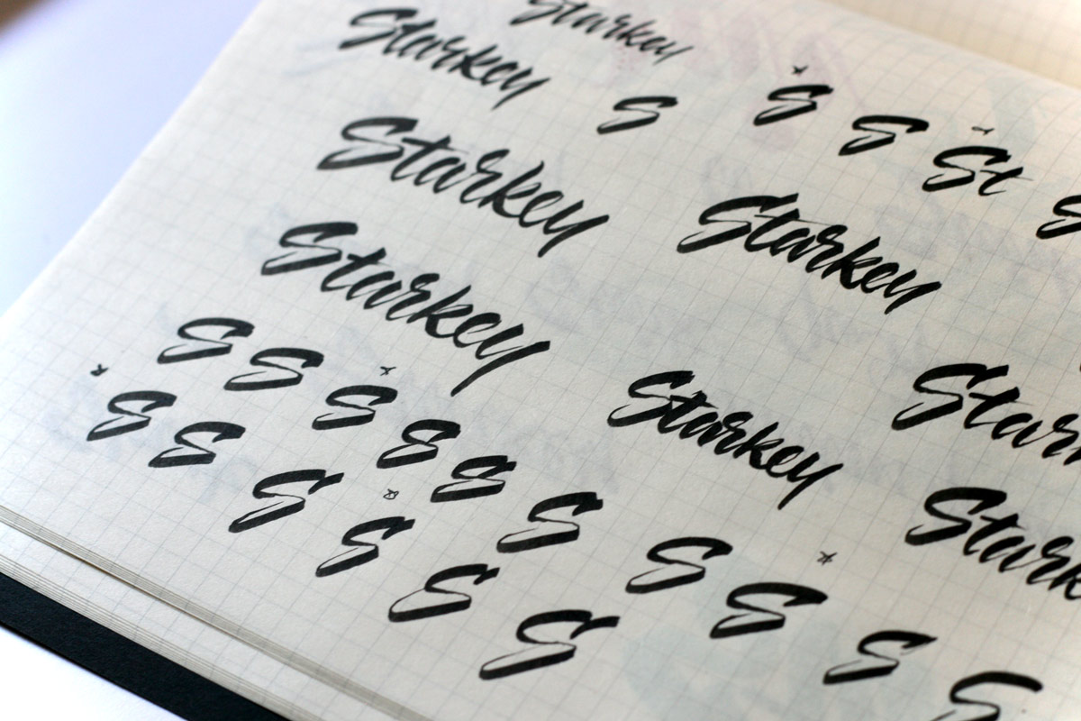
What better way to capture this unique expression than with a brush pen? The wordmark wouldn’t be anything like a font. It had to be truly original. It had to be “perfectly imperfect”.
I gathered my different types of brush pens and begin sketching the word over and over.
Execution and Refinement
Writing the name over and over again allowed me to get comfortable with the letters and explore different ways to achieve the letters using different expressive gestures.
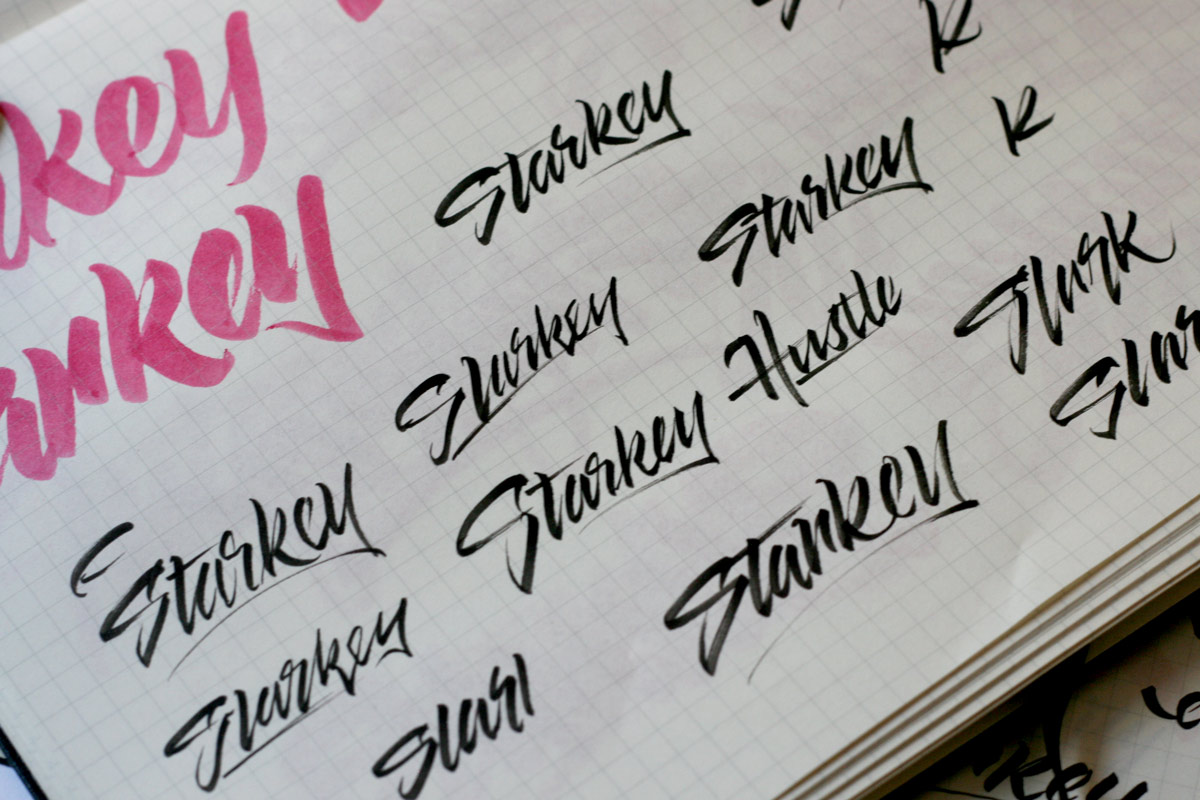
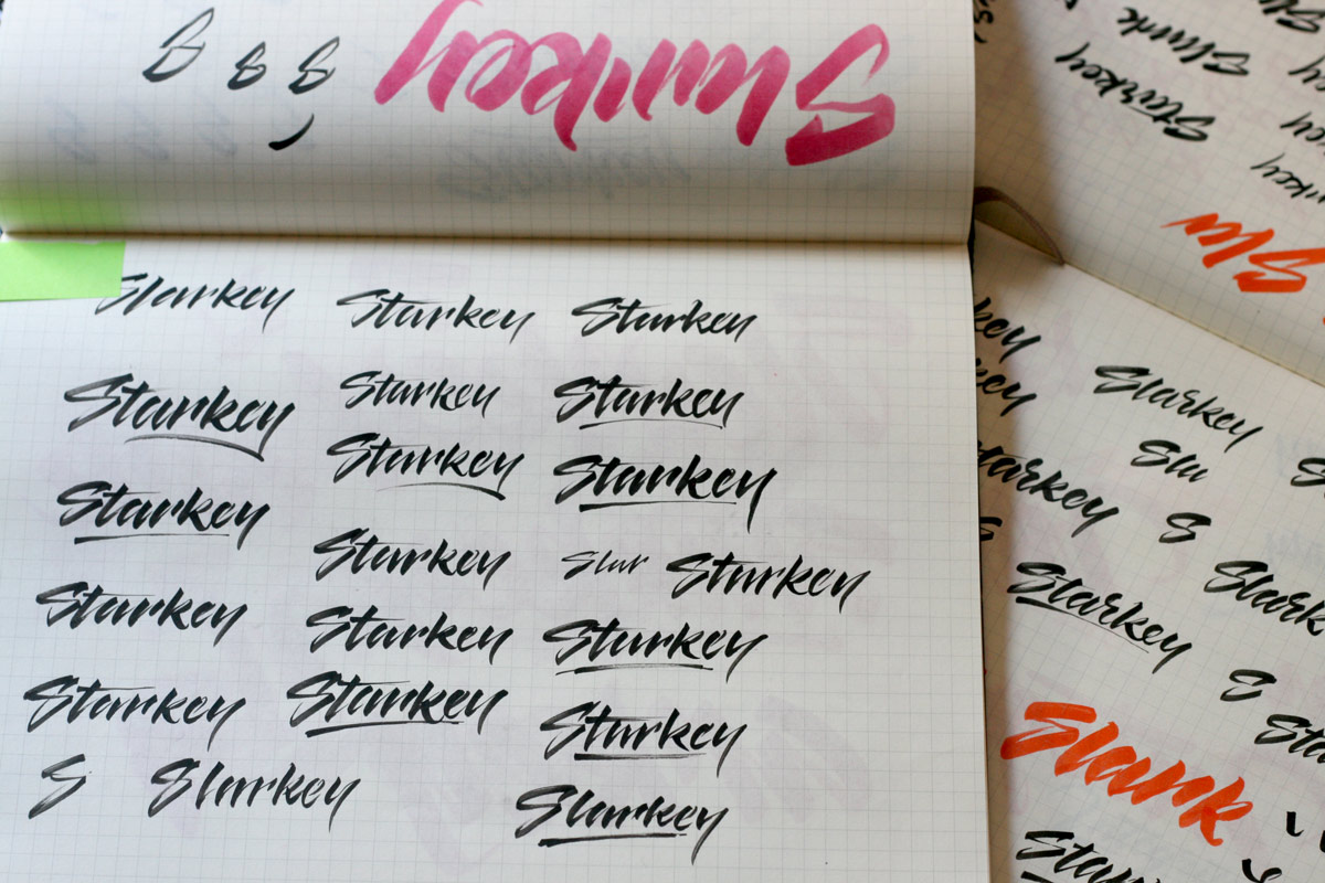
After several-hundred sketches, I reviewed all of them and picked the best ones. I studied every aspect of what made each one good and combined them into a solid solution that I was fully satisfied with.
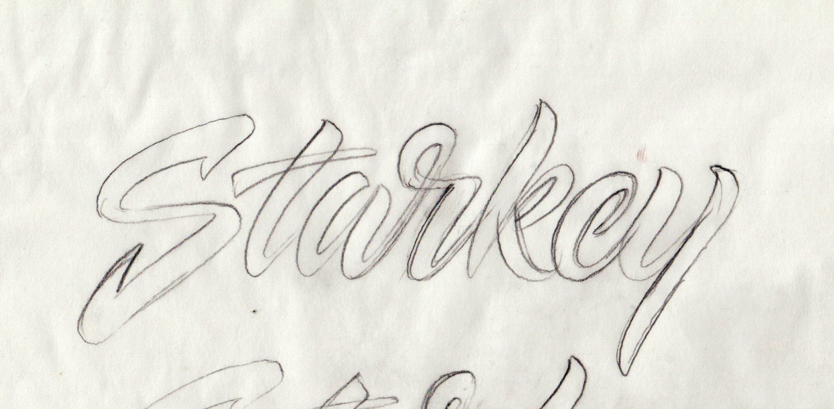
In order to get a drawing that I could work from in the vector phase, I scanned the small brush pen drawings. I blew up the scan to a large size and printed it out. On tracing paper, I traced the design and carefully refined the letterforms to perfect every single detail.
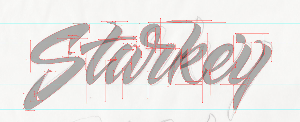
The first pass in the vector phase came out pretty good but there were certainly some inconsistencies that needed to be addressed. The S has looked good in sketch form. However, when it was vectorized, it was just too large. There were also small inconsistencies in the A and the Y that stuck out. These became even more awkward when the design was shrunken down. Since the logo would be used in many applications, I wanted to make sure it looked perfect in every context.
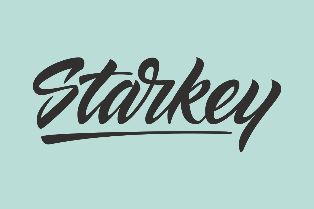
The Final Product
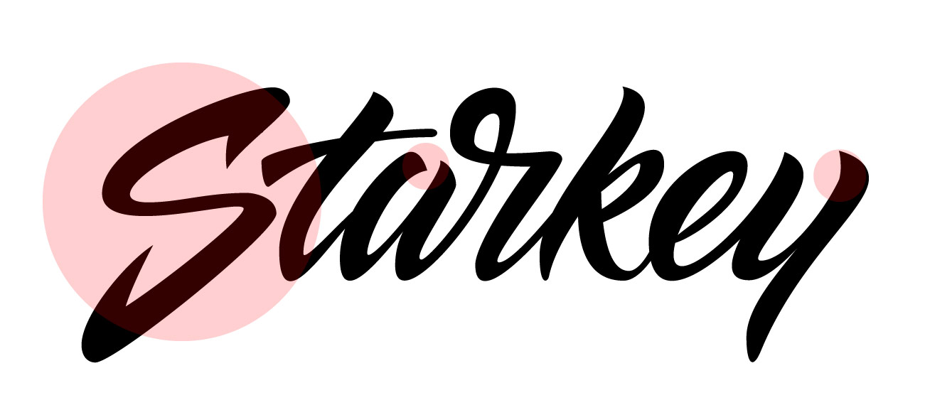
Towards the end, I added an underline as another design element to help tie the logo together and balance out some of the white space on the bottom of the letteform.