
The Ultimate Blackletter Calligraphy Resource Guide
In this article, you’ll learn everything you need to know when it comes to shopping for and experimenting with supplies for Blackletter calligraphy tools. This post is NOT an all-encompassing list of every tool out there, it’s a zero-fluff list comprised of only the best that I’ve discovered throughout my entire journey through calligraphy.
Whether you’re looking to learn Blackletter or other flat-pen calligraphy styles and don’t know where to get started, or you have plenty of experience and you’re just curious, this article will serve you as a comprehensive list of tools and learning resources. I’m talking about writing instruments, paper, canvas, inks, paint, and even instructional materials.
One would have to be a millionaire to buy every tool out there. With that said, I haven’t tried every ink on the market or every type of brush or canvas. However, I have reached a point after years upon years of experience where I’m now extremely satisfied with my toolset and knowledge of materials. And I’m confident that you’ll be more than equipped to conquer any sort of project throughout your own journey with the tools on this list.
A quick disclaimer before we jump in… don’t go and buy all of these tools at once. Your toolset will enable you to do you very best work but a tool will never make you a better artist. Bottom line; all you need to start is one pen and a pad of paper.
Okay, let’s dive in.
Writing Instruments
With so many choices, but which one’s are the best? First, decide what interests you most. Fountain pen? Dip pen? Brush? Marker? Each have their pros and cons, and each have their own nuanced learning curves. If you’re just starting, I’d recommend a fountain-pen or a marker simply because of their convenience and ease of use. But don’t let that stop you if you’re eager to try something else!
Pilot Parallel
First things first… if there is ONE tool you should own, it’s a Pilot Parallel.

The Pilot Parallel is a versatile fountain-pen that comes in four different-sized nibs (Red: 1.5MM, Orange: 2.4MM, Green: 3.8MM, and Blue: 6mm). The colors just denote the size of the nib which is convenient if you multiple pens. The tip is comprised of two parallel slabs of metal that feed the ink from a standard cartridge into ink reservoir.
These pens are extremely precise, robust, and easy to maintain. They come with some maintenance tools as well as a couple of cartridges. Additional cartridges can be purchased and while the ink is of good quality, you can easily refill them manually with the ink of your choice for variety and to save money. Alternatively (or additionally), you can dip the pen into an inkwell and it will behave like a dip pen, which makes working with different colors on-the-fly a synch.
Furthermore, the Parallel can be modified and hacked in a number of ways. If you’re interested in pushing the boundaries of this tool, check out my comprehensive Parallel owner’s guide post:

Other Good Fountain Pens
I can’t recommend the Pilot Parallel enough when it comes to fountain-pens. They top anything on the market when it comes to both cost and quality. However, if you’re interested in exploring further, here are two other pens worth checking out.
Lamy Joy

The Lamy brand is a higher-end pen manufacturer and their Joy fountain pen is fantastic for smaller-scale work. The nib is 1.9MM, which makes it small enough to practice other styles of scripts such as italic or Copperplate. This makes it a particularly good choice if you practice a variety of styles. It’s also quite small, so it fits right in your pocket.
Rotring ArtPen
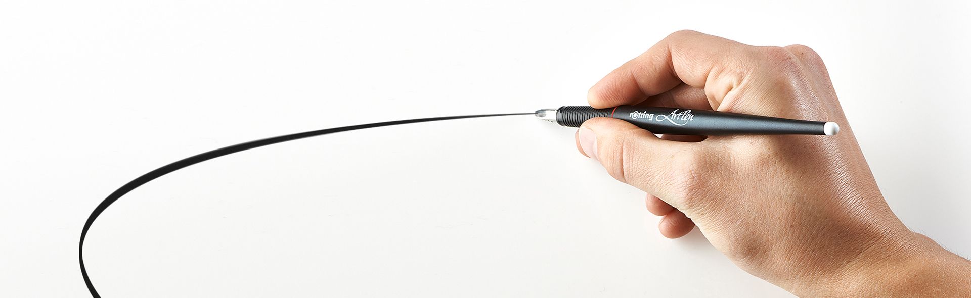
Rotring’s ArtPen line offers a 2.3MM nib, which is slightly bigger than the Lamy. But its nibs are also interchangeable in case you want to go smaller. So if you practice other styles of scripts, this is also a good choice.
Automatic Pens
Automatic pens are extremely simple, but also incredible versatile. Basically, it’s just a stick with two metal slabs. The slabs are spaced and angled diagonally to meet together at the tip. The space between the nib acts as a reservoir to hold your ink. Even though they require a quick clean after each use, a great aspect about automatic pens is you can a wider variety of pigments than a fountain-pen since it has no internals (some pigments can dry inside of fountain-pen reservoirs).

Automatic pens also come in a variety of sizes ranging from tips smaller than a Pilot Parallel all the way to large poster-sized tips. You can also find automatic pens with splits in the nib that will allow you to create multi-line scroll effects.
Be aware that for what they are, they do tend to be a little expensive. So before you go buying a set of every size, try buying one or two to see how you like working with them.

When you first start working with an automatic pen, here are a couple quick tips worth noting:
- Wash it with warm soap and water and dry completely before its first use. They tend to ship with a protective coding that can repel ink.
- Before committing to a large composition, warm up and test your pigment on a scrap paper to get comfortable with the ink flow.
- One side of the nib is solid and the other has little slots. Write with the slotted side of the nib down. This allows the ink to flow optimally.


Pen Nibs
Just like pointed pen nibs, you can also buy flat-pen nibs to stick in a standard calligraphy pen holder (I’d advise against using oblique holders).
Dip nibs do come with a steeper learning curve, so consider holding off if you’re just starting. They don’t work particularly well with standard inks either, so you’ll need to mix your own. Gouache and water is the best way to go, but this too does require some trial and error to get the appropriate consistency.
Brause Nibs
These classic Brause calligraphy nibs are unbeatable when it comes to dipping. They’re inexpensive and come in a variety of sizes from .5MM all the way up to 5MM (which is just in between the two larger Pilot Parallel sizes for reference).
Speedball C-Style Nibs
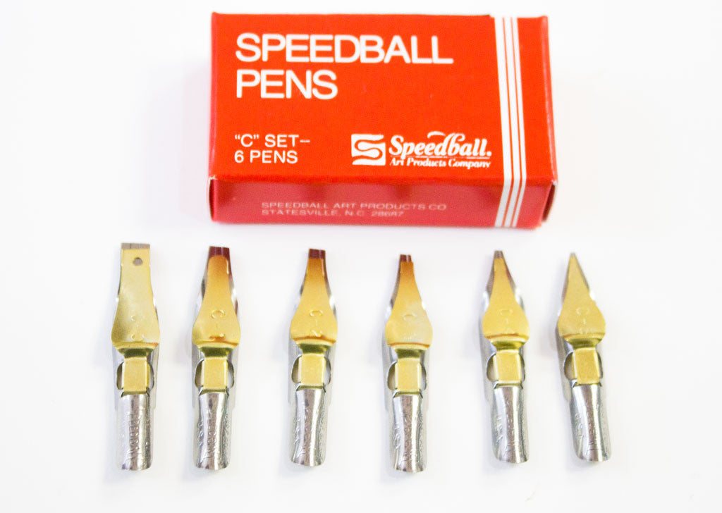
Speedball’s standard set of flat-pen nibs (C0—C5) is another great option.
Nib Holders
Trying to write with just the nib would be a bit of a pain, wouldn’t it? If you decide to go the nib-route, you’ll also want to grab a nib holder.
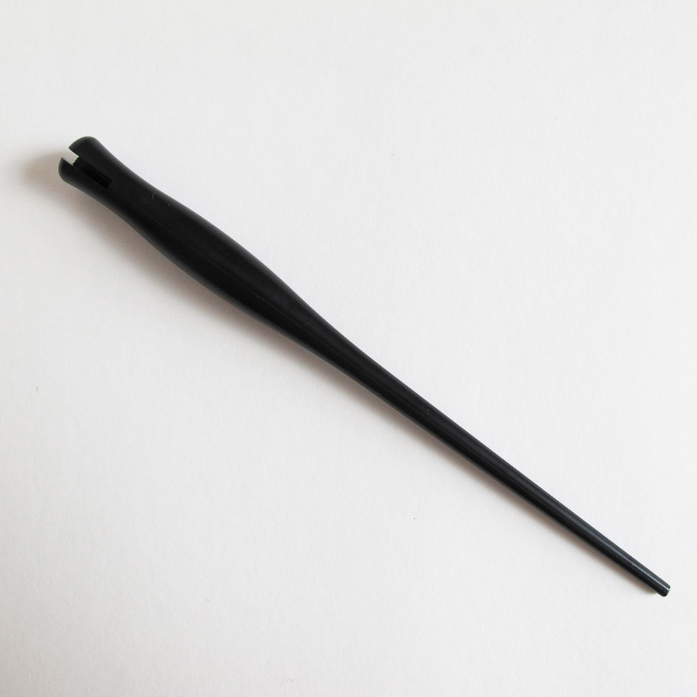
All these do is hold your nib, so you don’t need to go crazy picking one out. In fact, I’d recommend just getting the cheapest one you can find (less than $10 USD). Just be aware that they generally come in a small size and a large size. You’ll want the larger one. The smaller holders are meant for smaller, compact pointed nibs.
You should also be aware that some holders are “oblique” style holders:

These are great for pointed pen calligraphy (Copperplate, Spencerian, and other pointed scripts). However, using this style of holder with broad nibs is a pain and is not recommended.
Brushes
Like dip nibs, brushes also require a degree of learning, but the effort is totally worthwhile! Unlike any other writing tool, brushes offer a variety of truly unique characteristics. For example, they have the ability to flex. This give you the ability to add gesture and expression to your work in a way that a pen would never allow for. You can also create unique textures depending on how you mix the consistency of your pigment.
With the endless variety of brushes on the market, it is difficult to give definitive advice on which brushes are the best for creating flat-pen calligraphy. The primary reason for this is because everybody has their own style and preferences when it comes to a brush’s bristle length, material, and stiffness.
If you’re more heavy-handed, you might consider trying a stiffer brush with shorter bristles. This will give you more control over your strokes. On the other hand, if you have worked with brushes in the past and feel confident in your abilities to control a more flexible brush, you might prefer this approach. Flexible brushes are particularly great at capturing gesture and expression within a stroke.
You may also find that your preferences reflect your mood. If you’re feeling stressed or anxious, you’ll likely apply more pressure to your strokes. Try starting with a stiffer brush and then move to a more flexible brush once you’re feeling more relaxed. Bottom line, there’s no silver bullet. Experiment to find what works best for you.
With that said, here are the brushes I use. If you have no idea where to start, you certainly won’t be disappointed with these.
Princeton Umbria (6250 Series) Brushes
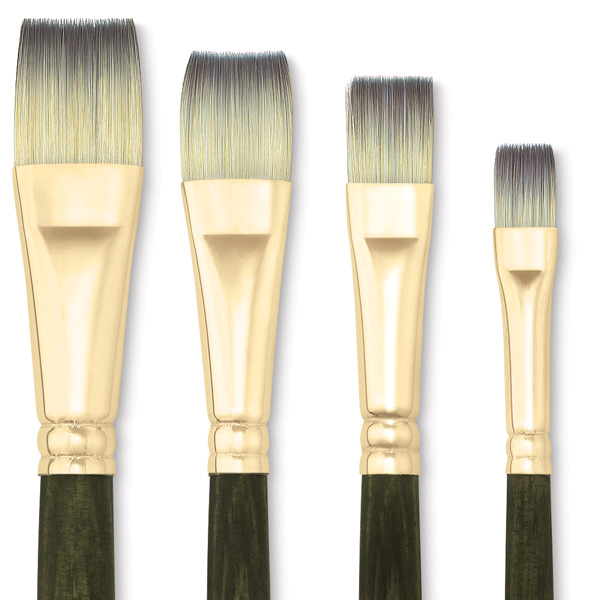
Princeton’s Umbria 6250 line offers a reliable set of brushes in a variety of sizes. The synthetic bristles flex nicely under pressure and retain their shape, even after extended use. Their short bristle length allows for precise stroke control, which is perfect when it comes to blackletter calligraphy.
Blick Studio Synthetic Brushes

The Blick Studio Synthetics by DickBlick are a less expensive brush option, but still of wonderful quality. Their stiff bristles are capable of providing crisp, sharp strokes, while still allowing for a degree of flexibility.
Liquitex Freestyle Brushes
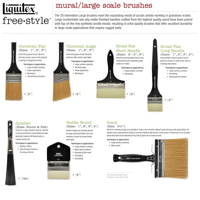
Looking to go bigger? Liquitex makes a line of larger-scale flat brushes in their Freestyle product line. These brushes are equipped to handle harsher materials which is important if you’re considering outdoor murals. Even if you’re only looking for something bigger, this line is a great place to start.
Markers
Let’s break this down into two categories. First, you have small calligraphy markers. These are generally made from a felt tip and can be found in any stationary stores and come in one of three different styles:
- Brush tip: These are great for brush script, but not for flat-pen calligraphy, so I wouldn’t recommend these for for this particular style.
- Chisel tip: These are flat-nibs cut at an angle. Think of a large Sharpie. You can make them work, but I wouldn’t recommend these either.
- Flat tip: In the context of flat-pen or Blackletter calligraphy, this is what you’re after.
These smaller markers are great to learn with (I learned with them myself), but I have found myself moving away from them ever since I started working with Pilot Parallels, automatic pens, and brushes simply because their nibs wear out fast. Even before they run out of ink, the dull nibs quickly reduce the desired sharpness of your strokes.
Then there’s have paint markers. Arguably, these are better suited for a different application than writing on paper (e.g. canvas, glass, or other hard surfaces). Paint markers tend to be larger in scale with thicker nibs capable of holding harsher, more permanent pigment. Traditionally these are marketed as “graffiti” or “street art” markers, so you’ll probably find these near the spray-paint section of your local art store.
Now that we have that out of the way, here are my marker recommendations.
Elegant Writer (3MM) Calligraphy Marker

The widest tip (3MM) of the Elegant Writer marker line by Speedball is a good everyday blackletter utensil. Even though the tips tend to dull quickly with heavy use, they are inexpensive and widely available at most arts and crafts stores. They can be ordered in bulk online and also come in smaller sizes.
Zig Dual-Tip Calligraphy Marker

The Zig calligraphy dual-tip marker is the best everyday calligraphy marker on the market. It comes with a 2mm and a 6mm felt tip, which allows you to vary your letter sizes. The 6mm nib is nice if you’d like to work at a larger scale than the 3mm Elegant Writer.
15MM Acrylic Paint Marker
As mentioned, these larger, heavy-duty markers are generally marketed towards graffiti/street artists. Generally, they’re all constructed the same. You’ll find brands such as OTR, Grog, Krink, Molotow, and Montana.

The only differences I’ve found between each tend to be the opacity of the pigment. In my opinion, Molotow is the best, followed by Montana. I haven’t been as impressed with anything else. However, you can usually buy empty markers and fill them with whatever liquid acrylic you like. If your local art store sells liquid Molotow paint, I’d highly recommend that.
Writing Surfaces
If you visit your local art store, you’ll find an overwhelming selection of paper to choose from. The good news is that most of it will work just fine, so here’s the one area in which I’d recommend not being too choosey if you don’t know exactly what you’re after. In fact, knowing the types of paper to avoid is probably more important than knowing which paper is best for your needs.
Writing surfaces comes in many materials and qualities, but two most important aspects for calligraphy artists is weight and texture.
Paper weight is rated in poundage or grams (GSM or g/m which denotes grams per square meter). Basically, the higher the number, the heavier the paper. Plain copy/printing paper sits at around 20lb. (or ~75g/m), so use that as a baseline. Anything below this is thinner and probably won’t hold your pigment (the paper will bleed and/or warp). Even plain every day paper might not be suitable for your needs. Card stock is generally twice as thick and that weight, or anything above it will work just fine. Just keep in mind, the thicker the paper, the more you’ll pay.
Texture represents the actual textural makeup of the surface. For example, plain mixed-media paper will have less texture than watercolor paper. Texture isn’t necessarily a bad thing — it will depend on the result you’re after. However, more fibrous (and often, handmade) will likely give you some trouble, causing your nib to get caught and pull up fibers that mess with your work.
So the general rule of thumb is to stay away from newsprint or any other thin, low-weight paper as it will likely bleed and warp. And stay away from anything fibrous as it will likely catch your pen. Beyond that, experiment with any other paper within your price-range for optimal results.
Bristol & Other Mixed-Media Paper
When a paper is toted as “Mixed-Media”, it denotes that it can handle both dry and wet mediums. Since ink is wet, it should work just fine. Brands don’t really matter much here, but spring for Strathmore and Canson if you can. Both brands are reputable, mainstream paper manufacturers well-known for their quality.
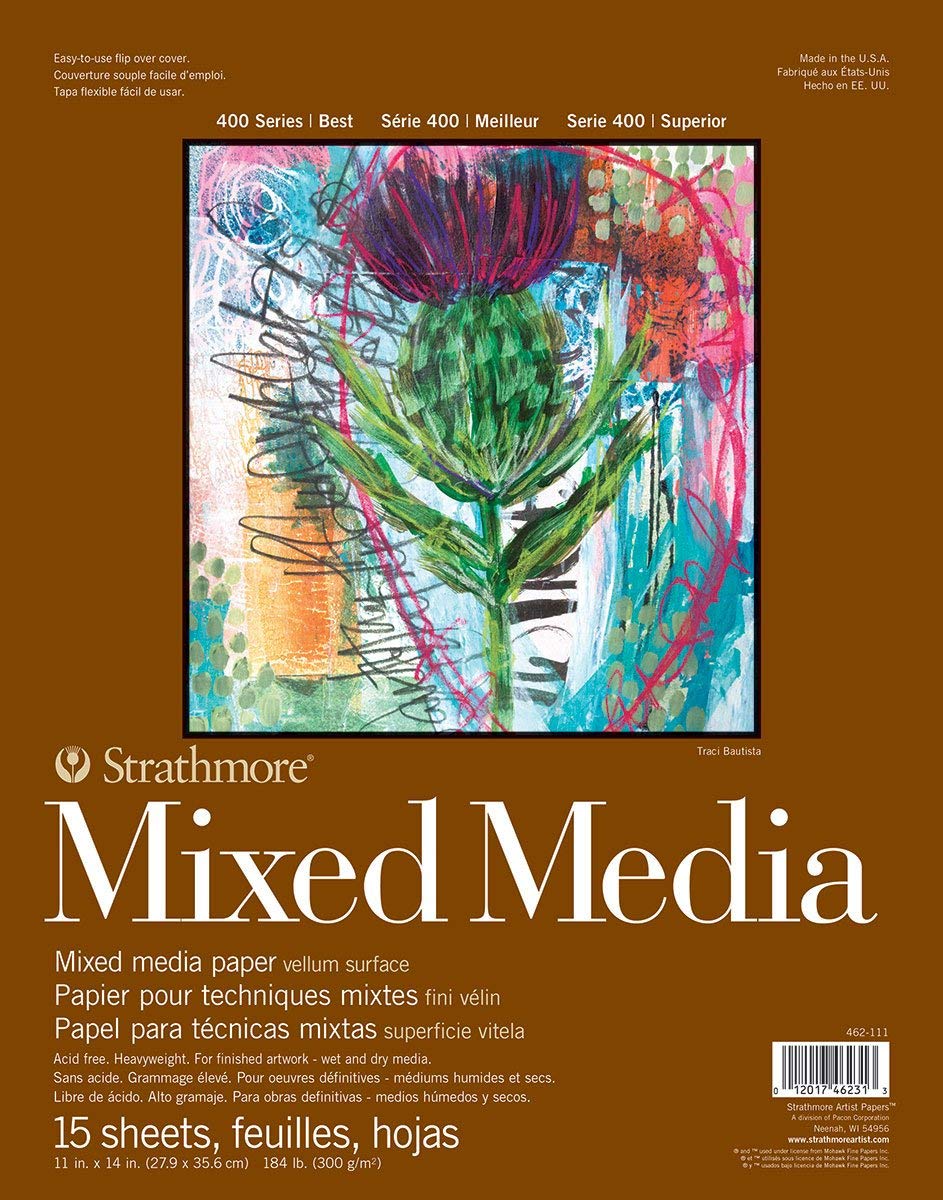
Another great go-to is Bristol. You can typically find these in both “Vellum” or “Smooth” surfaces, the difference is quite negligible when it comes flat-pen calligraphy. A bristol piece of paper is comprised of two, three, or four multi-ply sheets glued together under pressure, which means it’s quite thick and less flexible than other drawing or mixed-media paper (think plywood vs. cardboard). Because of this, it’s generally sold at lower quantities and at a higher cost, but the quality is excellent.
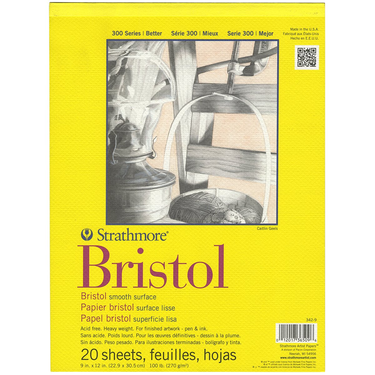
Pro tip: If you can, opt for paper that is labeled “acid-free” or “archival”. This just means that it isn’t treated with chemicals that will cause it to age and discolor over time. This is ideal for work you might end up selling or displaying down the line.
Watercolor Paper
Watercolor paper tends to be of the thicker papers you can buy since it’s meant to hold water. This makes is great for any other sort of wet media, especially calligraphy ink!
You’ll also find that watercolor paper is available in a spectrum of different textures. All of them work great for calligraphy, but keep in mind that the more texture you have, the more “spotty” and weathered your work will look. To some, this might be a desired effect.
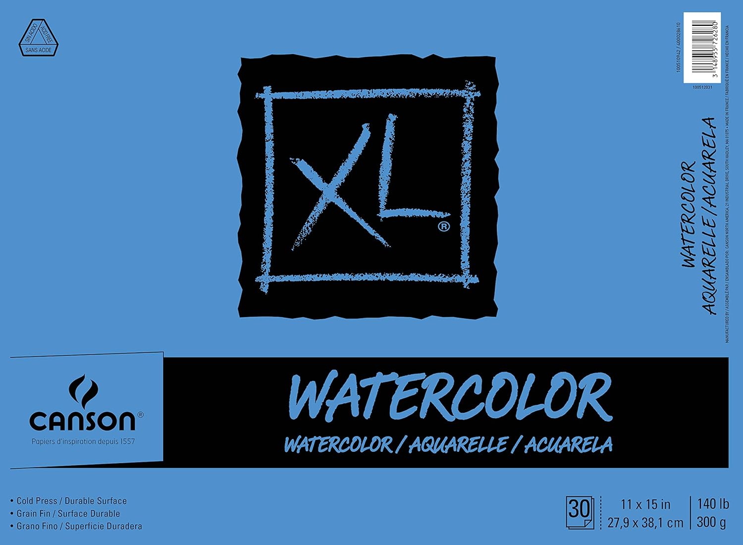
Canson’s Watercolor paper is my personal go-to, particularly when working with automatic pens. It’s a whopping 140lb (300g/m), so it can really hold a considerable amount of pigment and it comes in a variety of different sizes.
Note: Due, to its thickness, watercolor can often be confused for pastel paper. Be weary of pastel paper. Despite its weight, it is commonly fibrous. And we don’t want that!
Charcoal Paper
Charcoal paper is also pretty good for flat-pen calligraphy practice.
I almost left it off this list, but I find myself buying it over and over again, so I felt it was worth touching upon. It’s relatively inexpensive, and while it might not be as desirable as bristol, mixed-media, or watercolor, you might consider it more expendable for practice purposes.
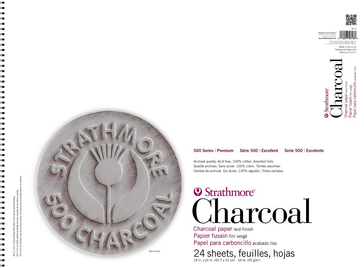
Strathmore’s Charcoal paper has a nice texture and it can bring out some nice character to your work. However, you’ll want to make sure your pigment isn’t too strong or else it will bleed and warp.
Black Paper
Black artist paper is a relatively new new. Sure, you’ve seen black construction paper (stay away — too many fibers), but black artist paper is different in that it behaves very similar to mixed-media paper. This is ideal if you’re working with opaque colors, especially white. Inverting the color your work can bring about entirely new qualities and characteristics.
The trick to working with black paper is finding the right pigment. If it’s too thin, it will disappear into the page in be ghosted or invisible by the time it dries. I’ll touch more on this in the upcoming ink section.
There aren’t nearly as many options out there, but here are two that I swear by.
OOLY DIY Sketchbook
OOLY is a brand that used to be called International Arrivals. OOLY’s DIY Black Notebook is fantastic. They come in a small (5″x7.5″) and large (8″x11″) size and both contain 75 sheets.

The sheets are somewhat thin, which is a double-edged sword. They don’t actually bleed like other thin paper which is great, but they do warp and bend a little. On the other hand, their thin nature gives the ink less space to seep into so the ink ends up being more vibrant.
I enjoy working in white so I keep some OOLYs on hand for practice.
Canson Colorline Black Drawing Notebook
Canson recently released its Colorline Black Drawing Notebook, which is excellent! At 92lb (150g/m), the 9″x12″ paper warps far less than the OOLY which makes it perfect for finished pieces for sale or display.
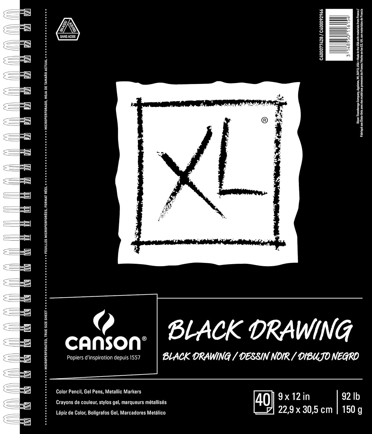
Just be sure not to use an overly-diluted pigment, otherwise it will be tough to get fully opaque lines. Even if you can’t, the textured strokes still make for a nice effect!
Canvas
The idea of working on canvas might seem a little intimidating at first, particularly since most canvases are bigger than any paper you’ve worked on. Canvas also behaves differently than paper since it’s made from a different material that has its own unique texture. But the best thing about canvas is that you can paint over it and start over as many times as you like until you’re satisfied with end result.
When it comes to buying canvas, particularly for a newcomer; start cheap. Seriously, the cheapest you can get. There are countless brands, but the differences they offer will mean nothing to you until you begin experimenting. In fact, the differences might not ever mean anything depending on the type of work you’re doing.
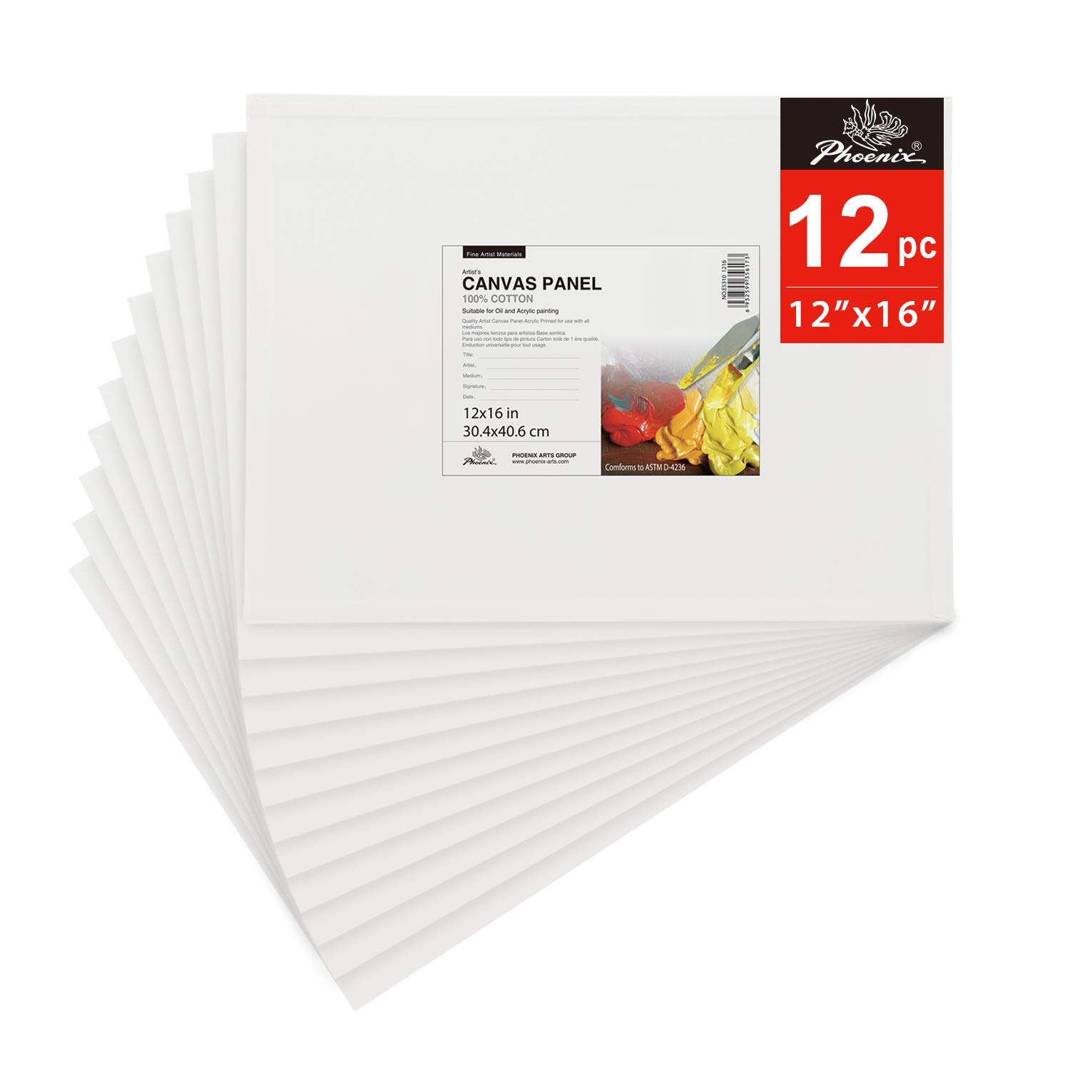
Keep in mind that canvas is made for a variety of wet mediums (oil, acrylic, etc.) and when it comes to combining different qualities/materials of pigment with different qualities/materials of brush with different types of canvas, there are infinite outcomes.
Calligraphy is far different than painting a colorful landscape. So this is one area in which you should not overthink. Start cheap and find what you like. Personally, I’ve worked on canvas for years now and still buy the cheapest canvas I can get my hands on.
Inks
So many inks, so little time (and money)! Experimenting with inks can be an expensive investment. In my case, I’ve given away the majority of the ink I’ve bought to non-calligraphy artists because the ink I chose just wasn’t suitable for the calligraphy work I was doing. Sigh.

After all of that experimentation, I’ve found a great round-up of my go-to inks. You can’t go wrong with any of them. And unless otherwise noted, all of these are fountain-pen friendly.
Standard Everyday Inks
I divided inks into two different categories; standard and specialty. These standard inks are what I would recommend for general every day use. They’re reasonably priced and perfect both practice and finished works on the paper of your choosing.
Higgins (by Chartpak)
When it comes to working in black or white, I personally don’t think Higgins can be beat. I tend to stock up on bottles of black and white since they’re the ones I use most. However, they also come in a variety of both dye-based and pigment-based inks. Both will work in fountain-pens, but the dye-based will flow a little better. However, the intensity of the pigment-based inks are quite impressive.
Higgins also sells inks marketed for calligraphy, such as Higgins Eternal. They’re sold in bigger dropper-less twist top containers. I find that these bleed more when it comes to flat-pen calligraphy — particularly when fed through a fountain-pen such as a Pilot Parallel. For that reason, I stick to these two inks exclusively. Just look for the ones with droppers and you’ll be good to go.


The black is slightly muted, which happens to be an effect I like in my work. The white… oh man, the white. It’s unbeatable! Just be sure to shake it vigorously before dipping or filling up an ink cartridge.
Calli & FW Artist Inks
Both Calli and Daler-Rowney’s FW artist inks are fantastic brands that sell affordable, high-quality inks in a wide variety of colors. There’s really nothing more to say. Pick your favorite colors and get writing! They work great in fountain-pens (excellent flow) and are also great to dip into with automatic pens.


Pilot Parallel Ink Cartridges
Pilot sells replacement cartridges for the Pilot Parallel. Their proprietary ink blend is excellent and difficult to recreate with other ink due to the way their ink flows through the pen so nicely. You can buy 12-piece replacement packs in black, individual color or multi-color. I’ve also seen bulk packs here and there, but they’re hard to come by.

The major drawback of these replacement cartridges is two-fold. First, you can only use them exclusively in the Pilot Parallel. And second, constantly buying replacements can become expensive, particularly if you write a frequently. Sometimes, I go through two or three cartridges in a single sitting. With that said, I’d recommend manually refilling your cartridges with other inks if you’re trying to spend conservatively.
Specialty Inks
If you’re after something a little more fancy, or if you’re interested in working with vibrant colors, you should consider investing in some specialty inks. While they might be a more expensive than your standard everyday inks, you might be able to justify the spend once you see some of these inks in action.
Jaques Herbin Ink
Jaques Herbin ink has been around since 1670! For centuries, it has been considered some of the highest quality ink money can buy. Their entire offering is wonderful, but be sure to check out the 1670 line of inks.
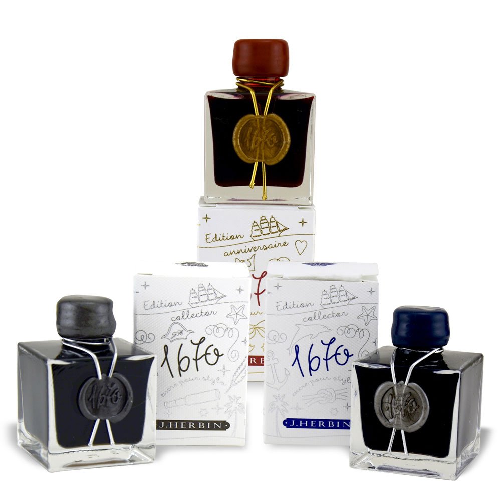
The 1670 line offers a breathtaking array of colors. The ink is mixed with tiny pearlescent sparkles that you might be hesitant to put into a fountain-pen. But fear not — it works wonderfully and will not clog your pen internals. The coolest thing about these inks is the varied tonality you’ll get when the ink is concentrated differently. Here’s an example of the Emerald of Chivor color:

You can see how just how brilliant the color is. The ink has subtle glow from its sparkles and the color becomes a deep purple where the ink is more concentrated.
Jaques Herbin ink is not cheap in comparison to other standard everyday inks. A single inkwell of the 1670 line will run you $25-$35 USD, but the 50ml should last a good amount of time if you’re using fountain-pens or automatic pens. Before you put it into your pen, give the pen and cartridge a thorough cleaning so that the vibrancy of the ink isn’t subdued. Be sure to give the ink a good shake too.
Ecoline Liquid Watercolor Inks
Ecoline offers a line of liquid watercolor inks and their brightness is incredible. You can purchase the colors individually, but I would recommend starting with the 10-piece set, which comes with nine different colors (plus black).
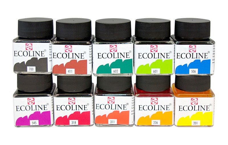
These inks are made to blend, so if you keep the ink nice and wet throughout your composition, try mixing colors here and there. You’ll quickly get a feel for their power, which will enable you to create stunning color combinations and beautiful color mixes.

These inks can be safely added to a fount pen, but because of their color-mixing qualities, you should consider using an automatic pen or brush. This will allow you to mix colors more frequently.
Concentrated Liquid Watercolor Inks
Several brands offer concentrated watercolor ink. They generally come in small droppers and per their name, are concentrated so that you can add a drop or two to plain water (the amount of water will depend on how intense you want the color to be) to create higher quantities of ink. This gives you more flexibility when it comes to creating and blending color.

My local art store only carries Dr PH Martin concentrates, so that is the brand I use personally. However, other brands should work just fine. Grab yourself a couple of colors that will work nicely together and experiment to find your perfect blend.
Just like the Ecoline liquid watercolor inks, these inks are also fountain-pen-friendly. But likewise, you’ll have the most flexibility with brush or an automatic pen when it comes to working with multiple colors.
Gouache
Okay, so gouache isn’t technically ink. It’s ground pigment mixed with water and a binding agent that makes it more of a thick, goopy, glue-like consistency. However, you can mix water to dial back the thickness to achieve the desired viscosity. Your desired viscosity will vary depending on the type of work you’re doing, the surface you’re writing on, and the instrument you’re using to write.
As for brands, buy the most expensive one you can afford if you’re working with colors. Cheaper gouaches tend to lack vibrancy. In my opinion, Winsor & Newton gouache is the best bang for the buck. It comes in a variety of colors, but if you’re just writing in black, you can get away with cheaper
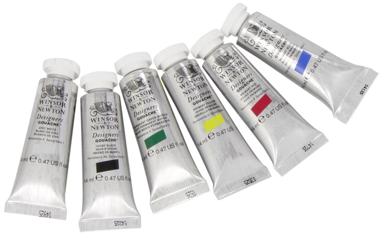
When working with gouache, add water little-by-little (just a couple drops at a time). You can always add more, but you can’t take it away. Once you find a consistency you’re happy with, document how much gouache you used and how much water you applied to the mix.
You’ll get the best results and the most mileage if you work with a brush, but automatic pens will do if you add enough water. Gouache is not fountain-pen-friendly. Like paint, it dries and will ruin the internals of your pen.
Miscellaneous Tools
You’ve got the essentials, but there are a couple more tools you should consider adding to your arsenal that will allow you to streamline your workflow.
Mechanic Pencil & Eraser
You’ll want a pencil and eraser to draw and erase guidelines to make your compositions consistent.
In regards to the actual pencil and erase, there are no secrets. You don’t need anything special. I use BIC mechanical pencils because they’re easy to steal from the office. Their graphite tends to be lighter and softer, which makes erasing them easy. The erasers they come with are excellent.
Many artists prefer to use self-healing kneaded erasers. These work great too.
Artist Light Box
Good god, where has this thing been all my life?! My buddy Josh Yelle (@Pencilmancer) recently turned me on to this thing and it’s been a life-changer. Basically, it’s a thin, lightweight panel that contains a vibrant (and adjustable) backlight. The light is powered by USB, so you can just plug it in, turn it on, and get to work.

My favorite aspect of using the light box is that I don’t need to draw out guidelines for my work each time. Instead, I keep a couple reusable guides that I put underneath the paper I’m working on. The light shines through both sheets (almost like tracing paper).
I might also recommend grabbing this transparent gridded plastic template. It’s clear and works great as a guide for any sized work you’d do on the light box.
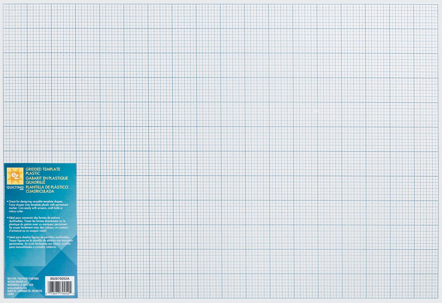
Pro tip: use some masking tape to anchor the guide as well as the paper you’re working on to the light box to prevent the template from shifting underneath your work.
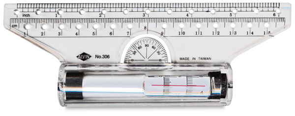
Artist Rulers & T-Squares
Artist rulers (and especially T-squares) are helpful for drawing straight guidelines before laying your composition down (if you really don’t want to invest in a light table). Once again, nothing special here. Aluminum is recommended because it is a resilient material and will last forever. Plastic tools tend to split and snap easily and can be more difficult to clean if there is dried ink or paint stuck on them.

An alternative to a T-square or straight edge rulers is a rolling ruler. Rolling rulers take a little practice to get the hang of, but they make creating guidelines a breeze. Essentially, it’s a straight-edge ruler with a built-in… inner ruler. You draw a line, and without lifting the roller, glide it along the page to the desired space (which is indicated by markings on the inner ruler), and draw your next line. Very handy.
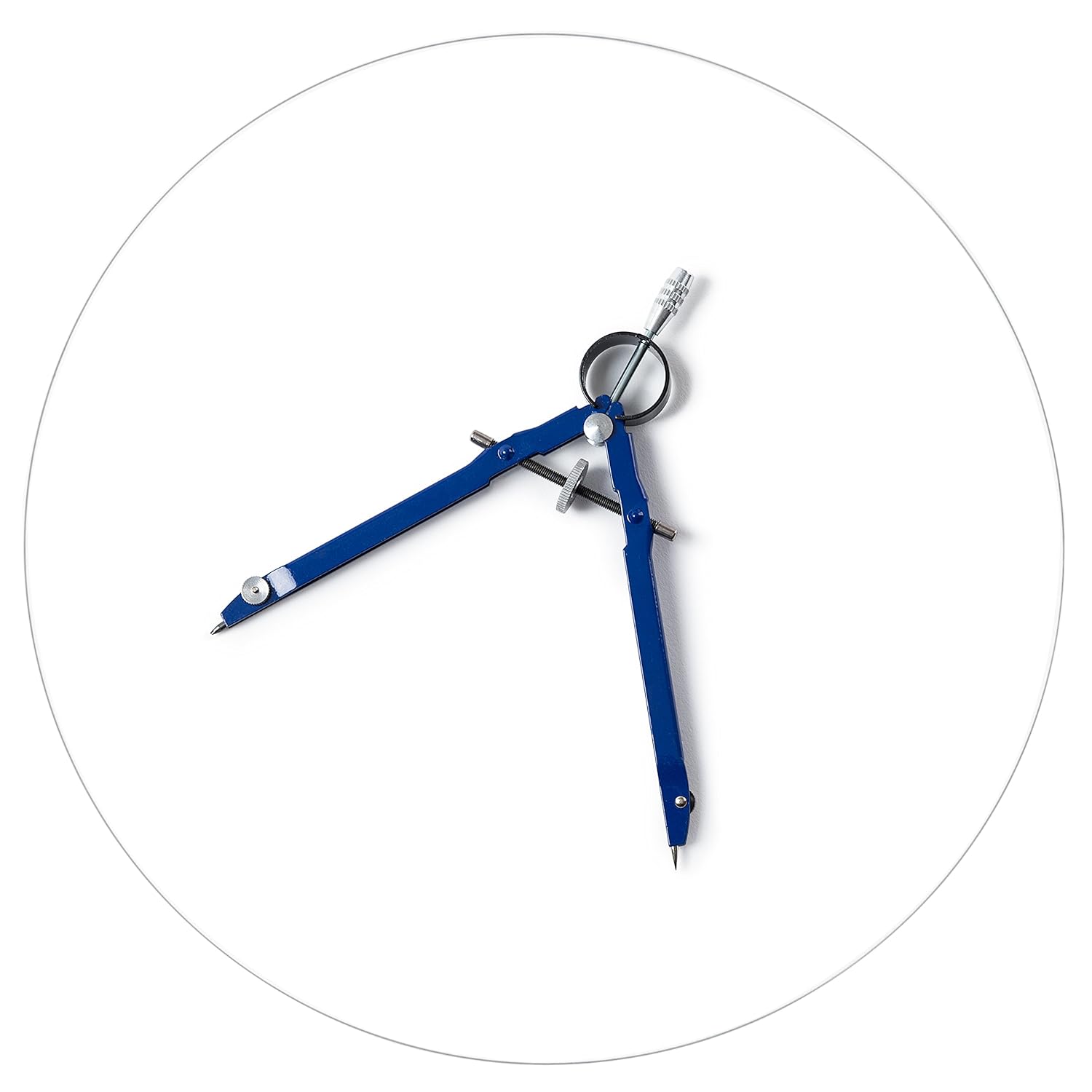
Compass
A standard architect’s compass is helpful if you’re working with a curved or circular composition or a composition that involves non-straight curves. You can buy them cheap or even fashion one yourself if you’re feeling crafty.
Another cool tool that you might want to invest in if you’re planning on working at a larger scale is a tape compass.
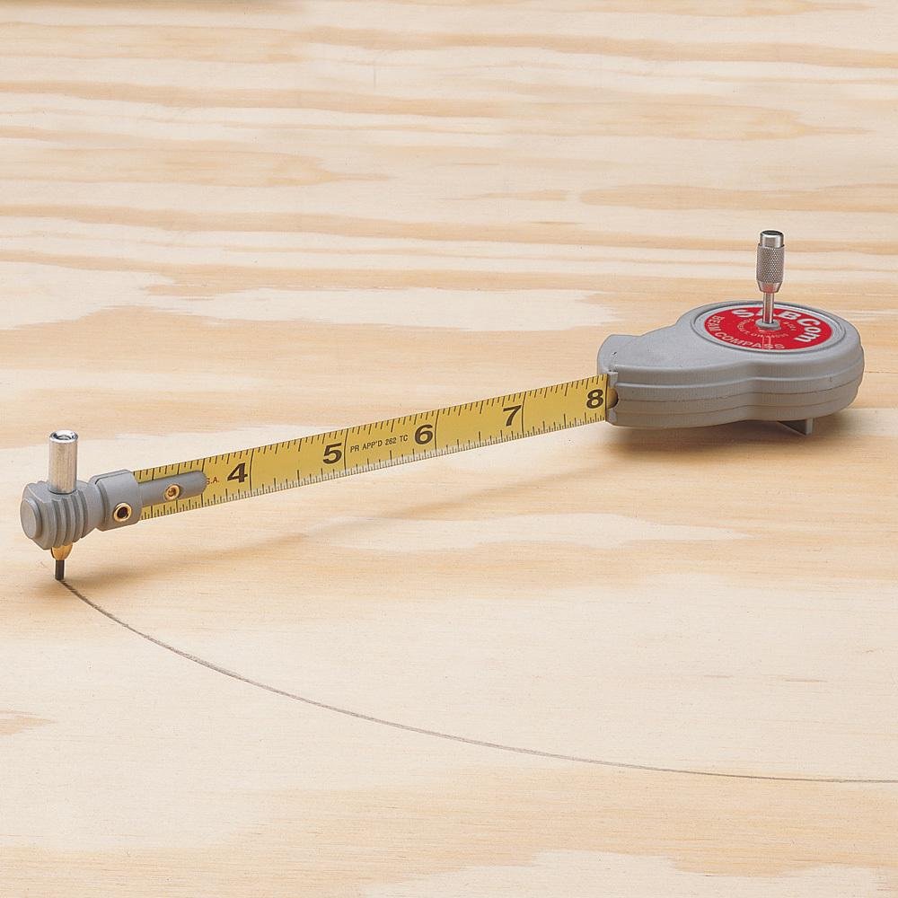
This thing is awesome. It can draw circles as little as 3.5″ in radius all the. way up to 72″ in radius (that’s a big circle!).
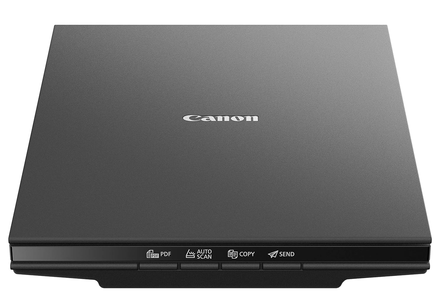
Scanner
If you plant to digitize your work (whether it be for a website, creating prints, or converting to vector), consider getting a scanner. The Canon CanoScan Lide 300 Scanner is a perfect, affordable choice. It is every straight-forward and easy to use. Just plug in a USB chord and you’re off to the races.
iPad Pro, Apple Pencil and the Procreate App
What? That’s not real calligraphy!
I suppose not, but despite what all of the YouTube haters might say, it’s not cheating and it will certainly not make you a better calligraphy artist. It’s merely just an alternative to working on paper. And it’s quite fun and forgiving!
As you might guess, the iPad Pro and the Apple Pencil are not cheap. But if you can justify the investment, it’s a force to be reckoned with when it comes to creating digital art.
The App Store features a wonderful app called Procreate, which is the absolute best digital painting app in existence for the iPad. However, you’ll only be able to reap its benefits with an iPad Pro and the Apple Pencil due to the device’s pressure and orientation capabilities.If this is a route, you’re interested in, I sell a variety of Blackletter calligraphy Procreate brushes in my online store. Hundreds of artists have purchased them and the feedback is overwhelmingly positive.
Learning Resources
Now that you know all of the very best tools to create Blackletter and flat-pen calligraphy… now what? You can dive in and go! Don’t let me stop you.
However, if you’re looking for some guidance or are interested in making your learning more purposeful and deliberate, allow me to recommend two great resources.
Foundations of Calligraphy by Sheila Waters
I’ve read many lackluster calligraphy books. In fact, almost all of the instructional calligraphy books I’ve read have been lackluster. In fact, when it comes to flat-pen calligraphy, only one has stuck out to me. This book by Sheila Waters is worth its weight in gold.
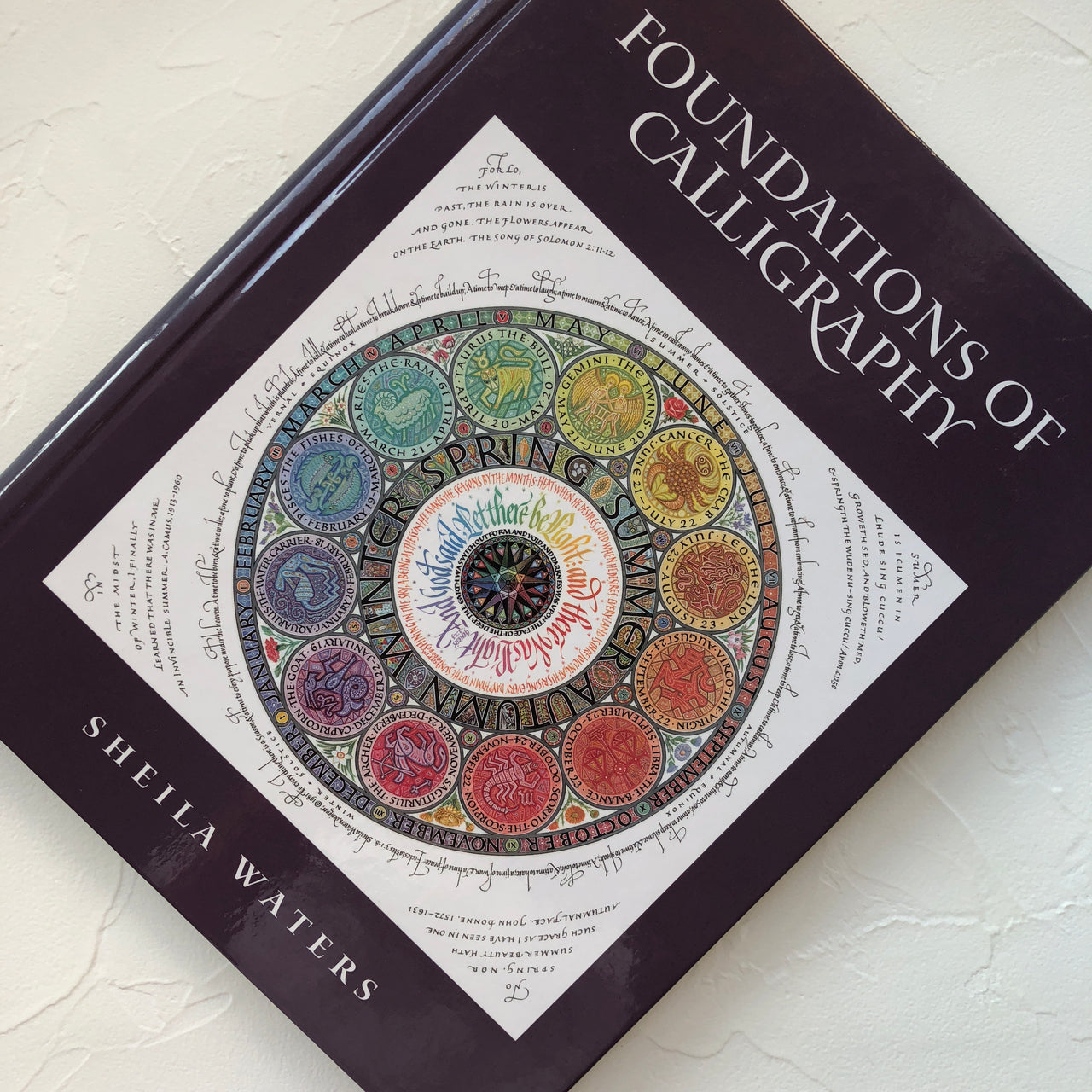
All of the content within is beginner-friendly and includes historic background, analytical approach, and instructions for creating a variety of flat-pen calligraphy styles (Roman Minuscule, Gothic, Uncial & Half Uncial, Carolingian, and Italic).
My Blackletter Calligraphy Books
Excuse the shameless plug, but I also offer four books — one for each of the four styles of Blackletter (Textura, Rotunda, Bastarda, and Fraktur). These books are great learning companions if you’re interested in diving deep into gothic calligraphy. Each contains a historic overview, stroke analysis, alphabet analysis, and a wealth of practice sheets to apply the learning.

I’d like to note that I wrote these four books simply because other material on the four core blackletter hands does not exist. If it did, I’d have written about it in this article.
Like other aspiring Blackletter calligraphy artists, I wanted to learn the ins and outs of blackletter and its varieties, as well as the distinct differences and unique histories behind each one. It wasn’t easy. I scoured the bowels of the internet to piece together historic articles and calligraphic overviews, studied old manuscripts, and learned from fragments of information provided in instructional classes. Once my initial studies felt complete, I compiled them together into these books so other artists would not need to go to such great lengths to learn.
Enjoy!
Conclusion
Consider yourself well-equipped, my friend! But let me just reiterate that while a tool might enable you to create the best work you’re capable of, it won’t necessarily make you a better artist.
Prioritize your next steps based on your biggest pain-points. When it comes to learning consider investing in learning resources over tools. If you’re just getting started and want to give it a shot, invest in a Pilot Parallel and perhaps some artist paper. Not your first rodeo? Looking to expand your capabilities? invest in some new tools and inks.
If you have any questions or comments, or if there are tools that you swear by that aren’t listed here, shoot me an email. I’d love to continue the conversation and I always love learning new things from fellow artists!