Fresh Baked Vintage Logo Design
While I was traveling to Portland, OR in 2015, I had the unexpected pleasure of meeting Kristin, the owner of Fresh Baked Vintage. Kristin specializes in the curation and resale of vintage goods as well as vintage-inspired handmade crafts. Through various internet channels, fairs, and markets, she sells these goods to craft and enthusiasts. Over the course of time, she has established a very successful business in this realm and is planning on opening up her very own brick and mortar in Portland. Now that things were starting to get more serious for FBV, it was time to establish a proper visual identity.
Project Demands
Fresh Baked vintage needed a logo that could be applied to all digital and print collateral, as well as something that could be either etched or screened on the glass storefront.
After a thorough discovery of what the FBV brand is all about, the need for something clear and legible was obvious. However, there also had to be an element of fun. The result was a bubbly and whimsical script that still maintained legibility and a tone of established professionalism.


Ideas and Exploration
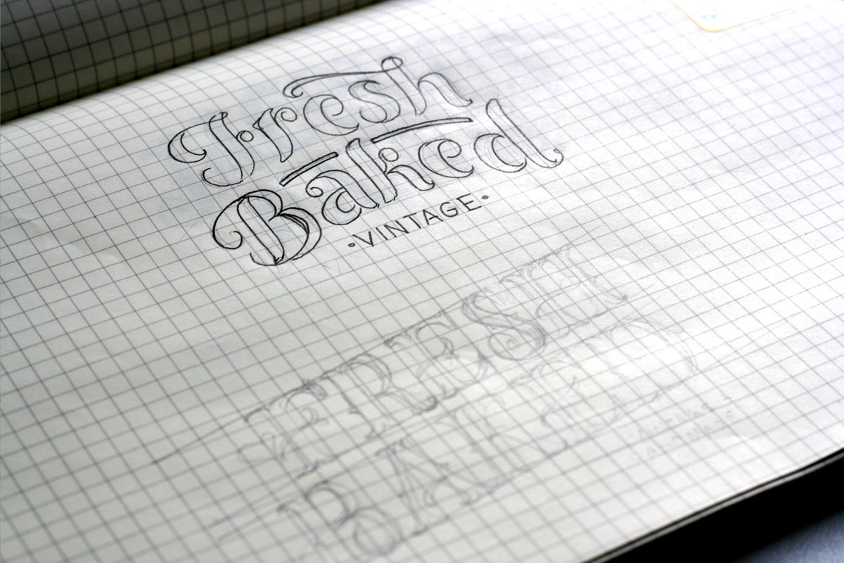
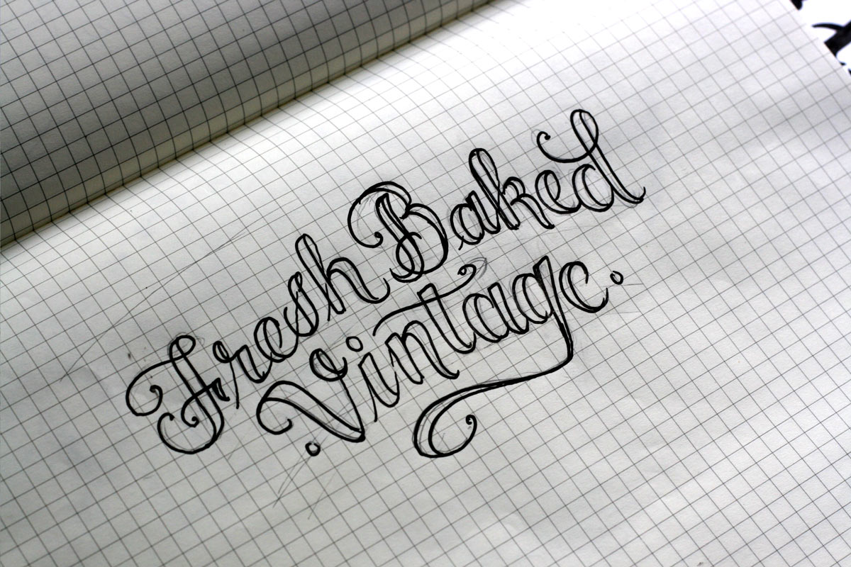
As always, I started with sketching after we finished defining the project goals.
To find the good ideas, you need to get the lesser ones out of the way. Sometimes, the initial phase of sketching is more about quantity than quality. Exploring every single idea that comes to mind is essential to determining what works and what does not work.
There were several important aspects that a successful execution would be comprised of. The name was long, and due the variety of potential applications, the logo would scale from very large to very small. Therefore:
- The logo was best suited to fall on multiple lines rather than one.
- The letters needed to carry weight to ensure legibility at small scales.
- Smaller details in the letters should not be used exceedingly in the interest of improving the design. Keeping this aspect simple would also ensure legibility at smaller scales.


Execution and Refinement
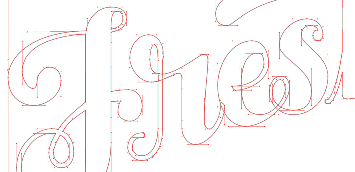
Sometimes, translating ideas that look perfect on paper can reveal obvious flaws and inconsistencies when digitized onto a perfect grid, particularly when the baseline arches. This particular scenario required a lot of refinement to get the visual relationship completely balanced. It’s amazing how many tiny inconsistent details that were once imperceivable get revealed in this phase.

The Final Product


