Letters With Impact Design
When I set out to create my website, I spent a lot of time brainstorming and writing to discover the tone, language, and message that I wanted to convey throughout all of my content. What value and services do I offer? Why are they important? Throughout this exploration, I kept coming back to the phrase “Letters With Impact”. Impact, particularly in this case, can mean many things. Impactful feelings, impactful visuals, impactful business results, etc. I fell in love with this phrase and thought it would be the best way to describe what one can expect from my work.
Ideas and Exploration
I wanted this phrase to be clear and legible while still delivering a visual interest that a first-time viewer would not just gloss over. I decided to proceed with an elegant script that would have heavyset letters and some nice flourishes to tie the entire design together. Since it would be the central focus on the top header of the website, I wanted the letters to be stacked and centered in order to occupy the optimal space.
I began sketching with all of this in mind and ended up developing a primary direction.


Execution and Refinement
One of the most fascinating parts of the vectorization process is uncovering the unforeseeable design flaws that were present in the initial sketch. Sometimes, the organic expression that lives within gestural sketches disappears when it turns into a polished vector. This project was a prime example.
After the first pass of vectorization, the words were lacking a visual unity. At first glance, it seemed to be a problem with letter e in the word letters. I examined this portion carefully. One approach I take is to replace letters in one word with letters in another word. In this scenario, I mocked up “Letters With Impect”. It became obvious that the e letters needed to be reworked. In mocking up “Lattars With Impact”, it was apparent the visual unity was much more balanced.


Reworking the e letters proved to be successful and the newly found balance between all of the letters worked beautifully.


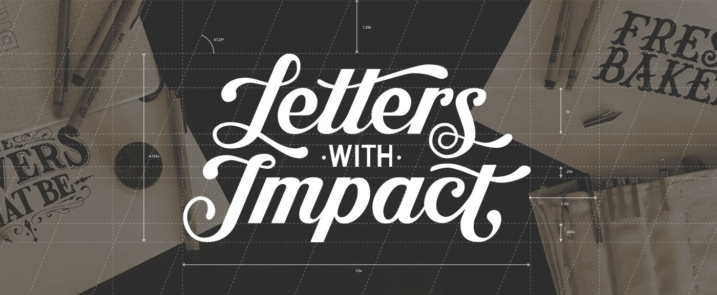
The Final Product
To demonstrate all of the hidden relationships between all of the letters and the underlying grids, I placed the design in context with the guides that I used to ensure uniformity.

I also did a photoshoot to compliment the lettering piece that would eventually become the masthead image of my homepage.