Plumchester Identity Design & Numeral Set
Plumchester is a brand new art supply manufacturing company specializing in high quality notebooks and writing utensils. Though the company is still young, the founders are experienced business owners with a distinct vision for providing the best materials money can buy. Plumchester notebooks are no joke. You’re not going to find flimsy thin Moleskine paper that your pens and markers bleed through. The paper is thick, heavy, and ready for any application.
Project Demands
When the folks at Plumchester approached me, they were excited to create a strong and regal aesthetic identity. The research they had put into the Plumchester brand was thorough and deliberate. Plum is a color with a lot of history. The brand needed to convey a classic look that would still maintain a degree of timelessness.
Plumchester had already concluded that they wanted the wordmark to be serif style. This made a lot of sense. Roman serif faces date back thousands of years, and without a doubt, provoke the aesthetic of elegance timelessness. In addition to the wordmark, there also needed to be an iconic stamp that could be used as a complimentary design element for both the products as well as various other print and digital applications.
Prior to contacting me, the owners had experimented with a variety of different premade font faces. However, they still felt there was something missing and decided that it would be best to base the aesthetic around something completely custom and tailored to their vision.
Ideas and Exploration

I began by immersing myself in serif fonts. I had no intention of referencing or borrowing letters or elements from pre-existing fonts. But for the sake of inspiration, I studied a variety of serif styles. Then I put them all away and began drawing on an empty page. It was very important to me that I worked without references.
While sketching, I explored a variety of different serif treatments including lower case, upper case, and sentence case.


Due to the length of the word, I quickly realized in my sketches that using a traditional width of serif was going to make the word very long. For this reason, I experimented with a more condensed style of word. When the word was fully condensed, its legibility suffered at smaller sizes.

When I produced this sketch, I had a feeling it was the one. The font had modern aspects in its letterforms, but still maintained a classic feel. This was a difficult threshod to find. It was also a perfect balance between being fully condensed and fully extended. The stems were thick and strong and the thinner parts of the letter were still thick enough to maintain its structure and legibility, even at smaller sizes.
Execution and Refinement
I refined my sketch and got to work in Adobe Illustrator.
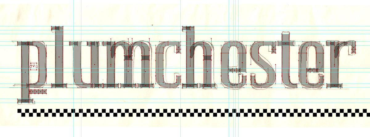

There were a lot of careful refinements between the sketch and the finished vector. Many of these refinements were in minor details of letterform peices that came off of the main stem. As you can see in sketch above, finding the right balance of whitespace within each letter was a bit of a challenge.
Serifs might look simple at first glance, and in essence they are. But when letters are “simple”, it actually becomes exponentially harder to get them to look right. Just the slightest imperfection can throw the entire design off. That said, I knew how important it was to come up with a rigid system.
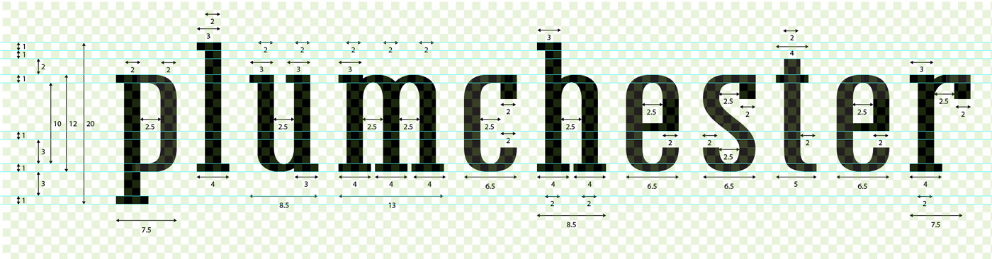
I developed a system that involved a single root unit of measurement. Every single aspect of the letterform was measured based on this unit and the grid that the unit was comprised of down to a quarter increment.
Even the bezier handles that were used to define the curves were pulled accordingly to align with the grid system. The grid system — though invisible when just looking at the wordmark by itself — is the driving force behind the wordmark’s uniformity.

The iconic stamp that would compliment the wordmark was developed based on the P vector. The icon adhered to the same grid system as well.

A New Scope
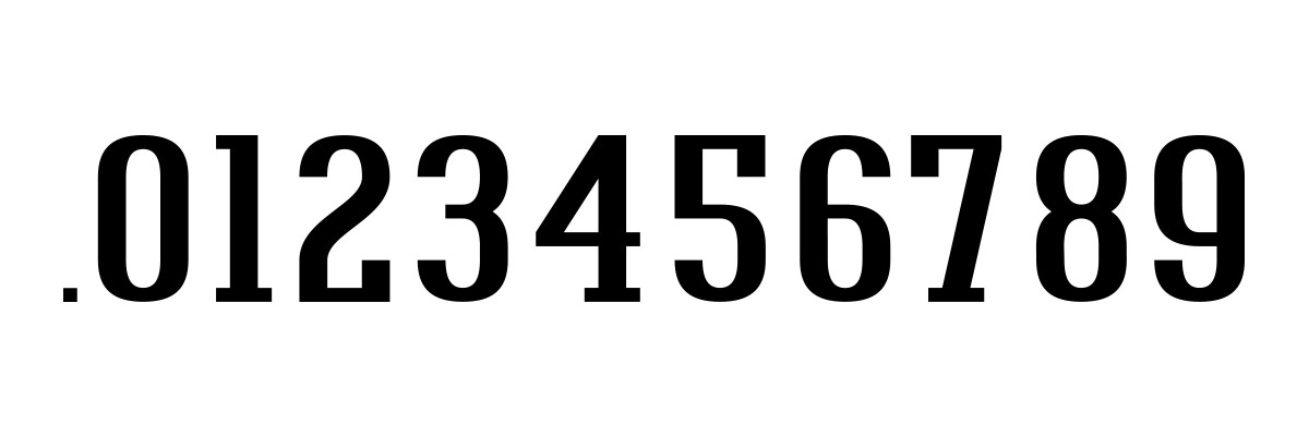
The owners at Plumchester were ecastic when they saw the finished wordmark. They got in touch with their manufacturer and began mocking up the physical products. Soon after, they realized that they also wanted to utlize a number set that would be featured on their products. So we got to work on that as well!
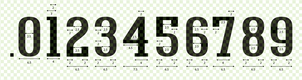
The numerals adhere the exact same grid system and measurements that was used to develop the wordmark and icon.
The Final Product